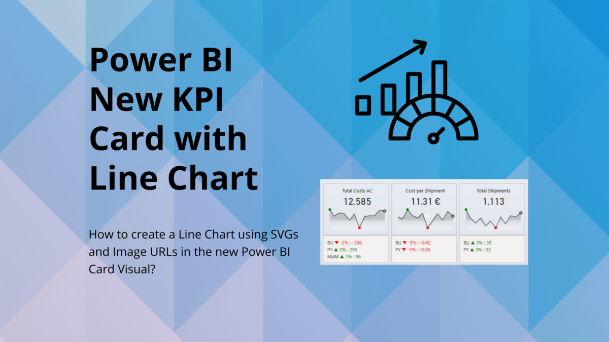
As a Power BI developer, I’m always looking for ways to get more insights out of my reports. The new KPI card Power BI with references feels like a real step forward. With the November 2024 update, it’s no longer just about showing numbers on a card — it’s about giving more context and making the data easier to understand.
In the past, KPI cards in Power BI were limited to static values. Now, the Power BI new KPI card can show a fuller picture, almost like a card with states Power BI or even a Power BI card with line chart, helping me and other developers turn raw numbers into meaningful insights.
Traditional vs. New KPI Cards: A Comparative Analysis
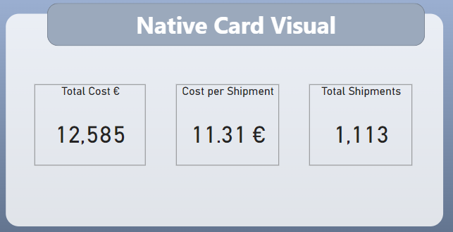
The “Normal” KPI Card in Power BI
The standard KPI cards in Power BI were straightforward but also limited. They displayed figures like sales totals or quarterly earnings, giving only the basics at a glance. The problem was context — these visuals showed numbers in isolation, without trends or comparisons. Unlike a Power BI card with trend or a card with states Power BI, the old design made it harder to evaluate performance over time or against targets. Without this layer of comparative data or trend analysis, the standard card often fell short for strategic decision-making.
Don’t Miss Out!
50% OFF DataCamp SQL – Secure Discount now!
Learn SQL Skills, Level Up Your Career
For selected periods only!
Click Here & Start Now!Okviz Custom KPI Card
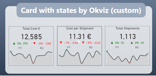
To enhance data visualization, I often turned to Okviz’s custom KPI Cards. These cards aimed to offer more than just standalone figures. They included trend lines beneath the main number, offering a glimpse into performance over time. However, these cards had their challenges. They were complex to set up, often requiring the integration of multiple elements for a complete view. This complexity sometimes led to configuration errors, resulting in inaccurate data displays. Especially when showing averages, you had to separate the trendline and the KPI Value as two visuals to show the correct data!
The image below shows 3 main KPIs. Each KPI needed a minimum of 3 individual visuals to complete the image. This is time consuming and not efficient when aligning and managing visuals.
The New PowerBI KPI Card with line chart
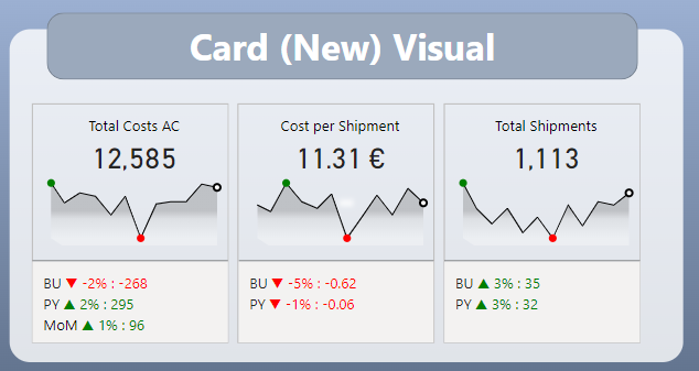
The latest update brings the “New Power BI KPI Card with References and Line Chart,” a significant improvement over both previous versions. This new KPI Card boasts several key features:
- Integrated View: It consolidates various data points into a single, comprehensive visual.
- Customization Options: Users can personalize the card with images and format each reference label individually, enhancing the visual appeal and readability.
- Reference Labels: The standout feature is the ability to add reference labels. These labels allow users to compare current data against benchmarks like previous performance, budget targets, or industry standards.
- Flexibility: The new KPI Card offers greater flexibility, allowing users to input multiple reference points for a more detailed analysis. Each KPI can have a different number of reference points!
- User-Friendly Design: It simplifies the visualization process, making it more accessible to users of all skill levels.
Creating a Line Chart in the New PowerBI KPI Card
The new KPI card in Power BI doesn’t come with a trendline built in. However, you can add one yourself. Using DAX and SVGs, you can build a small line chart directly inside the visual. This Power BI card with line chart approach helps display key trends like sales going up or down over time.
Here’s a step-by-step walkthrough to create a line chart for the new KPI card Power BI visual. The SVG-based solution works almost like Power BI new card visual sparklines, letting you enrich the KPI card without relying on external visuals. The original sparkline example comes from Kerry Kolosko, who shares many creative SVG designs on her website. I adapted her Sparkline Chart and, with the help of ChatGPT, modified it to create the Power BI card with trend shown in the image above.
🚀 Level Up Your Career with Power BI & DataCamp!
Learn Power BI, SQL & Data Skills Trusted by Top Companies.
What are you waiting for?
Step 1: Create new measure
You can copy the code below: Simply replace my measures with your measures.
1. dTime[EndOfMOnth] is my date range showing Year/Month data in form of 2023/11.’ Just replace this one with the date field from your PowerBI data model.
2. [Total Costs AC] refers to my total cost this year. Just replace this measure with any given measure that you want to visualize.
Sparkline Total Cost =
// Static line color
VAR LineColour = "black"
VAR PointColour = "white"
VAR Defs = "<defs>
    <linearGradient id='grad' x1='0' y1='25' x2='0' y2='50' gradientUnits='userSpaceOnUse'>
        <stop stop-color='#666666' offset='0' />
        <stop stop-color='#CCCCCC' offset='0.3' />
        <stop stop-color='white' offset='1' />
    </linearGradient>
</defs>"

// "Date" field used in this example along the X axis
VAR XMinDate = MIN(dTime[EndOfMOnth])
VAR XMaxDate = MAX(dTime[EndOfMOnth])

// Obtain overall min and overall max measure values when evaluated for each date
VAR YMinValue = MINX(Values(dTime[EndOfMOnth]),CALCULATE([Total Costs AC]))
VAR YMaxValue = MAXX(Values(dTime[EndOfMOnth]),CALCULATE([Total Costs AC]))

// Build table of X & Y coordinates and fit to 50 x 150 viewbox
VAR SparklineTable = ADDCOLUMNS(
    SUMMARIZE('dTime',dTime[EndOfMOnth]),
        "X",INT(150 * DIVIDE(dTime[EndOfMOnth] - XMinDate, XMaxDate - XMinDate)),
        "Y",INT(50 * DIVIDE([Total Costs AC] - YMinValue,YMaxValue - YMinValue)))

// Concatenate X & Y coordinates to build the sparkline
VAR Lines = CONCATENATEX(SparklineTable,[X] & "," & 50-[Y]," ", dTime[EndOfMOnth])

// Find the maximum and minimum points
VAR MaxPoint = TOPN(1, SparklineTable, [Y], DESC)
VAR MinPoint = TOPN(1, SparklineTable, [Y], ASC)

// Extract X and Y values for max and min points
VAR MaxPointX = MAXX(MaxPoint, [X])
VAR MaxPointY = MAXX(MaxPoint, [Y])
VAR MinPointX = MAXX(MinPoint, [X])
VAR MinPointY = MAXX(MinPoint, [Y])

// Last data points on the line
VAR LastSparkYValue = MAXX( FILTER(SparklineTable, dTime[EndOfMOnth]= XMaxDate), [Y])
VAR LastSparkXValue = MAXX( FILTER(SparklineTable, dTime[EndOfMOnth] = XMaxDate), [X])

// Add to SVG, and verify Data Category is set to Image URL for this measure
VAR SVGImageURL =
    "data:image/svg+xml;utf8," &
    --- gradient---
    "<svg xmlns='http://www.w3.org/2000/svg' x='0px' y='0px' viewBox='-7 -7 164 64'>" & Defs &
     "<polyline fill='url(#grad)' fill-opacity='0.3' stroke='transparent'
      stroke-width='0' points=' 0 50 " & Lines &
      " 150 150 Z '/>" &
    --- Lines---
    "<polyline
        fill='transparent' stroke='" & LineColour & "'
        stroke-linecap='round' stroke-linejoin='round'
        stroke-width='1' points=' " & Lines &
      " '/>" &
    --- Max Point---
    "<circle cx='"& MaxPointX & "' cy='" & 50 - MaxPointY & "' r='2' stroke='green' stroke-width='3' fill='green' />" &
    --- Min Point---
    "<circle cx='"& MinPointX & "' cy='" & 50 - MinPointY & "' r='2' stroke='red' stroke-width='3' fill='red' />" &
    --- Last Point---
    "<circle cx='"& LastSparkXValue & "' cy='" & 50 - LastSparkYValue & "' r='3' stroke='" & LineColour & "' stroke-width='2' fill='" & PointColour & "' />" &
    "</svg>"

RETURN SVGImageURL
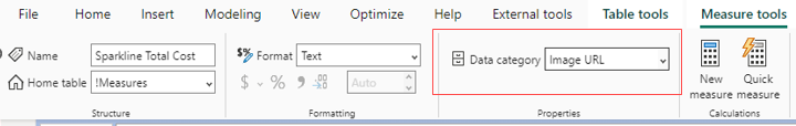
2. Save the measure as Image URL
Click on the measure and on the top menu under “Measure tools” go to Data Category and select Image URL
3. Include the Image URL in the New PowerBI KPI Card:
Click on the new Power BI KPI Card, navigate to the visualization pane and open the image label.
Select the relevant KPI (in my case “Total Costs AC”) and under image select “Image URL”.
Then click on the formula Icon and choose the newly created measure.
Its important to check the image size after referring to your measure. I set the size in my case to 200
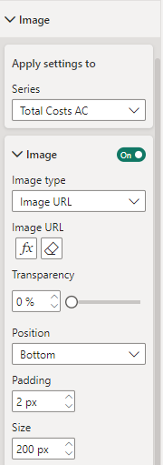
There are many settings to customize the color and layout of the new KPI card in PowerBI. For now, this blog post focuses on showing how to integrate the line chart into the KPI Card itself. In the settings above you can also choose the position. Personally, I like the position on the bottom below the main KPI number.
The Missing Piece: Tooltips in the New KPI Card
Despite the impressive advancements of the new KPI Card Power BI visual, one notable feature is still missing: tooltips. In the custom KPI card Power BI created by Okviz (often referred to as the card with states by Okviz Power BI), hovering over elements would reveal detailed insights, such as monthly data breakdowns. This functionality added a layer of depth, allowing users to quickly access specific data points without cluttering the visual field.
The absence of this feature in the Power BI new KPI card means users can’t immediately view detailed information, such as month-by-month comparisons, by simply hovering over the visual. This limits the ability to quickly glean detailed insights at a glance. It’s a minor setback, but significant for users who rely on this level of interaction for deeper analysis.
Conclusion: A New Era in Power BI Visualization
In conclusion, the Power BI card with line chart and references represents a notable advancement in the area of data visualization. It successfully integrates key features like an all-in-one visual, extensive customization, sparklines (Power BI new card visual sparklines), and the invaluable addition of reference labels, making data more contextual and insightful.
While there’s room for improvement—particularly in the area of interactive tooltips—the Power BI KPI card is undeniably a step in the right direction. It simplifies complex data presentations, such as a Power BI card with trend, and makes them more accessible and meaningful for decision-making.
As the tool continues to evolve, we can anticipate further enhancements that will refine and perfect its capabilities, offering even more powerful tools for analysts who rely on card with states Power BI and KPI-driven insights.
📈 Master Power BI & Data Analytics
Join 10M+ learners on DataCamp. Learn at your own pace, from beginner to pro.
Your career growth starts here.