
Built for clarity, performance, and real decisions.
This page shows a selection of real dashboards and reporting systems I’ve built in Power BI. The focus is always the same: clear business logic, clean models, and visuals people actually trust and use.
Use cases
These projects reflect how I typically work with Power BI: from shaping business questions, modeling and validating data, to designing dashboards that scale across teams. Some projects focus on performance and structure, others on UX, storytelling, or IBCS-style reporting. While patterns repeat, every solution is tailored to the environment, data sources, and decisions at hand.
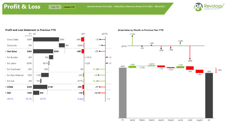
Built for a U.S.-based client with fragmented sales data. The dashboard consolidates regions, products, and customers into a single decision-ready view, replacing manual reports and enabling faster strategic alignment.
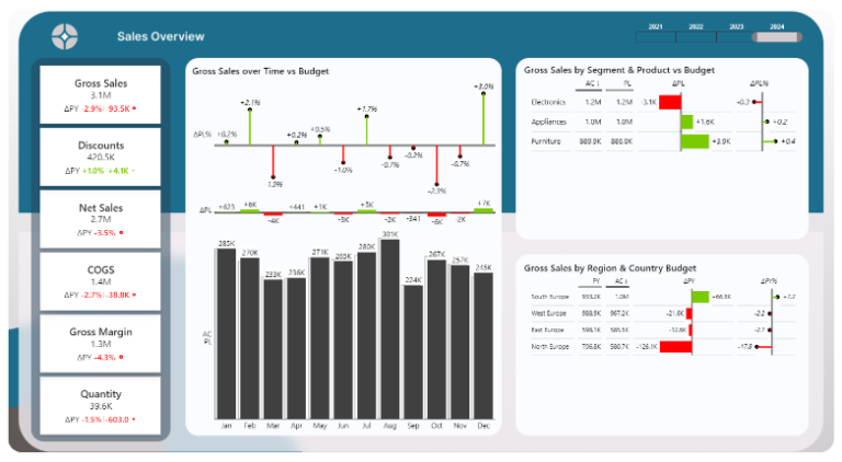
A comparative sales index dashboard designed to highlight over- and underperformance at a glance. Focused on variance logic, clear benchmarks, and executive-ready visuals inspired by IBCS principles.

An interactive Power BI dashboard that transforms raw GSC data into actionable SEO insights. Includes dynamic KPI cards, cross-filtering, and optimized DAX for flexible time comparisons across countries, devices, and queries.
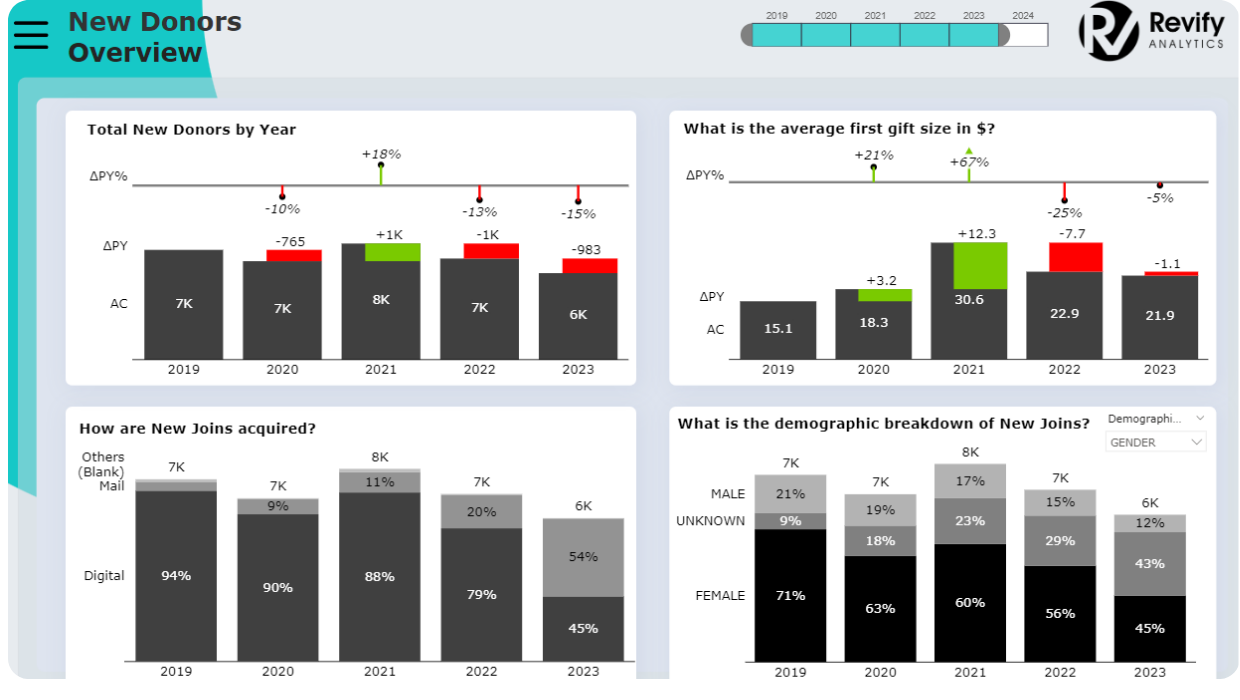
Designed to support fundraising and retention decisions. The dashboard highlights donor behavior, campaign performance, and segmentation patterns in a clear, accessible structure.