Table of contents
Today, I want to share a simple, yet handy trick for your Power BI reports – The Line Break in Power BI! Ever noticed how your text elements can become too long and hard to read? That’s where a neat little function, UNICHAR(10), comes into play in DAX. Use DAX to create a new line in a string. It’s all about adding those much-needed line breaks to separate your data points. So, let’s dive into this quick tip to tidy up your visuals!
DAX Line Break: Why and How to Use It in Power BI
To add a line break in Power BI DAX, use the UNICHAR(10) function. This is the easiest way to create a DAX new line in your reports. Imagine you have several measures like Total Cost Current Period, Total Costs vs. Last Year, and Total Costs vs. Budget. If all these measures appear on one line, they can be hard to read.
By inserting & UNICHAR(10) & between each measure, you create a new line in DAX for every data point. This DAX line break separates your information into distinct lines, making your data clearer and easier to understand. This small change improves readability and helps users quickly grasp key details.
DAX New Line: Understanding UNICHAR(10) in DAX
The UNICHAR(10) function in DAX is a powerful tool for adding a new line in your Power BI reports. Think of it as pressing the “Enter” key while writing text. This function creates a DAX new line in string, which helps to break down large chunks of text into smaller, more readable pieces.
When you use UNICHAR(10), it generates a line feed character. This character is the standard symbol for a new line in most text formats. So, if you want to create a new line in DAX or insert a DAX line break in string, this function is your go-to solution. It allows you to format text dynamically within your reports, improving both the look and readability.
By adding UNICHAR(10) in DAX formulas, you can easily manage text in Power BI visuals, such as titles, labels, or measures. This technique is especially useful when you need to display multiple data points or lengthy descriptions in a cleaner, more structured way. For example, you can separate product names, metrics, or any other text data using a simple DAX line break.
Benefits of Adding Line Breaks in DAX
Using line breaks in DAX, such as the UNICHAR(10) function, can transform cluttered text into clear, readable information in Power BI. When you do not use a DAX line break, your measures can appear messy and hard to follow. For example, if each text string is written on a new line in the DAX measure, it doesn’t automatically mean the output in Power BI will display with line breaks.
Here’s a sample DAX measure without line breaks. Consider following DAX Measure, where we have 3 lines of code written in DAX. But the problem with this dax measure is that you won’t be able to go to the next line in Power BI with it!
No Line Break =
"Total Costs Current Period: " & FORMAT([Total Costs AC], "#,0") &
"Total Costs vs. Last Year: " & [mKPI Total Cost ref] &
"Total Costs vs. Budget: " & [mKPI Total Cost BU]
Output with no Line Break in Power BI:
As you can see, the text and numbers are hard to read and hard to distinguish. The screenshot shows a standard table visual in Power BI. Without a DAX adjustments there is no new line in this string

Power BI output with Line Break using Unichar(10):
If you simply add Unichar(10) to your measure, you automatically get a linebreak. I added two Unichar(10) variables so I create an additional space between the rows with text:
Line Break =
"Total Costs Current Period: " & FORMAT([Total Costs AC], "#,0") & UNICHAR(10) & UNICHAR(10) &
"Total Costs Last Year: " & [mKPI Total Cost ref] & UNICHAR(10) & UNICHAR(10) &
"Total Costs vs Budget: " & [mKPI Total Cost BU]

The difference? The latter separates each metric onto its own line, making the visual clear and easy to digest. Line breaks aid in distinguishing between different data points, ensuring that each element gets the attention it deserves.
How to go to the next line in Power BI DAX: KPI Cards
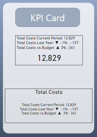
You can use the UNICHAR(10) function to create a line break in standard KPI Cards in Power BI. This versatile function is not limited to the body text; it can also be used in the titles or value fields of KPI Cards. Adding line breaks helps separate different elements within a card, such as dividing a long title or breaking up multiple key figures listed in the value field.
By using line breaks in KPI Cards, each piece of information stands out more clearly. This makes your KPIs easier to understand at a glance and improves the overall impact of your data presentation. Applying this technique ensures that key metrics do not get lost in a sea of text.
Remember to Enable Text Wrap in KPI Cards
Important: For line breaks to work correctly in KPI Cards, you must enable “Text Wrap” in the formatting options. Unlike table visuals, KPI Cards do not automatically add extra space between lines, so the line breaks might not display correctly without this setting.
You can experiment with different placements, such as having the measure in the title or the value section of the KPI Card. This flexibility allows you to find the most visually appealing way to present your data. The KPI Card on the top has the measure in the title while the KPI Card in the bottom has the measure in the Value section. You can play a little bit around what you like more. Of course, you can use the measure as a dynamic title in other visuals, such as bar charts as well.

Conclusion: Dax Line Break Power BI
Adding line breaks using UNICHAR(10) in Power BI can greatly improve how your data is presented and understood. Whether you’re working with standard measures or KPI Cards, this simple technique breaks down information into clear, easy-to-read parts. It enhances readability and boosts the overall impact of your reports.
A small change like a DAX line break can lead to a big improvement in data visualization. Try using DAX new line in your next Power BI project to see the difference it makes. This straightforward method can help your data stand out and become more accessible to users.
Now you hopefully understand how to go to the next line in Power BI using DAX.
You want to take your reporting to the next level? Make your Power BI reports more dynamic and interactive. Check out my latest blog post series: 8 Tips to Create an Interactive Power BI Dashboard.

