This is now my fourth blog post about making your Power BI reporting more interactive. In today’s post, I want to focus on user-friendliness and making decisions easier. We’re going to talk about visual level filters in Power BI, specifically how you can filter one visual by another. There are standard ways to do this using Power BI’s built-in tools, but I’ve found that these can be slow and clunky. That’s why I recommend using Zebra BI as a third-party visual for a smoother experience.
Getting the Basics Right: Standard Visual Level Filters in Power BI
The Highlight Option
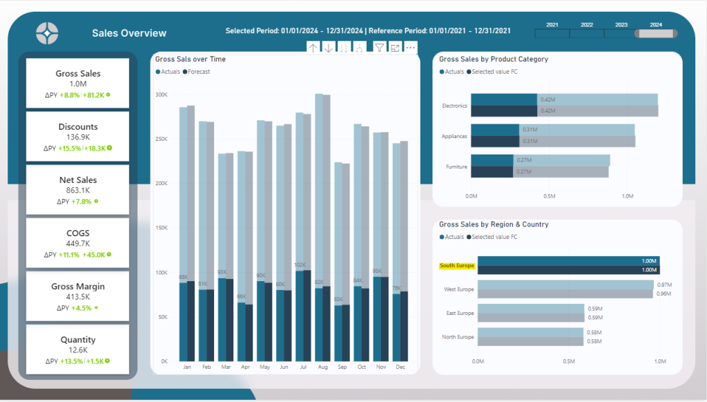
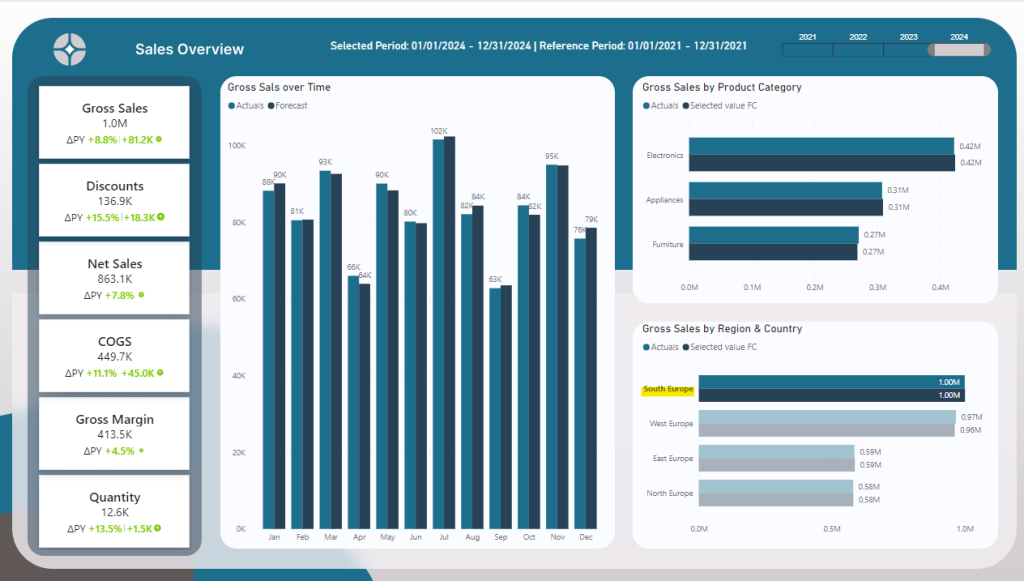
First things first, let’s talk about how visual level filters typically work. In my example sales report below, we have 3 main visuals. One showing sales over time, one showing sales by product category and the other sales by region and country. I simply can click Southern Europe the other visuals interact. But, in my opinion, the highlighted default option is not clear showing a greyed-out area in the back. Especially with other visuals like pie charts it becomes impossible to read.
The filter Option
Luckily, there are options how to edit the visual filter interactions: If you’re using a standard visual, you need to select your visual, go to Format, and then Edit Interactions. This allows you to control how one visual affects another. While this is fine, it’s not the most efficient way to work, especially when your report is getting complex.
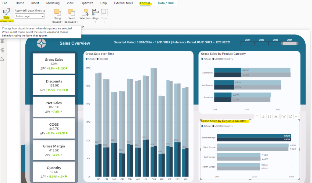
Once you selected the Edit Interactions you will see two options on the top right corner of each visual. The first one is Filter, the other one is Highlight which indicates which way you want to filter: In our case, we want to switch from Highlight to Filter. Filter is the left most icon.
IMPORTANT: You need to have the Sales by Region visual still selected! If you have not selected any visual, you will not see this option! Moreover, you need to do this for all visuals in this report page. This can be tiring and its easy to oversee one or two visual filters.
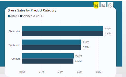
To showcase how it looks after we have chosen the visual filters, we click again on the South Europe text to filter all other visuals. Now the highlighted parts are gone and it’s easier to see trends!
Why I Prefer Zebra BI for Visual Level Filters in Power BI
This is where Zebra BI comes in. If you’re like me and care about both speed and clarity, Zebra BI visuals make a huge difference. Instead of fiddling around with the Format menu every time you add a new visual, Zebra BI automatically handles interactions for you. It’s smoother, faster, and frankly, just easier to understand. Plus, the visual options you get with Zebra BI are way more flexible and dynamic, allowing you to focus on insights rather than setup.
Comparing the Standard Visual to Zebra BI Visuals
Let’s compare a typical setup: You have a main visual, and you want it to filter other visuals in your report. With the standard approach, you’ll be clicking through menus and adjusting each visual interaction manually. But with Zebra BI, this process is mostly automatic. You set it up once, and your visuals dynamically adjust to what you’re filtering. It’s a time-saver and gives you cleaner, more professional-looking reports.
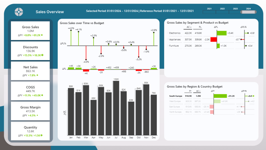
The image below filters Southern Europe again. Without any further adjustments, one visual automatically filters all other visuals. You can even select multiple visuals; you just need to press CTRL and click. It’s that easy!
Why This Matters for Your Reporting
The whole point of using visual level filters in Power BI is to give users a better experience. Whether you’re building reports for yourself or your team, the goal is to make data easy to explore. By using tools like Zebra BI , you cut out the manual work and create reports that are more interactive, effective, and, let’s be honest, more enjoyable to use. When reporting is quick and clear, decisions are easier to make.
Why I use Zebra BI for dynamic value reporting in Power BI?
Zebra BI is a powerful tool that makes reporting in Power BI more dynamic and actionable. With Zebra BI, you can easily create visuals that allow users to switch between different KPIs, compare actual vs. budgeted results, and dig deeper into your data with just a click. It’s designed to help you present complex information in a clear and consistent way, making it easier for decision-makers to understand the story behind the numbers.
What makes Zebra BI stand out is its ability to automatically adjust and display data in the most effective format, whether it’s variance charts, waterfall charts, or tables. It’s perfect for dynamic reporting because it offers seamless integration with Power BI, enabling real-time insights that drive better business decisions. You can try Zebra BI with a free 30-day trial and experience its benefits firsthand using this affiliate link below.
TRY OUT ZEBRA BI TODAY
Visual Level Filters in Power BI: Download the free Power BI Desktop file
If you want to follow along using my Power BI Desktop file, you can do that. Use the link below and get free access to the PBIX file with all measures, data models and settings.
Final Thoughts
Visual level filters are a must in Power BI, but they don’t have to be a hassle. Sure, you can stick with the standard options, but if you’re serious about improving user experience and making better decisions, give Zebra BI a try. It’s all about making reporting faster, easier, and more dynamic, which ultimately leads to better business outcomes.
Want to learn how to make your Power BI Report more dynamic? Read my other blog posts:
How to Compare Actual Results to Budgeted Results in Power BI
Using Power BI Dynamic Values for Flexible Reporting
How to Handle the Selected Value Field Parameter in Power BI
If you like this type of series, I would be very happy if you give me a comment, share this post or follow me on LinkedIn.

