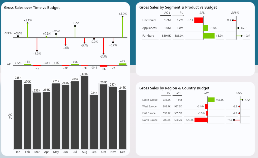
Many Power BI reports lack the interactive features needed to deliver clear insights. Without the right level of interactivity, reports can be confusing, leading to poor decision-making. In this series of eight blog posts, I’ll show you how to create an interactive Power BI dashboard that’s both user-friendly and impactful. From dynamic titles and KPI switching to working with parameters and comparing multiple periods like actuals versus budget, forecast, or previous year, these tips will help you take your reports to the next level.
In this blog post series, I’ve shared my knowledge and experience in creating dynamic Power BI reports. Each post dives into practical techniques that you can easily apply to your own reports, from setting up dynamic KPIs to building interactive visuals. These tips are designed to help you create reports that not only look good but also deliver powerful insights that drive better decision-making. Whether you’re just starting or looking to refine your skills, this series offers valuable lessons for every Power BI user.
Why Interactive Power BI Dashboards matter:
Creating an interactive Power BI dashboard is essential for giving users the control they need to explore data, uncover trends, and find actionable insights. When a report is interactive, users can seamlessly switch between KPIs, compare data across different time periods, and dive deeper into specific details—all without needing to navigate multiple pages or visuals. This level of flexibility not only enhances user experience but also ensures that decision-makers can quickly access the information most relevant to them. Interactivity transforms static reports into dynamic tools that drive smarter, faster decisions by allowing users to interact with data in a meaningful way.
0. How to Create a Dataset for Power BI Using ChatGPT
Before diving into interactivity, having a realistic dataset is key. In this post, I show how to generate datasets using ChatGPT for your Power BI portfolio. Read more.
1. How to Compare Actual Results to Budgeted Results in Power BI
Comparing actuals with budget is a fundamental analysis. This post covers how to set up these comparisons for better performance tracking. Read more.

2. Using Power BI Dynamic Values for Flexible Reporting
Dynamic values make your reports adaptable and flexible. Learn how to implement dynamic values in Power BI to allow users to interact with key metrics. Read more.
3. How to Handle the Selected Value Field Parameter in Power BI
Field parameters allow users to easily switch between different data views in a report. This post explains how to handle them effectively for a more interactive experience. Read more.
4. Zebra BI Charts: Adjusting Parameters and measures for Comparing Actuals, Budget, and Forecast
Zebra BI charts are great for comparing multiple metrics like actuals, budget, and forecast. But visuals can become overwhelming when using multiple measures like actuals, previous year, budget and forecast. This post shows how to switch between different parameters to only show one of the options above. Read more.
5. Mastering Power BI Dynamic Year Comparison for Multi-Year Data Insights
Comparing data across multiple years is essential for spotting trends. This post covers techniques for making dynamic year-over-year comparisons in Power BI. Read more.
6. Visual Level Filters in Power BI: How to Filter One Visual by Another
Visual-level filters allow users to control which data is displayed based on interactions with other visuals. This post explains how to implement this feature to enhance interactivity. Read more.
7. Power BI Tooltips: Enhancing Your Interactive Power BI dashboard
Tooltips provide extra context without cluttering the main visuals. Learn how to use tooltips to improve user experience and deliver deeper insights. Read more.
8. Power BI Drill-Through vs. Drill-Down: Differences and How to Use Them
Drill-through and drill-down are powerful features for diving deeper into data. This post explains the differences between the two and when to use each. Read more.
Final Thoughts on Building an Interactive Power BI Dashboard
Creating an interactive Power BI dashboard is more than just setting up visuals; it’s about delivering an engaging experience that drives better decision-making. By following these tips, you can build dashboards that are intuitive, dynamic, and user-friendly. Whether you’re comparing metrics, setting up drill-downs, or filtering visuals, these techniques will ensure your reports are both insightful and easy to use.
Free Power BI and Dataset download
Follow my posts to download a free copy of my Power BI Desktop (PBIX) file. Get insights on all measures, relationships and calculations for free. Each blog post above contains a link how to download the file. Moreover, the Blog Post 0 also contains the excel file used to create this semantic model. So, follow along and start making your report more interactive, today!
If you like this type of series, I would be very happy if you give me a comment, share this post or follow me on LinkedIn.
Thanks and enjoy!

