This post is part of my series on making Power BI reporting more dynamic. Today, we’re focusing on using Zebra BI charts (affiliate link) to compare actuals with previous year, budget, or forecast in Power BI. Zebra BI is one of my favourite tools because it’s fast to implement and makes it incredibly easy to compare different fact data. Whether you’re looking at actuals versus budget, forecast, or previous year, Zebra BI lets you bring it all together in one clear, actionable chart.
Why Use Zebra BI Charts for Comparing Metrics?
Zebra BI charts support actionable reporting, which is exactly what I love. They are IBCS-compliant and focus on making insights clear and easy to follow. In Power BI, you can now add all your key metrics—actuals, previous year, budget, and forecast—into a single chart. This is great for getting a full picture of your data.
The key difference between budget and forecast is that forecasts focus on future performance and can change month by month. While it’s powerful to show all this information at once, sometimes visuals can get overloaded and hard to read. That’s why I prefer focusing on just one comparison at a time—like actuals versus budget, or actuals versus previous year.
Managing Overloaded Visuals with Zebra BI Charts
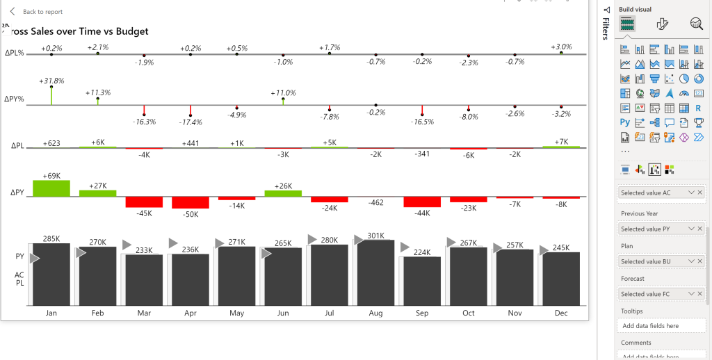
When you compare multiple metrics like actuals, previous year, budget, and forecast all together, the visual can become cluttered. The visual below illustrates that overload.
As you can see in the data fields, the visual includes 4 measures: Selected Value for AC (actuals year), PY (previous year), BU (budget/plan) and FC (forecast). These are dynamic measures, depending which KPI you chose (e.g. Gross Sales, Discounts, Net Sales etc) they automatically adjust. If you want to know how to create that I recommend reading my article about it: Using Power BI Dynamic Values for Flexible Reporting.

To make it easier to understand, I recommend only comparing actuals with one other metric at a time. For example, you can switch between actuals vs. previous year and actuals vs. budget, depending on what’s most relevant for your analysis.
This setup keeps your report clear and focused, making it easier for your audience to identify key trends and areas that need attention. If you want to learn how to set up parameters in Power BI to switch between metrics, check out my previous article where I explained the steps in detail: How to Handle the Selected Value Field Parameter in Power BI.
Implementing Dynamic Filtering in Zebra BI Charts
In my Power BI report, I use parameters to control which metric is shown alongside actuals. If I select “Budget,” the forecast and previous year data should automatically disappear. The same goes if I select “Previous Year”—budget and forecast should be hidden. This dynamic filtering is what makes Zebra BI charts so effective for comparing metrics without overloading your visuals.
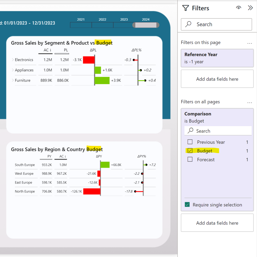
In the screenshot below, I selected the Budget option in my “Comparison” filter. I don’t want to see previous year or forecast data. This way it is neater and cleaner plus easier to interpret.

I’ll provide the DAX measure code below to help you achieve this setup in your own report. With this approach, you can create reports that are both insightful and easy to navigate, highlighting only the most relevant data for your analysis.
Dax Measures
I created “blank’ measures for previous year, budget and forecast indicated by the word blank at the end of the measure. Here’s the measure for previous year: We are using the blank function. If the selected parameter is ‘Previous Year’ it will show the data. If ‘budget’ or ‘forecast’ are selected, it will return blank. In the latter case we don’t want the previous year to show.
Selected value PY Blank =

IF (
    OR([Selected Parameter] = "Forecast", [Selected Parameter] = "Budget"),  -- Check if the selected parameter is "Forecast" or "Budget"
    BLANK(),  -- If so, return a blank value
    SWITCH([SelectedKPI],
        1, [Sum Gross Sales PY],
        2, [Sum Discounts PY],
        3, [Sum Net Sales PY],
        4, [Sum COGS PY],
        5, [Gross Margin PY],
        6, [Sum Quantity PY])
)
The measure for budget follows the same logic, just changes the words in the top and then the switch measure:
Selected value BU Blank =

IF (
    OR([Selected Parameter] = "Forecast", [Selected Parameter] = "Previous Year"),  -- Check if the selected parameter is "Forecast" or "Budget"
    BLANK(),  -- If so, return a blank value
    SWITCH([SelectedKPI],
        1, [Sum Gross Sales BU],
        2, [Sum Discounts BU],
        3, [Sum Net Sales BU],
        4, [Sum COGS BU],
        5, [Gross Margin BU],
        6, [Sum Quantity BU])
)
Finally the measure for the forecast:
Selected value FC Blank =

IF (
    OR([Selected Parameter] = "Previous Year", [Selected Parameter] = "Budget"),  -- Check if the selected parameter is "Forecast" or "Budget"
    BLANK(),  -- If so, return a blank value
    SWITCH([SelectedKPI],
        1, [Sum Gross Sales FC],
        2, [Sum Discounts FC],
        3, [Sum Net Sales FC],
        4, [Sum COGS FC],
        5, [Gross Margin FC],
        6, [Sum Quantity FC])
)
A small problem..
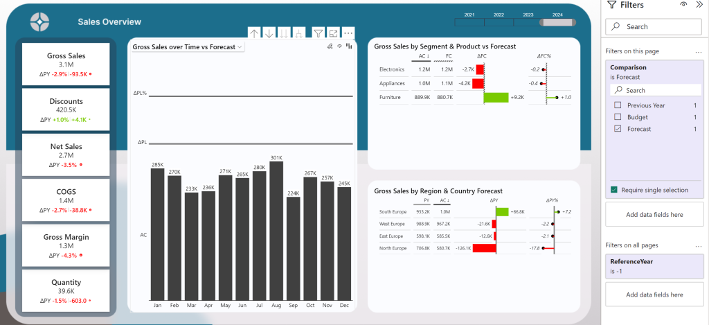
I do need to mention that this solution is not perfect! If we switch our parameter to “Forecast” the Zebra BI Chart visual only displays the actual year values. I could not figure it out yet why it doesn’t work. For the Zebra BI table visuals, the solutions works. If you know why that happens, please let me know in the comments.

There is a potential work around to this problem by creating a parameter switch for PY, PL and FC. Then we need to create a measure to get the selected parameter and put it all in the “Previous Year” field. The fields for Plan and Forecast will be blank! This means it is not coherent with IBCS standards as the Plan and Forecast background look different than the previous year background. But it works. If you want to see that solution, let me know in the comments 🙂
Still Confused with Zebra BI Charts?
Download my free Power BI Desktop file that contains everything you need to set up tooltips correctly!
Final Thoughts
Zebra BI charts are fantastic for dynamic, actionable reporting in Power BI. They’re fast to set up and let you compare multiple fact data seamlessly. By using parameters to switch between metrics, you keep your visuals clear and easy to understand. Whether you’re comparing actuals with budget, forecast, or previous year, Zebra BI charts help you deliver insights that drive better decision-making.
If you like this type of series, I would be very happy if you give me a comment, share this post or follow me on LinkedIn.

