Introduction:
Power BI Dashboard Design Ideas: Are you looking to make your Power BI dashboards truly stand out? Designing an eye-catching and effective report isn’t just about adding colorful charts—it’s about understanding your goals, aligning with business needs, and choosing the right visual elements. Creating beautiful Power BI dashboards involves careful planning, a keen eye for design, and the right tools and tricks. Whether you’re new to Power BI or looking to refine your skills, we’ve got you covered with practical design ideas that will transform your reports from ordinary to extraordinary!
You don’t have to be a design guru to create impactful dashboards. With the right inspiration and a few clever tips, anyone can produce reports that not only look great but also communicate insights clearly. Let’s dive into some of the best design practices and creative ideas to take your Power BI dashboards to the next level.
Why Dashboard Design Matters in Power BI
A well-designed dashboard is crucial in data storytelling. It turns raw data into a narrative that’s easy to understand and act upon. A beautiful Power BI dashboard doesn’t just display data; it tells a story that drives decision-making. Users are more likely to engage with and understand a dashboard that is thoughtfully designed, with a clear visual hierarchy and balanced use of colors and visuals.
Think about it: a cluttered dashboard can confuse users, while a clean, intuitive design enhances comprehension and encourages exploration. The goal is to simplify the complex, making key insights easy to find and understand. Incorporating good design practices can increase user satisfaction and trust, making your dashboards a powerful tool for driving business outcomes.
- Importance of Good Design: Enhances data storytelling and decision-making.
- Improves Engagement: Encourages users to explore and understand data.
- Key Design Elements: Visual hierarchy, balanced colors, and clean layout.
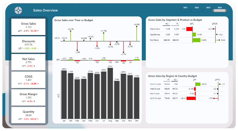
Below one of my recent dashboard projects. A beautiful background designed with Canva, clear pace between visuals, focusing on trends using Zebra BI visuals. It’s neat, clear and easy to follow. Plus it allows for a lot of interactivity, like comparing actuals with budget or switching from Gross Sales to Discounts, Net Sales or others. Check out my blog post: 8 Tips to Create an Interactive Power BI Dashboard
Start with Clear Goals and Business Objectives
Before diving into the design, you need to define the purpose of your dashboard. Ask yourself: What insights are you trying to convey? Who will be using this dashboard, and what do they need to know? Aligning your design with these goals will ensure that every visual element serves a purpose.
For example, a sales performance dashboard might prioritize KPIs like total sales, regional performance, and sales trends over time. A marketing dashboard, on the other hand, could focus on campaign metrics, engagement rates, and conversion funnels. By clearly defining your objectives, you can create a dashboard that is not only visually appealing but also highly functional.
- Define the Purpose: What insights are you conveying?
- Align with Business Goals: Tailor design to user needs and objectives.
- Examples of Dashboard Goals: Sales performance, financial overview, marketing metrics.
Choosing the Right Layout for Your Power BI Dashboard
Choosing the right layout is crucial to the success of your dashboard. A well-organized layout helps users find information quickly and reduces cognitive load. Start by deciding whether a single-page or multi-page dashboard suits your needs. Single-page dashboards are great for a high-level overview, while multi-page dashboards allow for deeper dives into specific areas.
Use tools like Dribble and Freepik to explore different layout options and get inspired by popular design trends. Consider organizing content logically with consistent alignment and spacing, and ensure the most important information stands out. A good rule of thumb is to place key metrics and visuals at the top or center, where they are most likely to catch the user’s attention.
- Explore Layout Options: Single-page vs. multi-page dashboards.
- Organize Content Logically: Use alignment and spacing to guide the user’s eye.
- Use Design Tools for Inspiration: Dribble, Freepik, and others.
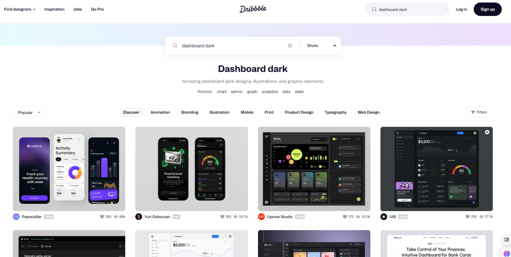
Here’s a quick look at dribble. Simple enter a search term like “Dashboard dark” and scroll through the designs for inspirations.
Power Bi Dashboard Design Ideas: Color Schemes
Color is a powerful tool in dashboard design. It can draw attention, convey meaning, and create a memorable visual experience. Choose a color scheme that aligns with your brand and enhances the readability of your data. Remember that colors should be used consistently throughout the dashboard to create a cohesive look.
Use tools like color palette generators to create complementary color schemes or extract colors from images to match a specific theme. Maintain a balance between colors—avoid overwhelming users with too many hues, and use contrasting colors to highlight critical data points. This approach ensures that your dashboard is both visually appealing and easy to navigate.
- Importance of Color: Enhances readability and draws attention.
- Use Tools for Color Selection: Color palette generators, image-based theme extraction.
- Maintain Visual Consistency: Use a balanced and cohesive color scheme.
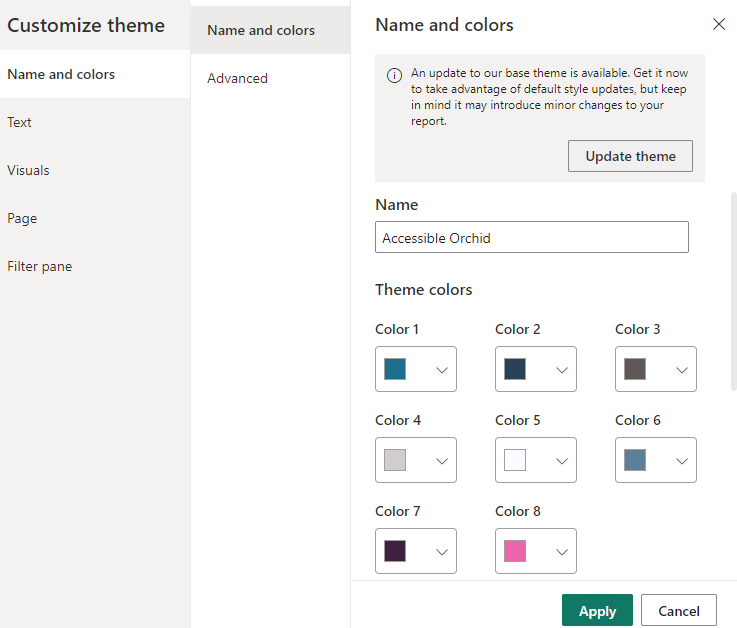
You can access and modify your current theme colors by going to the View tab, then click on the expanding icon and Customize current theme.
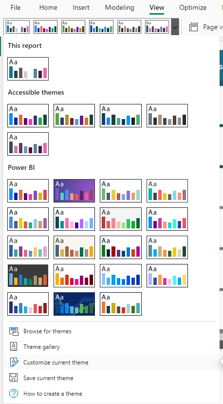
There, you can set do different settings like the color of the charts, text size, font and much more:
Best Practices for Data Visualization in Power BI
When it comes to visualizing data in Power BI, less is often more. Choose the right visualizations for your data type—bar charts for comparisons, line charts for trends, and scatter plots for correlations. Avoid overloading your dashboard with too many visuals, which can confuse users and dilute the impact of key metrics.
Focus on clean, simple visuals that align with your goals. For instance, avoid using tables unless necessary; instead, opt for visuals that summarize the data in a way that’s easy to digest. Remember, the goal is not just to display data but to tell a story that users can quickly grasp.
- Choose the Right Visuals: Match the visualization type to the data.
- Avoid Clutter: Focus on simplicity and clarity.
- Tip: Use visuals that align with your goals and simplify complex data.
Tools and Resources for Power BI Design Inspiration
Inspiration is everywhere for Power BI dashboard design ideas! Tools like Figma and PowerPoint can help you design and mock up your dashboards before building them in Power BI. Use websites like Dribble and Freepik to explore design trends, discover innovative layout ideas, and find ready-made assets.
Joining community forums, following YouTube channels like Data Pears, and engaging with other Power BI enthusiasts can provide fresh perspectives and keep you updated on the latest design techniques. Remember, the more inspiration you seek, the more creative your dashboards will become!
- Use Design Tools: Figma, PowerPoint for mockups and layout planning.
- Find Inspiration: Explore Dribble, Freepik, and other design resources.
- Engage with the Community: Stay updated on trends and learn from others.
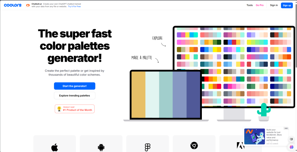
My personal tip: Go to coloors.co (affiliate Link) to get inspiration for gradients, color palettes, checking if colors are matching and much more! This will help you creating Power BI Dashboard Design Ideas.
Practical Tips to Enhance Your Power BI Reports
Creating an effective dashboard isn’t just about aesthetics; it’s also about functionality. Mara advises starting with the insights you want to show and working backward to determine the best visuals and layout. Make sure to use whitespace effectively to separate elements and improve readability. Proper padding and spacing between visuals can make your dashboard look more professional and less cluttered.
Consider using SVG images and custom themes to add a unique touch to your reports. Small details like these can elevate the overall look and feel of your dashboard, making it more engaging and user-friendly.
- Start with the Insights: Plan your visuals based on the data story you want to tell.
- Use Whitespace and Padding: Improve readability and visual appeal.
- Customize Your Theme: Use SVG images and custom themes for a professional touch.
Continuous Learning and Iteration
Creating a stunning Power BI dashboard is an ongoing process. Regularly seek feedback from users and iterate on your design based on their input. Small changes, like adjusting colors or repositioning visuals, can significantly enhance user experience.
Keep up with Power BI updates and new features to continuously improve your skills. Remember, design is not static—it evolves. Stay curious, keep experimenting, and don’t be afraid to break the mold!
- Iterate Based on Feedback: Regular updates and refinements enhance user experience.
- Stay Updated: Keep learning about new Power BI features and design trends.
- Embrace Evolution: Continuously adapt and refine your dashboards.
Conclusion: My Power BI Dashboard Design Ideas
Creating a beautiful Power BI dashboard is both an art and a science. It requires a clear understanding of your data, thoughtful design choices, and the right tools to bring your vision to life. Start by setting clear goals, choosing the right layout, and selecting colors that enhance your story. Leverage the tools and resources available to you, and don’t be afraid to iterate and learn from feedback. With these Power BI dashboard design ideas, you’ll be well on your way to crafting reports that are not only visually appealing but also powerful tools for decision-making. Ready to elevate your dashboards? Start experimenting with these tips today and see the difference!
Thanks for reading this far!

