Introduction:
Greetings, Power BI users! The February 2024 update brought us a groundbreaking feature: visual calculations in Power BI. This new functionality simplifies the application of DAX functions directly within visuals, making it an invaluable tool. Both for beginners and seasoned data analysts. In this post, explains how to enable enabling this feature and using it to enhance your data analysis and reporting capabilities in Power BI.
Enabling Visual Calculations in Power BI:
Before diving into the benefits of visual calculations, it’s essential to ensure that this feature is activated in your Power BI setup. Here’s how you can get started:
- Open your Power BI Desktop.
- Navigate to the cog icon at the bottom right to access ‘Options and settings.’
- Select ‘Preview features’ from the settings menu.
- Look for ‘Visual Calculations’, check the box next to it, and then click ‘OK.’
- Restart your Power BI Desktop to make the new feature available.
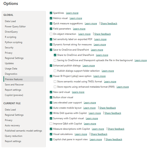
Activating visual calculations in Power BI is your first step towards more dynamic and interactive data reporting.
Understanding the Basics of Visual Calculations:
Visual calculations in Power BI allow for seamless integration of DAX functions directly into your visualizations, thus minimizing the need to toggle between different views and reducing the complexity of data manipulations. With visual calculations, you can immediately apply changes and see their effects right within the visuals, enhancing both the efficiency and accuracy of your data analysis process.
For example, adding a calculated measure like total sales or a dynamic growth rate can now be done directly within a sales performance dashboard, simplifying complex data operations.
Applying Visual Calculations:
To illustrate the power and convenience of visual calculations in Power BI, let’s walk through a practical example using a common analytical task—calculating running totals:
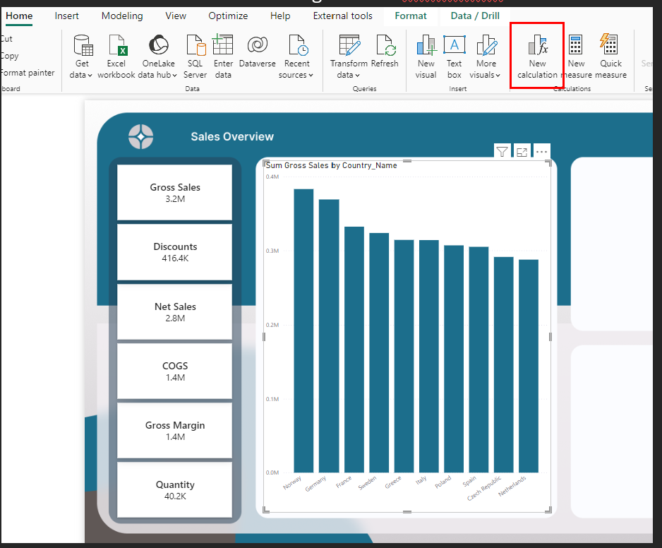
- Choose a visual that displays your data, such as a line chart showing monthly revenue.
- Go to the Home tab and click on ‘New Calculation’ to open the visual calculations menu.
- From the f(x) function menu, select a calculation template such as ‘Running Sum.’
- Adapt the formula to your data specifics, for instance,
Running sum = RUNNINGSUM([Revenue]), and apply it to view the cumulative totals directly on your visual.
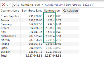
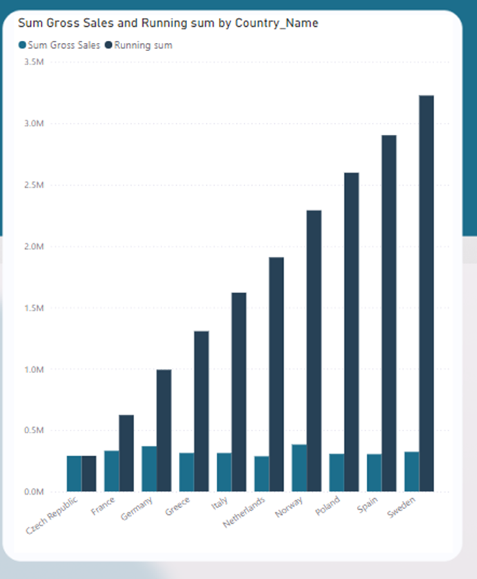
After Running Sum is Applied:
Once the running sum is applied, your visual updates to display both individual monthly revenues and their cumulative totals, offering a comprehensive view of financial trends over time.
Exploring Out-of-the-Box Calculation Options in Visual Calculations
In addition to the basic functions like Running Sum, visual calculations in Power BI offer a range of other functions. These can significantly enhance your data analysis without the need for complex DAX formulas. These predefined calculations are designed to apply directly to your visuals with just a few clicks. By that providing powerful analytical capabilities right where you need them.
Moving Average
This calculation helps smooth out short-term fluctuations and highlight longer-term trends in your data. Applying a moving average is particularly useful in financial analysis or to analyze performance metrics over time. For example, you could use it to understand the trend of monthly sales data. This helps to smooth out the effects of seasonal variability or outliers.
Percent of Parent
Calculate the contribution of each segment relative to its parent category in hierarchically structured data. This is incredibly useful for drilled-down reports where understanding the proportionate contribution of a child category within its parent category provides deeper insight, such as analyzing the sales contribution of different products within a larger product category.
Percent of Grand Total
This calculation shows each value’s proportion relative to the grand total across the dataset. It is essential for creating compositional analyses where you need to understand how each segment contributes to the whole, such as what percentage of total sales each region contributes to.
Versus Previous, Next, First, Last
These options allow comparisons across time or categories. For instance, ‘Versus Previous’ can show sales growth month-over-month. While ‘Versus Last’ might compare each month’s sales against the last month in your data set. These calculations are particularly valuable in reports where temporal comparisons are required to track growth, declines, or cyclical patterns.
By utilizing these out-of-the-box calculations, users can quickly enhance their visuals with complex comparative and cumulative metrics. Typically that would require detailed custom formulas. These features not only save time but also improve the accuracy and effectiveness of reports.
Implementation Example:
Let’s say you want to apply ‘Percent of Grand Total’ to sales data across different regions. You would select your sales visual, choose ‘Percent of Grand Total’ from the calculation menu. Next, the system would automatically adjust your visual to display each region’s sales as a percentage of the total sales across all regions. This immediate, contextual insight allows stakeholders to quickly grasp which regions are outperforming or underperforming relative to the total market.
Considerations and Limitations of Visual Calculations in Power BI:
While visual calculations in Power BI streamline many aspects of data reporting, they come with certain limitations:
- Scope of Application: These calculations are confined to the visuals they are created in, meaning they cannot be reused across different visuals or reports. This can be restrictive for projects requiring consistent measures across various reports.
- Compatibility Issues: Not all visual types support visual calculations. For example, some users have encountered limitations with combo charts, which may not currently support this feature.
- Formatting Limitations: Since visual calculations reside within the visual layer and not in the semantic model, the options for formatting these calculations are somewhat limited. Customizing the display and format of these calculations must be handled within each specific visual, sometimes requiring intricate DAX formatting commands.
Conclusion:
Visual calculations in Power BI significantly enhance how analysts interact with and manipulate data within visuals. By effectively leveraging this feature, you can boost your analytical processes, making reports more interactive and insightful. As you familiarize yourself with visual calculations, you’ll find new ways to enhance your data storytelling and make more informed business decisions.
This revision adheres to the active voice and sentence length requirements, making the content more direct and easier to read.

