Table of contents
- What is Power BI Dark Mode?
- Why Was Power BI Dark Mode Highly Anticipated?
- How to Enable Power BI Dark Mode?
- What Areas of Power BI Are Affected by Dark Mode?
- Benefits of Power BI Dark Mode
- How Does Dark Mode Compare to Other Microsoft Applications?
- Other Options to Use Dark Mode for Visuals and Canvas Background
- FAQs Power BI Dark Mode
- Conclusion: Legacy vs. Dark Mode Power BI Desktop
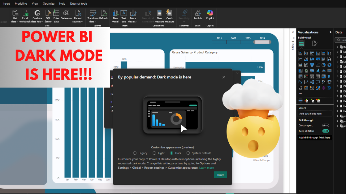
As of 2024, Power BI Desktop officially supports dark mode, a feature users have been eagerly anticipating. This long-awaited update introduces a sleek, modern interface that not only enhances visual appeal but also provides a more comfortable experience for those spending hours working on complex reports and dashboards. Switching between light mode, dark mode, or matching your system’s default theme is now just a few clicks away in the settings menu.
But dark mode in Power BI is more than just a style upgrade—it’s designed to reduce eye strain and improve focus, especially in low-light conditions. Accessibility is another key benefit, making the interface easier to use for individuals with visual sensitivities. This update also aligns Power BI with other Microsoft applications like Teams and Outlook, creating a seamless experience across platforms. Whether you’re working late nights or simply prefer a darker theme, now is the perfect time to explore and customize Power BI dark mode to match your workflow.
What is Power BI Dark Mode?
Power BI Dark Mode is a visually striking color scheme that replaces bright backgrounds with dark ones, paired with light-colored text, icons, and graphical elements. This design minimizes eye strain, particularly in dimly lit environments, while offering a sleek and professional look. Officially launched on September 17, 2024, the Power BI dark theme has become a highly anticipated addition to the platform, enhancing user experience and accessibility for all.
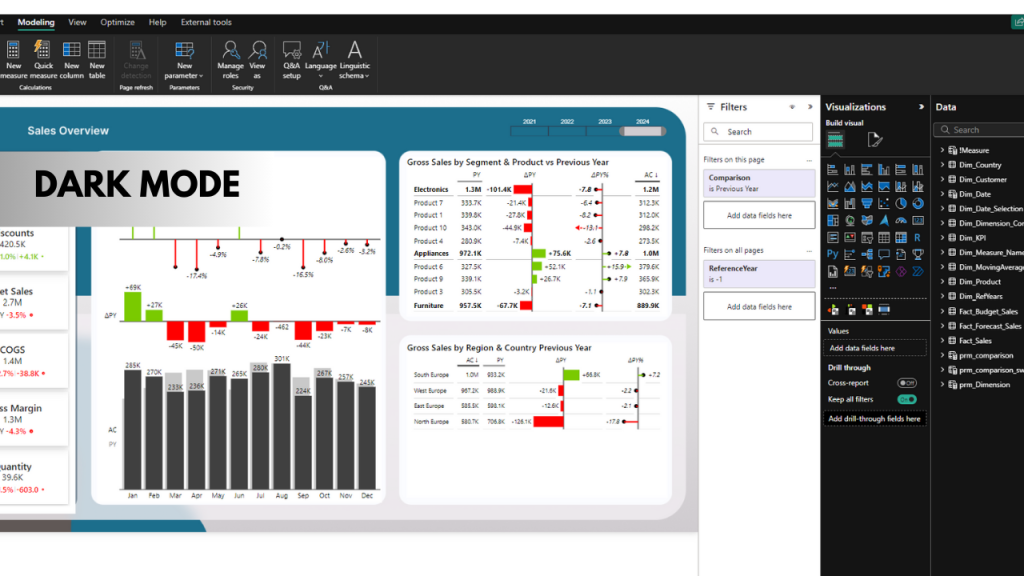
This feature transforms key elements of the interface, including the data pane, visualization pane, data model view, and home tab views, into a unified dark theme. However, some areas, like the canvas and filter pane, remain in their default light mode. This thoughtful design choice preserves flexibility, allowing users to tailor their workspace to meet diverse visualization and reporting needs.
Whether you’re working late at night or just prefer a modern aesthetic, dark mode in Power BI Desktop delivers both style and practicality.
Why Was Power BI Dark Mode Highly Anticipated?
The introduction of Power BI Dark Mode wasn’t just a visual upgrade—it addressed real user needs, making it one of the most awaited features of 2024. Here’s why users were so excited:
| Benefit | Description |
|---|---|
| Reduced Eye Strain | Dark mode in Power BI Desktop offers a softer visual experience by reducing glare, especially in low-light environments. This makes working on Power BI reports and dashboards for extended hours more comfortable and less tiring for your eyes. |
| Modern Aesthetics | With its sleek and professional look, dark mode in Power BI aligns with other popular Microsoft applications, such as Teams, Outlook, and Office. This consistency across the ecosystem enhances usability and makes Power BI feel more integrated. |
| Energy Efficiency | Devices with OLED or AMOLED screens benefit from Power BI dark theme, as dark pixels consume less energy. This feature helps prolong battery life, making it especially useful for mobile users. |
| Improved Accessibility | Dark mode in Power BI Desktop is a game-changer for users with light sensitivity or visual challenges. By reducing glare and improving text legibility, it offers a more inclusive experience for individuals with conditions like dyslexia. |
From reducing fatigue to offering a professional edge, dark mode in Power BI delivers benefits that resonate with a wide range of users, making it a standout feature of the platform’s 2024 update.
How to Enable Power BI Dark Mode?
Enabling dark mode in Power BI Desktop is straightforward, but your experience might depend on when you updated your software and your system settings. Here are two primary methods to activate it:
Method 1: Using the Pop-Up Notification (Temporary Option)
When Power BI Desktop first released the dark mode update, a pop-up notification would prompt users to switch to the dark theme immediately. If you selected this option, Power BI automatically enabled the dark mode for you.
However, based on my experience, this pop-up only appeared once, likely just after the feature was published. It’s worth noting that your experience with the pop-up may vary depending on your device, location, or Power BI version. If you missed it or don’t see the pop-up, don’t worry—there’s another way to enable it.
Method 2: Enabling Dark Mode via the Settings Menu
If the pop-up notification isn’t available, you can enable Power BI dark mode manually through the settings menu:
- Open Settings in Power BI Desktop.
- Navigate to Report Settings.
- Click on Customize Appearance.
- Choose from the available options:
- Legacy Colors: Retains the classic Power BI color palette.
- Dark: Enables the new dark mode theme.
- Light: Reverts to the default light theme.
- System Default: Matches your operating system’s theme.
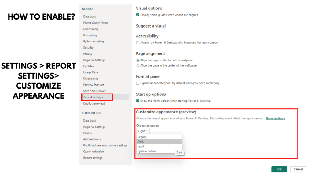
Here’s a quick summary table:
| Setting | Effect |
|---|---|
| Legacy Colors | Retains the original Power BI colors |
| Dark | Activates the new dark mode |
| Light | Standard light mode (default) |
| System Default | Follows the system’s default theme |
What Areas of Power BI Are Affected by Dark Mode?
The introduction of dark version in Power BI Desktop brings a sleek and user-friendly aesthetic to many parts of the interface. However, some areas remain unaffected to ensure flexibility for diverse workflows. Let’s explore which sections benefit from the Power BI dark theme and which don’t.
Areas Enhanced by Dark Mode
The following parts of Power BI are transformed with the dark mode theme, offering improved contrast and a modern, cohesive look:
| Area | Enhancements with Dark Mode |
|---|---|
| Data Pane | Displays a dark background for improved contrast and reduced eye strain while managing datasets. |
| Visualization Pane | Adopts the dark theme, enhancing all tools for building and editing visualizations. |
| Data Model View | Features a consistent dark background, making it easier to focus on relationships between data entities. |
| Home Tab Views | Applies the dark mode in Power BI to all home tab views, creating a unified appearance across menus. |
| Power Query | Offers a dark mode Power BI Desktop feature that significantly improves the experience of transforming and cleaning data. |
Comparing Legacy and Dark Mode in Power BI
The release of Power BI Dark Mode in 2024 brought significant changes to the user interface, giving users the option to switch from the bright, default legacy mode to a sleek, dark theme. This comparison breaks down how dark mode enhances three core views in Power BI: Power Query View, Table View, and Data Model View. Each section will explore the differences between the two modes, highlighting the advantages of Power BI Dark Theme for usability, aesthetics, and functionality.
Power Query View: Legacy vs. Dark Mode
Legacy Mode:
- The Power Query View in legacy mode features a bright, white background, which provides high contrast for text and visuals.
- While clear and simple, prolonged use in legacy mode can lead to eye strain, especially in low-light environments.
Dark Mode:
- In Power Query View, the dark mode applies a black background with contrasting light text. This reduces glare and is particularly beneficial for users working on data transformation tasks for extended periods.
- The interface looks modern and professional, with better contrast that helps focus on critical areas like query steps, column types, and applied transformations.
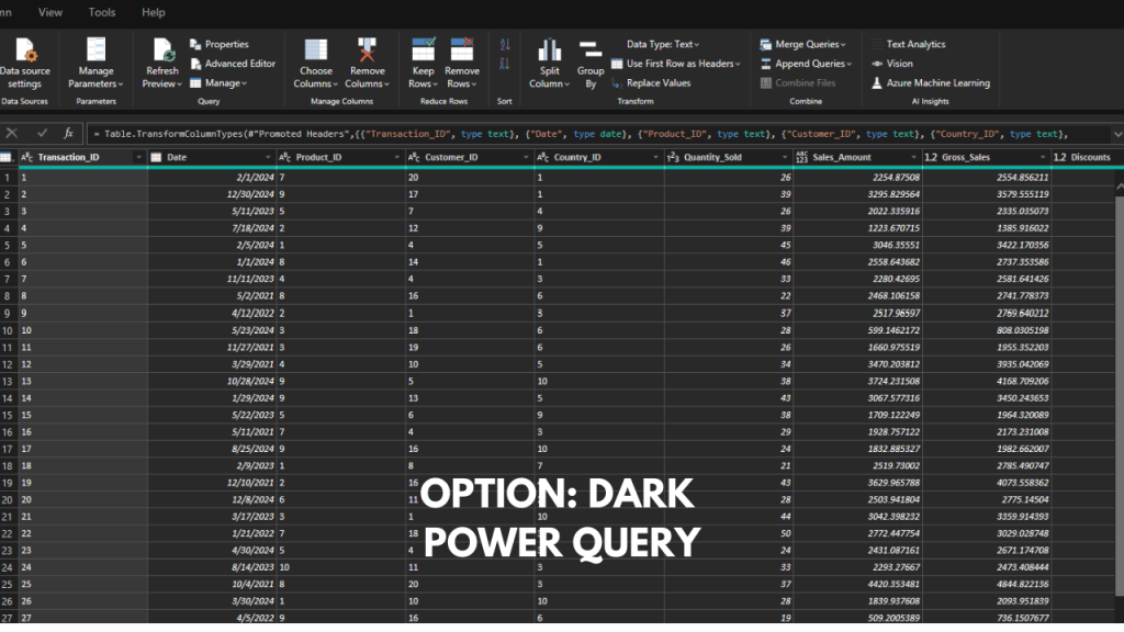
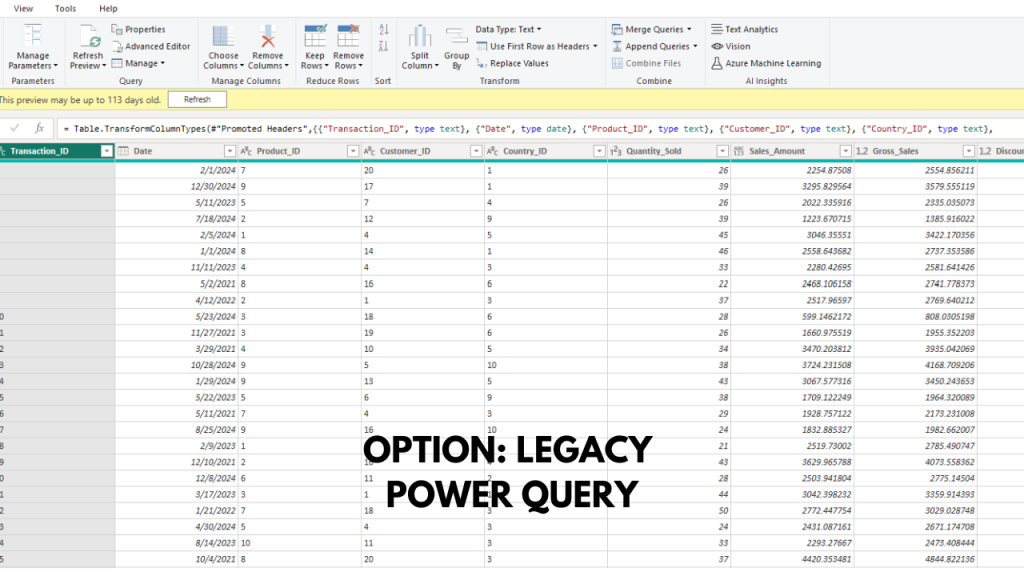
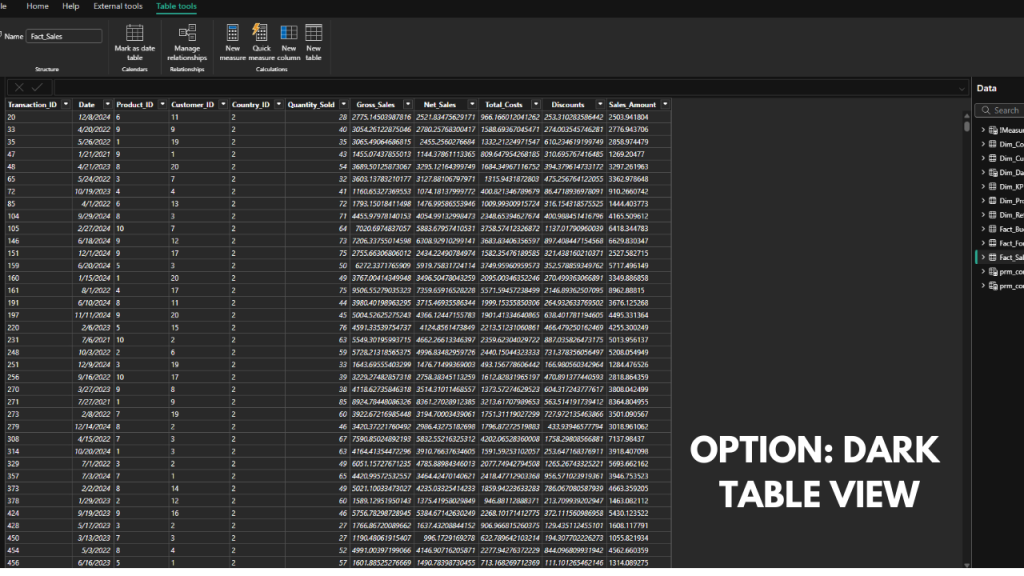
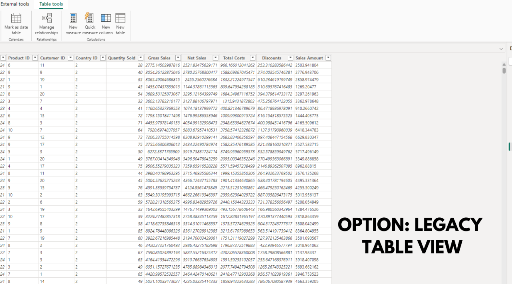
Table View: Legacy vs. Dark Mode
Legacy Mode:
- The Table View in legacy mode retains the familiar bright layout. Data grids and column headers are clear, but the default white background may feel overwhelming for users managing large datasets for hours.
- The light theme is suitable for well-lit environments but lacks the visual refinement of the dark theme.
Dark Mode:
- Dark mode in Power BI Table View adopts a rich black background, providing better visibility for numbers and text against the grid.
- This mode improves focus, especially when reviewing detailed tables with multiple rows and columns.
- For users with light sensitivity, the dark mode offers a more accessible and user-friendly alternative.
Data Model View: Legacy vs. Dark Mode
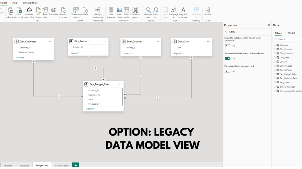
Legacy Mode:
- In Data Model View, the legacy mode uses a white canvas for displaying relationships between tables. While functional, the brightness can be visually fatiguing during long sessions.
- The light background ensures all connections and tables are visible but can feel dated compared to modern UI trends.
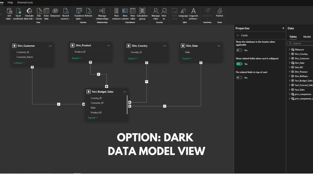
Dark Mode:
- The dark option in Power BI Data Model View introduces a stylish black canvas with white text for table names and field labels. This not only enhances the interface’s look but also improves usability by reducing distractions.
- Connections between tables stand out more clearly, making it easier to analyze data relationships in complex models.
Areas Not Affected by Dark Mode
| Area | Remaining Unaffected |
|---|---|
| Canvas | Retains the default light mode to provide clarity and avoid any visual inconsistencies with report visuals. |
| Filter Pane | Stays in light mode to ensure contrast and visibility when filtering data for reports. |
Benefits of Power BI Dark Mode
Using dark mode in Power BI offers numerous advantages:
- Enhanced Focus and Productivity: The dark theme helps you stay focused by reducing visual distractions.
- Reduced Eye Strain: Especially useful for those working in low-light environments.
- Customization and Flexibility: You can easily switch between themes (dark, light, legacy, system default) based on your preference.
Common Issues with Power BI Dark Mode
While dark mode is a great addition, there are some current limitations:
Visibility Problems in Advanced Filtering Options
Some users have reported issues with the advanced filtering options not being visible when dark mode is enabled. This problem can affect the workflow and data analysis process. However, Microsoft is aware of these issues and is likely to address them in future updates.
Potential Workarounds for Visibility Issues
If you encounter visibility problems, consider the following workarounds:
- Temporarily switch back to light mode while using advanced filters.
- Use high contrast mode as an alternative, if available.
How Does Dark Mode Compare to Other Microsoft Applications?
Consistency Across Microsoft Apps
The dark mode in Power BI seamlessly aligns with the themes available in other Microsoft applications like Teams, Outlook, and Office. This consistency creates a cohesive experience for users who frequently switch between different Microsoft tools.
Notable Differences in Implementation
Unlike some applications where dark mode applies universally, Power BI’s implementation is more selective. Areas like the canvas and filter pane remain unaffected, retaining their default light appearance. While this ensures flexibility for certain workflows, it may feel inconsistent to some users. Future updates could address these differences based on user feedback.
How to Customize Your Power BI Experience with Themes
You can customize Power BI using the available theme options:
- Dark: For a modern look and reduced eye strain.
- Light: The traditional theme for those who prefer a brighter workspace.
- Legacy Colors: Retains the original Power BI color scheme.
- System Default: Adapts to your operating system’s settings.
Pros and Cons of Each Theme
| Theme | Pros | Cons |
|---|---|---|
| Dark | Reduces eye strain, modern look | Visibility issues with certain elements |
| Light | Familiar and default setting | May cause eye strain in low-light environments |
| Legacy Colors | Original Power BI experience | Lacks the modern appeal of dark mode |
| System Default | Automatically matches OS settings | Less control over the appearance |
Other Options to Use Dark Mode for Visuals and Canvas Background
If you want to apply a dark theme to visuals or canvas backgrounds, you can use several methods, though they require some setup:
- Disconnected Table or Measures: Create a table or measures that allow switching between light and dark themes manually.
- Switch Values or Bookmarks: Use bookmarks to toggle between different themes. This requires more time and logic to set up but offers greater customization.
These methods are not optimal for every user due to the complexity and time required, but they provide alternatives until a full dark mode is available across all elements.
Check out my article on dark themes which explains how you can find dark themed color palettes and how to implement it in Power BI:
FAQs Power BI Dark Mode
FAQs: Power BI Dark Mode
Can dark mode be scheduled to turn on/off?
Not currently. Users need to switch manually via settings.
Does the dark mode affect visuals and the color theme?
No, the colors of visuals and the color theme remain the same. Only the data pane, visualization pane, the pane on top, and the data model are affected.
Is dark mode available for all versions of Power BI?
It should be available for the latest version (September 2024), but some users have reported it missing.
Does dark mode affect data processing or performance?
No, dark mode is purely a visual change and does not impact the performance.
How does dark mode impact accessibility features?
It enhances readability for some users but may present challenges for others due to visibility issues.
Conclusion: Legacy vs. Dark Mode Power BI Desktop
The addition of Power BI Dark Mode is a fantastic feature, offering flexibility and a modern aesthetic. It’s great for reducing eye strain, especially during late-night work, and provides a polished look across key views like Power Query and Data Model View.
Personally, I appreciate having the option, but I still work 80-90% of the time in light mode, as I find it more familiar and easier to navigate. In Table View, dark mode sometimes feels harder to read, but that could just be me needing more time to adjust.
Overall, dark mode in Power BI Desktop is a step forward. It may not replace legacy mode for everyone, but it’s a valuable option that caters to different working preferences and environments. Give it a try—you might find it a game-changer for your workflow!
More on color themes and dark modes in my related blog posts:
Interested to see some more interesting Power BI use cases?
Check out my sales dashboard use case below!

