Table of contents
Introduction
For new Power BI users, the terms “dashboard” vs “report” are often used interchangeably, leading to confusion about their true purposes. While both dashboards and reports are critical components of Power BI, they serve distinct roles in data visualization and analysis. As a Power BI developer, I’ve noticed that this confusion often arises because dashboards and reports can look similar, especially to new users. However, their functionality and use cases differ significantly.
From my perspective, Power BI reports vs dashboards are not interchangeable. I rarely use dashboards in my workflow, as my approach focuses on building semantic models and connecting individual reports to deliver tailored insights to stakeholders. This guide will clarify the distinctions between Power BI dashboard vs report, highlight practical use cases, and explain when to use each. By the end, you’ll understand how to leverage both tools effectively, whether you’re exploring dashboard vs report Power BI functionality or deciding how to integrate them into your workflow.
Infographic: Power BI Dashboard vs. Report
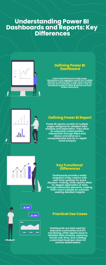
For those who prefer a quick overview, this infographic highlights the key differences between a Power BI dashboard vs. report. It also addresses common questions about Power BI report vs. dashboard and explains when to use each. Whether you’re comparing a dashboard vs. report in Power BI for your project, this visual guide offers a fast and clear summary to help you decide. Scroll down for a more detailed explanation!
What is a Power BI Dashboard?
Dashboard vs Report Power BI
A Power BI dashboard is a single-page visualization that aggregates visuals from multiple datasets or reports, providing a high-level overview of key metrics. Dashboards are created exclusively in the Power BI Service and are not available in Power BI Desktop.
Key Features of Power BI Dashboards:
- Aggregation of Visuals: Dashboards allow users to pin visuals from multiple reports and datasets, even if they are not connected, making them excellent for unifying KPIs from different sources.
- Real-Time Updates: Dashboards update automatically when the underlying data changes, making them ideal for live monitoring.
- Data Alerts: Dashboards support notifications when metrics hit specific thresholds, allowing proactive responses. Learn more about data alerts and how to set them up. Read my detailed blog post guide!
- Static yet Navigational: While dashboards themselves are static, they provide links to underlying reports for deeper exploration.
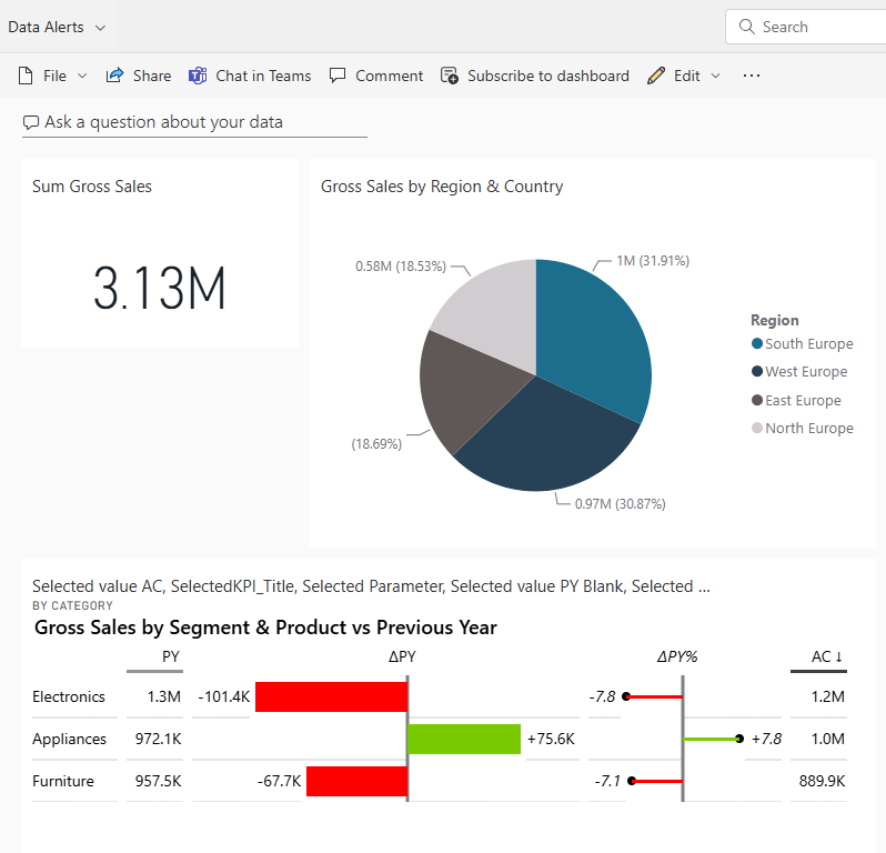
Example of a dashboard with 3 pinned visuals from different reports:
Practical Use Cases for Power BI Dashboards:
- Executive Overviews: Dashboards deliver quick snapshots of performance metrics for decision-makers.
- Monitoring KPIs: With real-time updates, dashboards are perfect for tracking key metrics across multiple departments.
- Cross-Functional Metrics: They excel in aggregating visuals from unrelated reports into one unified view.
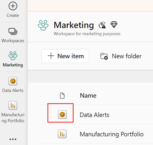
How do you recognize a dashboard in the Power BI Service workspace? Look for the symbol with the KPI needle. This is your dashboard. The other example is a classic Power BI report!
What is a Power BI Report?
Report vs Dashboard Power BI
A Power BI report is a multi-page tool designed for detailed data exploration and analysis. Reports are created in both Power BI Desktop and Power BI Service, offering flexibility in design and interactivity.
Key Features of Power BI Reports:
- Multi-Page Layout: Reports allow users to organize visuals across multiple pages, enabling comprehensive analysis.
- Interactivity: Reports provide interactive elements like slicers, drill-throughs, and filters for in-depth exploration.
- Advanced Customization: Reports can be tailored to specific needs using custom visuals, advanced data modeling, and semantic models.
- Granular Data Exploration: Reports are ideal for delving into detailed trends and data relationships.
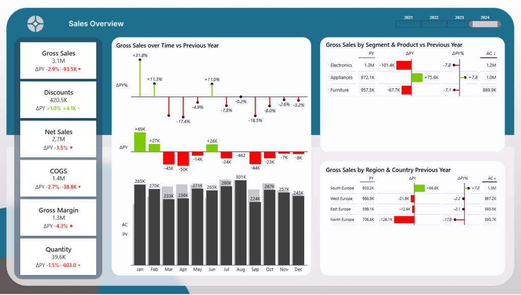
Below an example of a Poer BI Sales Report. Curious about this sales vs actuals report? Check out my portfolio item with step-by-step explanations and free Power BI desktop template to download!
Practical Use Cases for Power BI Reports:
- Detailed Analysis: Analysts can dive deep into granular data to identify patterns and insights.
- Exploring Trends: Reports help uncover trends across time, regions, or product categories.
- Tailored Reporting: Businesses can create specific views for different teams or stakeholders.
Key Features of Power BI Dashboards:
Here’s a side-by-side comparison to help you understand their distinctions:
| Feature | Power BI Dashboard | Power BI Report |
|---|---|---|
| Overview | Single-page, high-level view combining visuals from multiple reports. | Multi-page, in-depth analysis tool for exploring data trends. |
| Creation Environment | Created in Power BI Service only. | Created in both Power BI Desktop and Service. |
| Customization | Limited to arranging and resizing pinned visuals from various reports or datasets. | Extensive, allowing advanced data modeling, custom filters, and tailored visualizations. |
| Interactivity | Low interactivity; primarily static but links to detailed reports for further exploration. | Highly interactive with options to drill down, apply slicers, and navigate multiple pages. |
| Real-Time Data | Supports real-time data updates, ideal for monitoring live metrics. | Can use real-time data but primarily designed for analyzing historical trends. |
| Data Exploration | Focuses on summarizing key metrics for quick decision-making. | Enables deep dives into granular data for detailed insights and trend analysis. |
| Sharing | Shared via Power BI Service and accessible through apps. | Can be exported, shared, and embedded into other applications or services. |
| Collaboration | Allows viewing by multiple stakeholders but lacks real-time collaboration features. | Supports collaborative data analysis with shared filters and interactive sessions. |
| Best Use Case | Quick overviews and KPI monitoring for executives or high-level stakeholders. | Detailed data exploration and custom analytics for data professionals and marketers. |
| Accessibility | Easily accessible via Power BI apps or web browsers. | Requires Power BI Desktop for advanced editing but can also be accessed via apps and browsers for viewing. |
Why I Rarely Use Dashboards as a Power BI Developer
As a Power BI developer, my workflow revolves around creating semantic models and connecting individual reports to distribute visuals and insights via apps. This approach makes dashboards unnecessary for most scenarios. Reports provide the interactivity and detail required for analysis and decision-making.
That said, dashboards shine in specific contexts, such as combining visuals from unrelated reports or setting up real-time alerts for dynamic metrics. Understanding when to use dashboards vs reports is key to maximizing Power BI’s potential.
Practical Use Cases for Power BI Reports
Reports are essential when in-depth data exploration and tailored insights are required. Here are specific scenarios where Power BI reports excel:
- Interactive Analysis:
- Empower users to interact with data dynamically through slicers, filters, and drill-through capabilities.
- For example, a sales manager can drill into monthly sales data by region or product category to identify top-performing areas or products.
- Trend Exploration:
- Analyze and visualize data trends over specific periods, helping to uncover seasonality or long-term growth patterns.
- For instance, an operations team might explore production output trends across multiple factories to pinpoint bottlenecks or inefficiencies.
- Customized Reporting:
- Design reports tailored to specific business needs by leveraging semantic models and creating unique visuals.
- For example, a marketing department can build a report that tracks campaign performance, segmented by channels, demographics, and conversion rates.
These practical examples highlight how reports can deliver actionable insights across various business functions, making them indispensable for decision-makers seeking deep, customized analyses.
Frequently Asked Questions
FAQ
What is the difference between a Power BI dashboard and a report?
A dashboard provides a single-page overview of key metrics, while a report offers detailed, multi-page data analysis.
When should I use a Power BI dashboard?
Dashboards are best for high-level overviews or setting data alerts. Learn more about data alerts here.
Can I use dashboards and reports together?
Yes, dashboards can link to underlying reports for a comprehensive data strategy.
How can I identify a dashboard vs. a report in a Power BI workspace?
In a Power BI workspace, dashboards are marked with a grid-like icon, while reports are represented by a bar chart icon. Dashboards are typically single-page, whereas reports will show multiple pages when opened.
Are dashboards or reports better for sharing insights with executives?
Dashboards are better suited for executives who need a quick, high-level summary of key metrics. They provide real-time updates and a consolidated view from multiple datasets.
Can I create a dashboard in Power BI Desktop?
No, dashboards can only be created in Power BI Service. However, you can design and build reports in Power BI Desktop, which can then be used to pin visuals to dashboards.
What are the limitations of Power BI dashboards?
Dashboards are static and do not allow detailed data exploration or filtering within the same view. They rely on underlying reports for interactivity and deeper analysis.
What are the advantages of using Power BI reports?
Reports are ideal for detailed data exploration, enabling interactive analysis with filters, drill-downs, and custom visuals. They also support multiple pages for organizing complex datasets.
Can I pin a visual from one report to multiple dashboards?
Yes, you can pin a visual from a single report to multiple dashboards, allowing you to reuse key metrics across various high-level views.
Conclusion
Understanding the distinctions between Power BI dashboards vs reports is critical for using these tools effectively. Dashboards excel at providing high-level, real-time overviews, while reports are unparalleled for detailed analysis and exploration. By choosing the right tool for your needs, you can unlock the full potential of Power BI.
Ready to take your Power BI skills to the next level? Start mastering dashboards and reports today to transform your data into actionable insights. Explore more Power BI tips and tricks or get in touch to elevate your data strategy!

