Table of contents
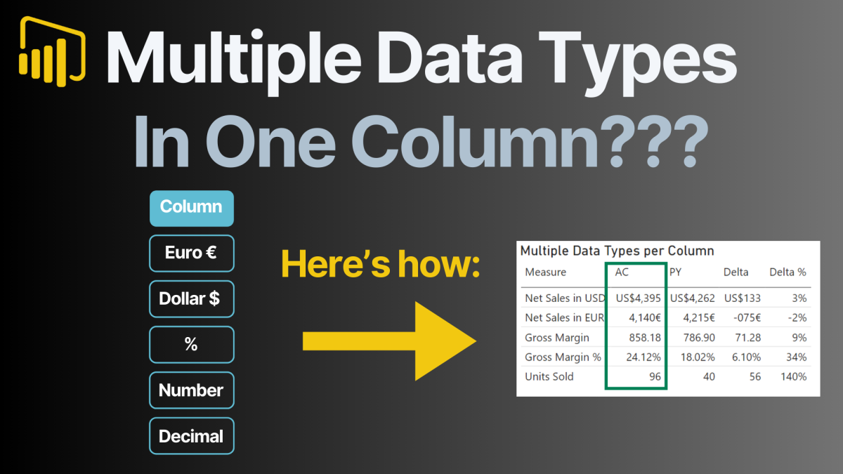
Displaying multiple data types in a single column within Power BI isn’t supported natively, but with some creative workarounds, you can achieve dynamic visuals that accommodate different data formats like percentages, currencies, and numbers. This step-by-step guide will show you how to leverage disconnected tables, DAX measures, and dynamic formatting to build a Power BI table that displays dynamic values with multiple data types.
Why Power BI Doesn’t Support Multiple Data Types in One Column Natively
Power BI’s columns are designed to store a single data type—text, numbers, dates, etc.—making it impossible to directly combine percentages, currencies, and other formats into one column. However, when creating a table or matrix visual, you can use DAX measures to dynamically display values with different formats. This workaround provides flexibility for presenting data in diverse formats while maintaining a seamless visual experience.
Dynamic values allow developers to tailor their reports to end users’ needs, increasing interactivity and usability.
Step-by-Step Guide to Dynamic Values with Multiple Data Types in Power BI
Follow these steps to create a Power BI table that dynamically displays values with different data types.
Step 1: Create a Disconnected Table
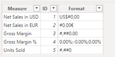
A disconnected table is essential for implementing dynamic values in Power BI, as it provides the structure needed to manage diverse data types in a single column. In this case, the table acts as a lookup for both the measures and their corresponding formats. Here’s how to set it up and how the format column works:
Creating the Disconnected Table:
- Open Power BI Desktop and create a new table manually or using the “Enter Data” option.
- Name the table (e.g.,
MeasureSelection) and include two key columns:- Measure: This column contains the names of the KPIs, such as “Net Sales in USD,” “Gross Margin %,” and “Units Sold.”
- Format: This column specifies the display format for each KPI. For example:
- US$ #,##0 for currency in USD.
- € #,##0 for currency in EUR.
- 0.00% for percentage values.
- #,##0 for whole numbers
How the Format Column Works:
- The Format column provides the exact format string that Power BI will apply dynamically to the selected measure.
- These format strings are compatible with Power BI’s built-in formatting capabilities, ensuring that each value displays in the correct way—whether as a currency, percentage, or number.
- When combined with a dynamic measure and the
SELECTEDVALUEDAX function, Power BI can retrieve the format string corresponding to the selected measure and apply it to the visual.
| Measure | ID | Format |
|---|---|---|
| Net Sales in USD | 1 | US$ #,##0 |
| Net Sales in EUR | 2 | € #,##0 |
| Gross Margin | 3 | #,##0.00 |
| Gross Margin % | 4 | 0.00%;-0.00%;0.00% |
| Units Sold | 5 | #,##0 |

Below are some typical data formats that you can copy and use:
| Format | Description |
|---|---|
| #,##0.00 | Standard numeric format with two decimals |
| #,##0 | Whole number format |
| #,##0,, “M” | Numeric format for values in millions (e.g., 1,000,000 as 1M) |
| #,##0,, “K” | Numeric format for values in thousands (e.g., 1,000 as 1K) |
| US$ #,##0.00 | Currency format with two decimals (USD) |
| € #,##0.00 | Currency format with two decimals (EUR) |
| ₹ #,##0.00 | Currency format with two decimals (INR) |
| 0.00% | Percentage format with two decimals |
| +0.00%;-0.00%;0.00% | Custom percentage format for positive/negative/zero values |
| #,##0.0000 | Numeric format with four decimals |
| +0.00;-0.00;0.00 | Custom format for positive/negative/zero numeric values |
| $#,##0;($#,##0);0 | Currency format with parentheses for negative values |
| #,##0.00;(#,##0.00);-“ | Numeric format with parentheses for negative values |
Step 2: Defining DAX Measures for Multiple Data Types in a Single Column
Define DAX measures for each KPI based on your dataset. Here are a few examples:
Sum Net Sales USD =
SUM(Sales_Data[Net Sales in USD])

Sum Gross Margin =
SUM(Sales_Data[Gross Margin])

Avg Gross Margin % =
AVERAGE(Sales_Data[Gross Margin %])

Sum Units Sold =
SUM(Sales_Data[Units Sold])
These measures will calculate the values displayed in your table.
Step 3: Using SWITCH Function to Combine Multiple Data Types in Power BI
Create a dynamic measure that combines all individual measures based on the selected KPI. Use the SWITCH function for this:
Selected Measure Value AC =
SWITCH(
    SELECTEDVALUE(MeasureSelection[Measure]),
    "Net Sales in USD", [Sum Net Sales USD],
    "Net Sales in EUR", [Sum Net Sales EUR],
    "Gross Margin", [Sum Gross Margin],
    "Gross Margin %", [Avg Gross Margin %],
    "Units Sold", [Sum Units Sold]
)
This measure dynamically selects and calculates the value for the chosen KPI.
Step 4: Apply Dynamic Formatting
Dynamic formatting ensures that each value is displayed in its appropriate format. Use the SELECTEDVALUE function to fetch the format from the disconnected table:
- Navigate to the “Modeling” tab in Power BI.
- Select the
Selected Measure Value ACmeasure. - In the format field, enter this expression:
SELECTEDVALUE(MeasureSelection[Format], "")

Power BI will now apply the correct format dynamically based on the selected KPI.
Step 5: Build the Table or Matrix Visual
To display the dynamic values:
- Create a new table or matrix visual in your Power BI report.
- Add the
Measurecolumn from theMeasureSelectiontable to the rows field. - Drag the
Selected Measure Value ACmeasure into the values field.
Your table will now display dynamic values with their respective formats.
Example: Displaying Multiple Data Types in Power BI Table
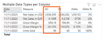
Here’s an example of a Power BI table showing dynamic values with different data types:

This table demonstrates the power of using dynamic measures and formatting in Power BI to display multiple data types within a single column. By leveraging techniques like disconnected tables, DAX calculations, and dynamic formatting, it is possible to showcase values such as currencies, percentages, and whole numbers all in one column. This approach allows for greater flexibility and enhances the visual appeal of reports, enabling users to consolidate diverse data formats into a single, cohesive view.
This technique is especially valuable for creating professional, interactive dashboards that provide clear and intuitive insights to end users.
Access My Power BI Desktop File for Free
Implementing dynamic values with multiple data types in a single column can be a challenging yet rewarding task in Power BI. By following the steps outlined in this guide—creating a disconnected table, defining DAX measures, and applying dynamic formatting—you can produce professional and interactive reports. However, I understand that recreating these techniques from scratch might take some time, especially if you are new to DAX or Power BI’s advanced features.
To make this process easier for you, I’ve prepared a fully functional Power BI Desktop file where all the steps are pre-configured. This file includes a sample disconnected table, pre-built dynamic measures, and examples of various data formats for currencies, percentages, and more. You can use it as a reference or even adapt it to your specific datasets and requirements. Download it for free and start building your own dynamic visuals effortlessly!
Here the link:
Conclusion
Dynamic formatting and the ability to display multiple data types in a single column are powerful techniques for creating interactive and user-friendly Power BI dashboards. By leveraging disconnected tables and DAX measures, you can overcome Power BI’s native limitations and design visuals that present complex datasets in a clear, cohesive way. This approach is especially valuable for businesses that need to report on diverse KPIs with varying formats, such as sales figures, profit margins, and growth percentages.
I hope this guide inspires you to explore the full potential of Power BI’s capabilities. Ready to dive in? Download my free Power BI Desktop file and start experimenting with these techniques today. Feel free to share your feedback or ask questions in the comments—I’d love to hear how this helped you transform your reports!
Looking for more inspiration to level up your Power BI reporting?
Check out my blog post series: 8 Tips to Create an Interactive Power BI Dashboard

