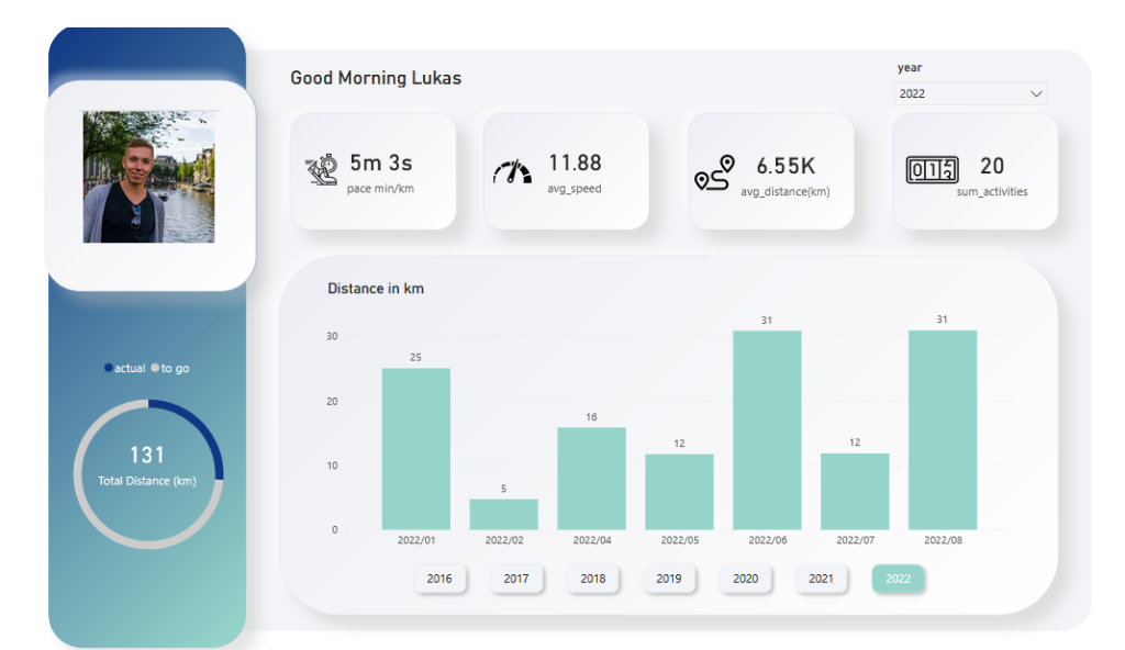
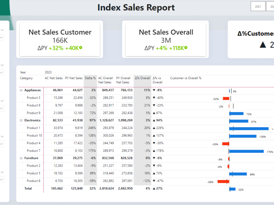
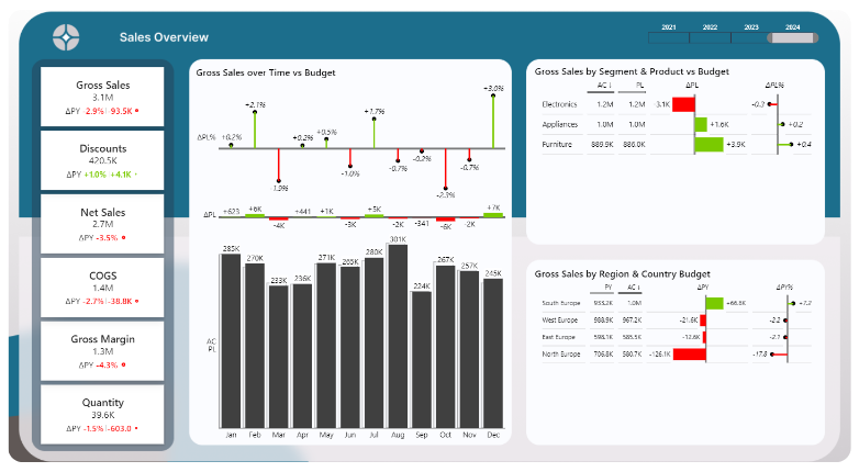
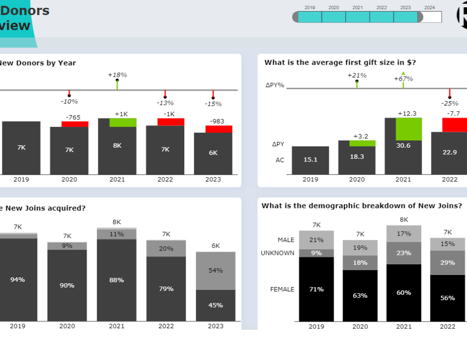
Here’s how I got an interactive dashboard about my Runtastic data for free!
When I am running, I usually bring my phone and the runtastic app with me. Later, I then look at the statistics to analyze my performance, time or distance. When opening the app, you can see some statistics but to access further details, one need to pay the premium. So I thought. Why should I pay for that service if i can do it myself?
Everyone can get their personal data from runtastic upon request by logging in to their website and making a request. After 1 day, I received many files and folders via a ZIP file in my email. First, I explored the data using Python. You can read my code and methodology here.
After cleaning, re-organizing and adding new columns it was time to connect the data to with PowerBI. The output from the python code was an excel file which can be easily uploaded to PowerBI. My goal was to make an “app-like” report, where the design is called Neumorphism. The report especially stands out with its modern interface and a neat design. It leverages PowerPoint to create stunning backgrounds and PowerBI to visualize the data.

Interested to get a similar solution tailored to your needs?
Feel free to get in touch with me 🙂


