About the data
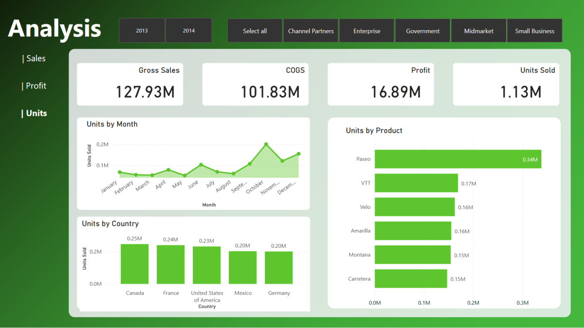
This data comes directly from PowerBI and serves as example data. It includes Financial transactions such as Segment, Country, Product, Sales, COGS, Profit and more. The design follows a modern approach with the goal to keep a neat and simple but at the same time informative as well.
Methods used
The report combines many functionalities from PowerBI to make it truly interactive and easy to read. The design was created in PowerBI. Many color combinations are possible, but for this design I chose a gradient color mix of dark-green to green.
- Four main KPI cards on the top highlighting the most relevant KPIs
- The visuals include bar charts as well as a line chart to display sales, profits or units over time.
- Slicer panel on top to easily filter by Segment
- Year slicer to chose the year
- Bookmark navigation to easily switch the visuals for Sales, Profit and Units.
Result
Below you can see the final result.
Video of the report:


