Introduction
Struggling to attract new donors? Unsure of how to keep current ones engaged? Non-profit organizations often face these challenges, coupled with a lack of visibility into revenue streams and marketing ROI. This is where a comprehensive Power BI non-profit donor analysis dashboard comes into play. In this portfolio project, I’ll walk you through the creation of a Power BI nonprofit dashboard including financial insights. This report was designed to tackle these issues head-on for a large US-based non-profit organization. The project was a real-world use case, supported by a great team with constant feedback loops. This ensured that the dashboard met the organization’s needs.
The preparation included a predefined document containing key questions to be answered and the views to be included. This approach ensured the accuracy of the insights provided. Additionally, it ensured that the dashboard is relevant and actively used in daily decision-making processes. The project involved navigating a complex MS Azure data structure. Tables were disconnected and combining them into a perfect star schema was impossible. It took significant effort and some creative DAX tricks in Power BI to build the final data model.
Please note that all data displayed are not real. They are manipulated for data security reasons. The message to the users is the same though:
Problem Statement
The primary challenge was to develop a Power BI non-profit report for donor analysis. In the project, I used a MS Azure Database accessing many disconnected fact and dimension tables. This makes it difficult to gain a unified view of donor data. As I was not the database admin, I couldn’t restructure the tables into an ideal star schema. Star schema simplify the data modelling process and improve performance. Despite these challenges, I successfully created a robust data model using advanced DAX techniques, enabling the generation of valuable insights. Continuous feedback loops and collaboration ensured a smooth implementation of the nonprofit financial dashboard. By doing this we ensured the final product was both accurate and user-friendly.
Key Features and Insights of power bi non profit dashboaord
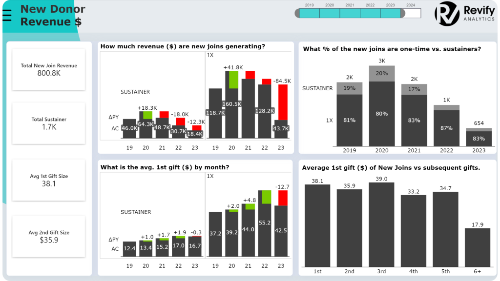
New Donor Acquisition
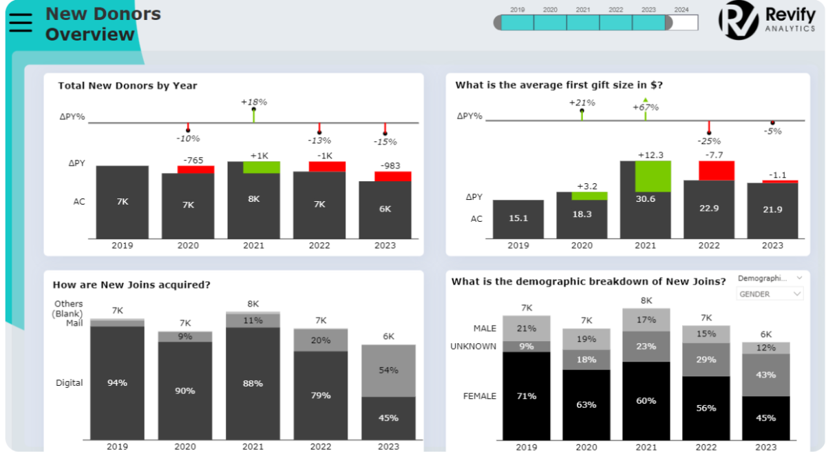
- Overview of New Donors: The Power BI non-profit dashboard provides an instant overview. See how many new donors the organization has gotten, comparing year-over-year data to identify growth or decline trends. This is crucial for donor acquisition channels analysis.
- Channel and Demographic Insights: Identify the acquisition channel of donors for further insights. Moreover, we can identify their first gift size, and their donor demographics background.
- Interactive Visuals: The interactive dashboard allows users to switch between different visual types. Such as bar charts, line charts, and waterfall charts, depending on their preference, showing Power BI visual customization.
- Drill-Down Capabilities: Red areas on the charts highlight negative trends. Looking at this allows users to drill down into specific donor segments or channels to understand the underlying causes.
Donor Retention Analysis
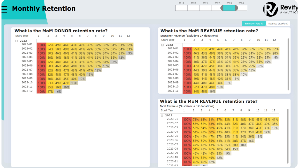
- Cohort Analysis: The Power BI non-profit dashboard uses cohort analysis to track donor retention over time. For example, the January 2023 cohort retained 52% of donors by February, but only 32% remained active by December. This is key for understanding donor lifecycle.
- Retention Strategies: By understanding these patterns, non-profits can refine their donor engagement strategies to improve retention rates.
- Relative and Absolute Views: Users can toggle between relative and absolute numbers to gain deeper insights into cohort behavior, optimizing donor retention strategies.
Acquisition Year Analysis
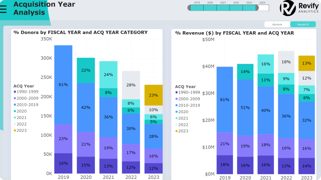
- Long-Term Supporter Trends: This tool categorizes donors based on the year they started contributing, tracking their engagement and revenue contribution over time. This helps in understanding trends in donor loyalty programs.
- Flexible Data Views: Users can switch between relative and absolute numbers, with pop-ups providing detailed insights into individual years, which is crucial for recognizing long-term donor relationships.
- Nurturing Long-Term Relationships: By identifying donors who continue to contribute significantly, non-profits can focus on nurturing long-term relationships to maximize impact.
Gift and Revenue Distribution
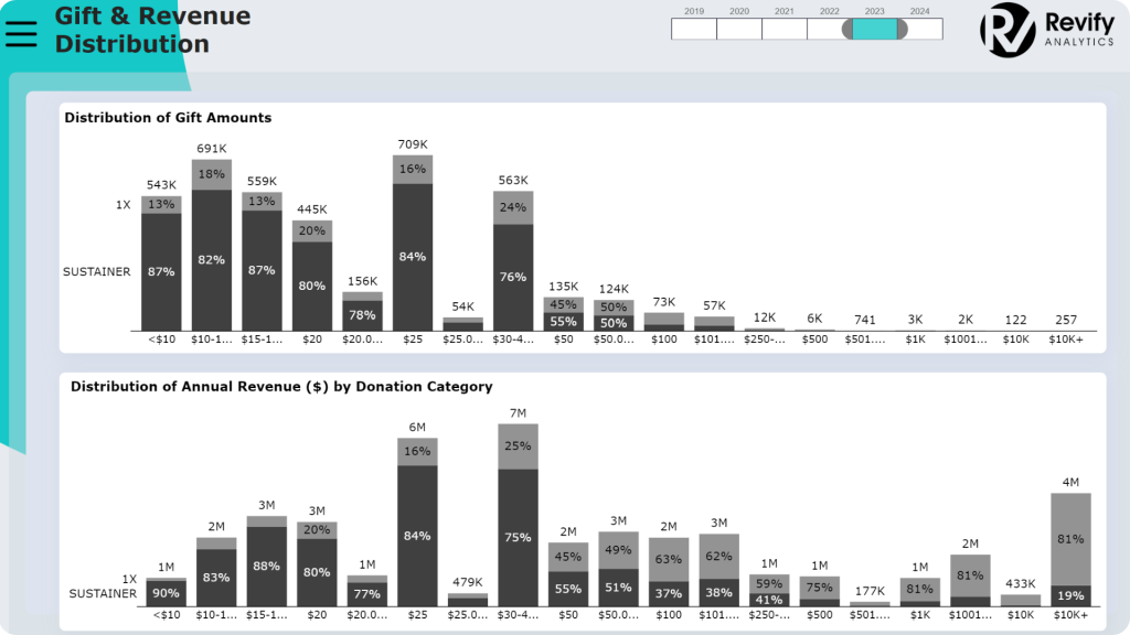
- Donation Behavior Insights: Donors are categorized by donation amounts, from $5 to over $500, with charts showing the distribution and financial impact of each category. This provides a clear picture of donor segmentation.
- Revenue Drivers: While most donations fall between $10 and $20, significant revenue comes from donations in the $25 to $49.99 range and high-level donations exceeding $10,000. This is essential for understanding donation volume impact.
- Tailored Engagement Strategies: These insights help non-profits develop tailored engagement strategies to encourage larger contributions and improve fundraising effectiveness.
Marketing Return on Investment (ROI)
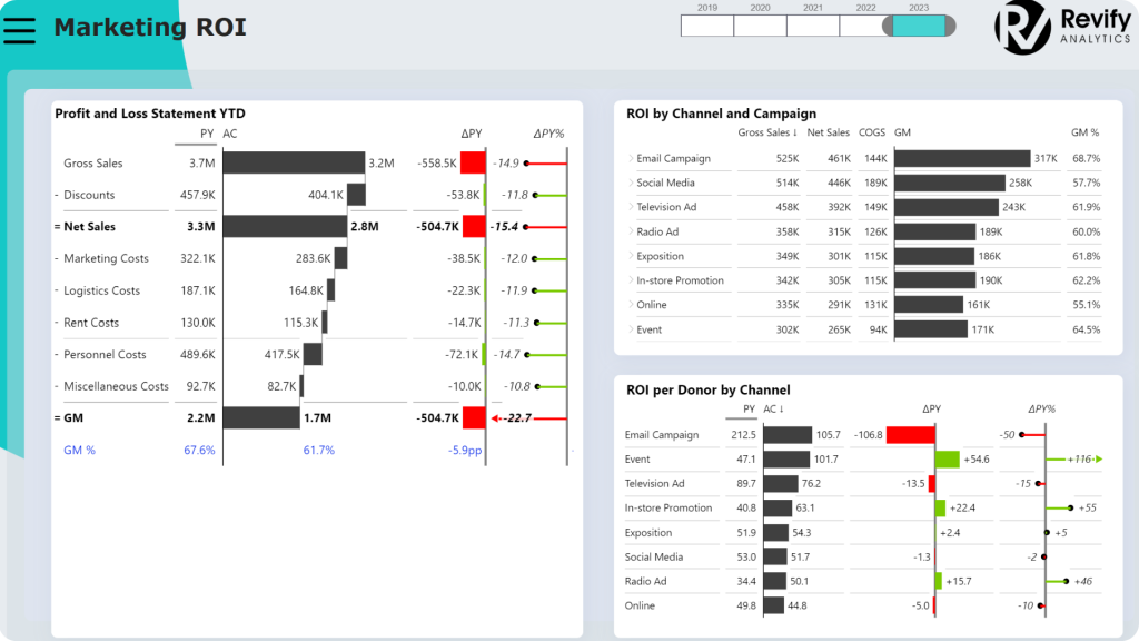
- Channel and Campaign Profitability: The Power BI non-profit dashboard includes a detailed analysis of the ROI for each marketing channel and campaign, showing gross margin and profitability, crucial for non-profit marketing strategies.
- Waterfall Chart Analysis: A waterfall chart highlights income, costs, and gross margin, providing a clear picture of financial performance analysis.
- Interactive Analysis: Users can click on a specific channel or campaign to see how it impacts overall financial performance, helping to optimize marketing channel profitability and fundraising effectiveness.
Conclusion: Power BI non profit dashboard
Building this Power BI non-profit donor analysis dashboard required navigating significant challenges, particularly with the disconnected data structure in MS Azure. However, by leveraging advanced DAX techniques and an intuitive interactive dashboard design, I was able to create a powerful tool that offers non-profits valuable insights into their donor base. The project was a real-world use case for a large US-based non-profit, and the collaborative approach, with constant feedback loops and a predefined document outlining key questions and views, ensured the final product’s accuracy and daily usability.
From understanding new donor acquisition and retention to analyzing marketing ROI, this Power BI non-profit dashboard empowers organizations to make data-driven decisions that enhance donor engagement and maximize impact. If you’re looking to transform your non-profit’s reporting capabilities, this project demonstrates how it can be done, even in the face of complex data challenges. I hope you liked this nonprofit dashboard example.
Contact me for custom nonprofit financial dashboard solutions. Elevate your insights and improve your business, today!
Curious about other Power BI use cases and portfolio projects? Check out my Sales Analysis dashboard created with Power BI for a large US-based manufacturing and wholesale company:
