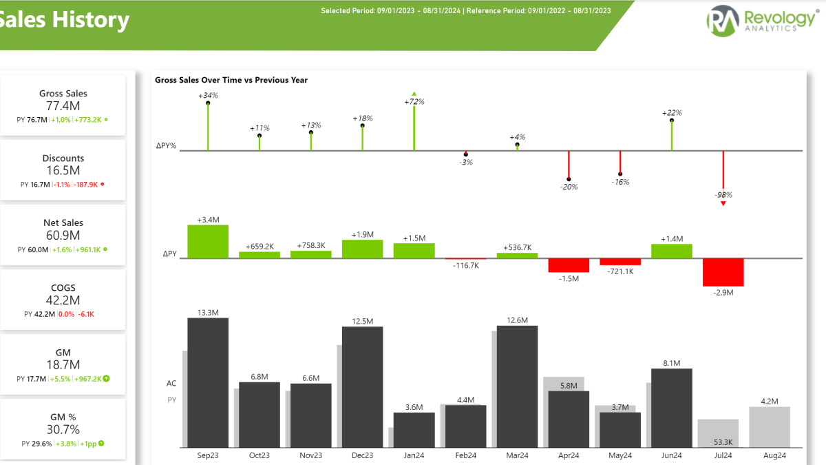
Table of contents
1. Initial Problem Statement
In today’s fast-paced business environment, organizations often struggle to manage and interpret vast amounts of sales data. The challenge is not just in data collection but in transforming that data into actionable insights that can drive strategic decision-making. Our client, a leading U.S.-based organization, faced several critical challenges related to analyzing their sales data. In Partnership with Revology Analytics I developed an integrated Power BI sales dashboard solution allowing for concrete and actionable insights.
- Disjointed Data Sources: Sales data was spread across multiple platforms, making it difficult to obtain a unified view of performance through a Sales Dashboard.
- Only Excel Based: Excel was the only go to visualization tool, leading to data silos and ineffective reporting with no single source of truth
- Inefficient Reporting Processes: Manual reporting methods were time-consuming, and the same tasks had to be carried out every time
- Limited Analytical Capabilities: Existing tools lacked advanced features such as drill-down analysis, making it hard to extract detailed insights from the Sales Dashboard.
- Need for Enhanced Visualizations: Existing reports did not provide intuitive and interactive visualizations to engage stakeholders via the Sales Dashboard.
| Quick Summary | Explanation |
|---|---|
| Problem |
|
| Our Approach |
|
| Impact |
|
2. Our Approach – Creating the Sales Dashboard
Understanding these challenges, we adopted a strategic approach to develop a Sales Dashboard that not only addressed these issues but also empowered the organization to harness the full potential of their data. Our Sales Dashboard Portfolio involved the following steps:
- Alignment with stakeholders: We had several sessions with stakeholders to understand the current business set-up and gathered requirements for the future sales dashboard solution
- Setting up an IT Infrastructure: As there was no centralized data warehouse, we set up a Azure database as a central storage and data access system
- Automating Data Processing: By automating data processing tools using alteryx we eliminated the need for manual and repetitive data processing and cleaning
- Single Source of truth: We consolidated data from various sources into a centralized Azure Database, ensuring seamless access to comprehensive sales data.
- Development and Feedback loops: Constant feedback loops ensured to be on track with data visualizations ensuring to maximize the value for the sales team
- Power BI Report: Power BI served as our main tool for distribution our sales dashboard solutions to dozens of employees across the organization ensuring access restrictions using Row Level Security and different views in the Power BI App.
3. The Solution – A Power BI Sales Dashboard
The Sales Dashboard we developed serves as a powerful tool for the U.S. organization, offering multiple views and capabilities. Note: All data has been anonymized to ensure data protection and data privacy rights aren’t violated:
Sales Dashboard: Overview
Our sales dashboard provides a comprehensive overview of gross sales over time, delivering insights at multiple levels of detail. The sales overview feature allows users to explore sales data by month and year, with the flexibility to drill down by year, quarter, month, and more. This level of granularity ensures that stakeholders can track sales performance precisely and accurately.
Key highlights of the sales overview include:
- Regional Insights: View sales data by region and state, enabling a geographical analysis of performance. This feature helps identify trends and opportunities within specific areas.
- Customer Analysis: Dive deep into customer data, exploring both main and sub-customer levels. This functionality allows for a detailed understanding of customer behavior and sales patterns.
- Product Breakdown: Analyze sales by product, offering insights into product performance and trends.
- Interactive Customization: The dashboard is fully interactive and customizable. Applying a filter to a region, customer, or product automatically updates all visuals, providing a cohesive and dynamic view of sales data.
- Comparison Metrics: Easily change between previous year, forecast, budget or a 3 year average, withing a click of a button.
- Easy KPI Switching: The image below shows Gross Sales across all visuals, however by simply clicking on the KPI cards on the left, all visuals automatically update to the selected KPI! (See video below for details)
- Calendar vs Fiscal vs YTD View: Easily switch between different views. Need fiscal year instead of calendar year? No Problem, our sales dashboard solution allows to change between custom year periods and YTD periods.
With these capabilities, the dashboard empowers users to make data-driven decisions, adapt strategies, and optimize sales processes effectively. The comprehensive overview helps users understand what happened, whether our performance is better or worse year over year. It guides you on which areas to focus on for improvement and growth.
The Power BI Sales Dashboard Overview Page
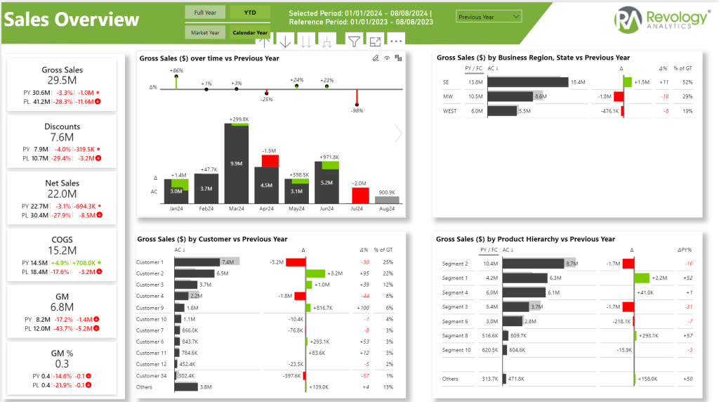
The visuals have been created using Zebra BI Custom visuals. They focus on delivering fast and actionable insights by comparing current year’s sales with previous year, budget or forecast. Easily detect if a region, product or customer is outperforming or underperforming by looking at the colours. Zebra BI is my main go to visual tool for creating visuals according to the International Business Communication Standards (IBCS). They do come with a fee. However, in my mind, they are absolutely worth it and make your life easier and help you making actionable decisions based on data.
Check out Zebra BI here (affiliate Link)
Profit and Loss View:
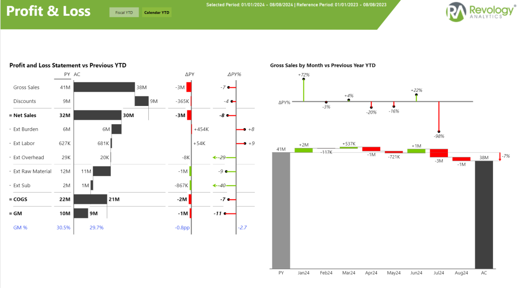
The Profit and Loss (P&L) view in the screenshot delivers a dynamic snapshot of financial performance, ranging from gross sales to gross margin. It tracks every financial metric, including net sales, a variety of costs, and the ultimate gross margin, offering insights into year-over-year changes. This level of detail is crucial for understanding the financial health of the organization and strategizing for future growth.
On the right, the sales dashboard features an engaging waterfall chart that vividly illustrates the monthly trends in gross sales. This visualization is not just about tracking numbers. It’s about uncovering the story behind each month’s performance. Whether it’s a spike in April or a dip in July, each change offers valuable insights into market dynamics and operational effectiveness.
This comprehensive analysis is invaluable as it provides a clear line of sight into the financial trajectory of the business, empowering stakeholders to make informed decisions that can steer the company towards sustained profitability and strategic adjustments throughout the fiscal year.
Interactive Sales Map:
The Power BI sales dashboard also features an interactive sales map of the USA, which is a powerful tool for visualizing sales distribution across different states. This map isn’t just a static display; it’s designed for user engagement and deep dive analysis.
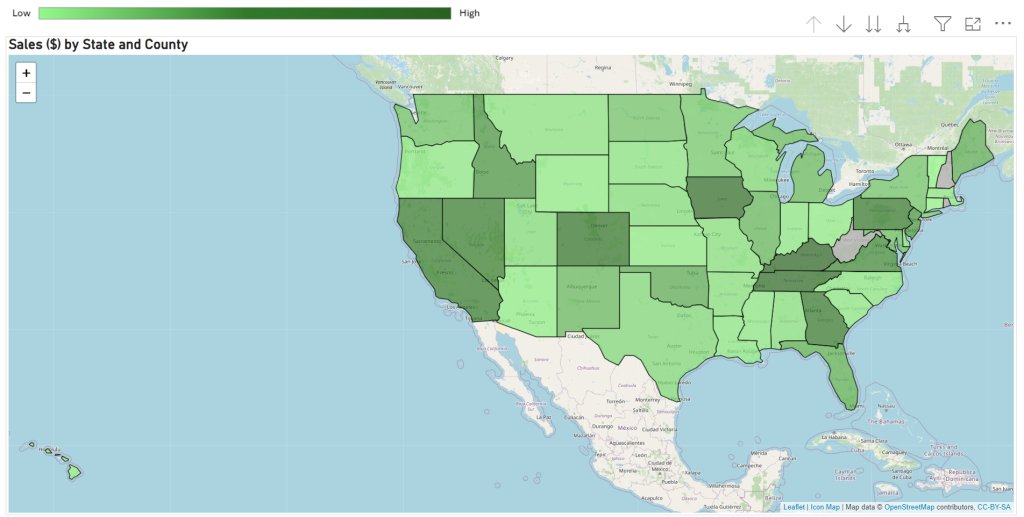
When you hover over each state, tooltips appear, providing detailed sales data by product and customer. This feature offers a quick snapshot of performance metrics and trends at a state level. This makes it easy to identify high-performing regions or areas needing attention.
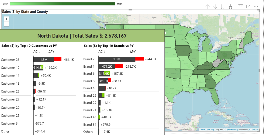
Moreover, the map allows users to drill down into more granular data by counties within each state. This drill-down capability enhances the analysis by revealing more specific geographic insights. This helps to pinpoint exact areas of strength or weakness. This level of detail is particularly valuable for strategic planning or targeted marketing campaigns. Moreover, it can help to optimize distribution channels based on regional sales performance.
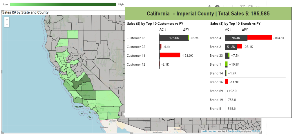
Overall, this interactive sales map serves as a crucial analytical tool, providing stakeholders with the necessary insights to make informed, data-driven decisions that can significantly impact the business’s regional strategies and overall success.
Sales Dashboard Video
Now you have seen a few screenshots and bullet points, however we created a video for you to better understand our approach and the interactive features of our sales dashboard solution.
4. The Impact of Our Power BI Sales Dashboard
The implementation of this Power BI sales dashboard had a transformative impact on the organization. By centralizing and automating the sales data reporting process, the following key benefits were achieved:
- Hundreds of Hours Saved: More than 50 sales representatives now save hundreds of hours each month previously spent on manual data preparation. This allows them to focus on strategic initiatives rather than data management.
- One Source of Truth: The sales dashboard eliminates data silos by consolidating all sales data into a single platform, ensuring consistent and trustworthy reporting. This fosters confidence in the data, as everyone in the organization is working with the same, accurate figures.
- Goodbye Excel Silos: No more fragmented Excel sheets across departments. The entire organization now operates from one platform, enabling seamless collaboration and comprehensive insights. With all data housed in one place, decision-makers can easily access and analyze key metrics.
- Better Decision-Making for Revenue Growth: With actionable insights at their fingertips, decision-makers can quickly identify high-performing products and customers, as well as underperforming areas. This enables targeted actions that prevent revenue loss and focus on boosting sales, ultimately leading to increased revenue.
This streamlined approach has not only enhanced efficiency but also empowered the organization to make data-driven decisions that drive both performance and profitability.
5. Conclusion
In conclusion, our Power BI sales dashboard is user-friendly and powerful. It unifies data from various sources into one platform. You get a complete view of your sales performance. Drill-down capabilities let you explore data in detail. Customize visualizations to uncover actionable insights. Quickly identify trends and opportunities. Make informed decisions that drive your business forward.
Our solution automates data processing and reporting. This saves time and reduces errors. Focus on growing your business with ease. Track performance with regional, customer, and product analyses. Let our dashboard boost efficiency and optimize strategies.
Got interested in stepping up your sales data game as well? Reach out to us today and get ready for actionable insights that improve your business performance.
Contact Me
Interested in a custom sales reporting solution with Power BI? Contact me today and have a first free call with me.
Curious about other use cases? Check out my blog post series how to make your Power BI reporting more interactive:
Thanks for reading this far 🙂

