Introduction
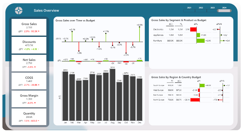
Hey there! I’m excited to share the details of my latest Power BI Dashboard example and portfolio—a Power BI sales budget vs actual dashboard. I built this dashboard using a dataset generated by ChatGPT, specifically to showcase my skills in data modelling, dynamic reporting, and advanced data visualization techniques. This dashboard is designed to provide actionable insights by comparing actual sales data with budgeted and forecasted figures across multiple dimensions like regions, product segments, and time periods.
Creating this dashboard involved several key steps, from generating the dataset and designing the data model to choosing the right visuals and adding interactive elements. I’m excited to walk you through the process and share some best practices I followed, like using a star schema to ensure data efficiency and maintain performance. If you want to dive deeper, you can download the Power BI file yourself and explore all the features up close!
This is a “fake dataset” generated with Chat GPT. Head over to my blog post to learn how to create a Power BI Portfolio dataset: how to create a dataset with Chat GPT:
My Power BI Portfolio Project: The Budget vs Actual Dashboard
Overview of My Power BI Dashboard Example
This Power BI dashboard example was built to provide a comprehensive view of sales performance by comparing actual results against budgets and forecasts. It’s designed to answer key business questions: Which regions are meeting their sales targets? Which product lines are underperforming? What trends can we identify over different time periods?
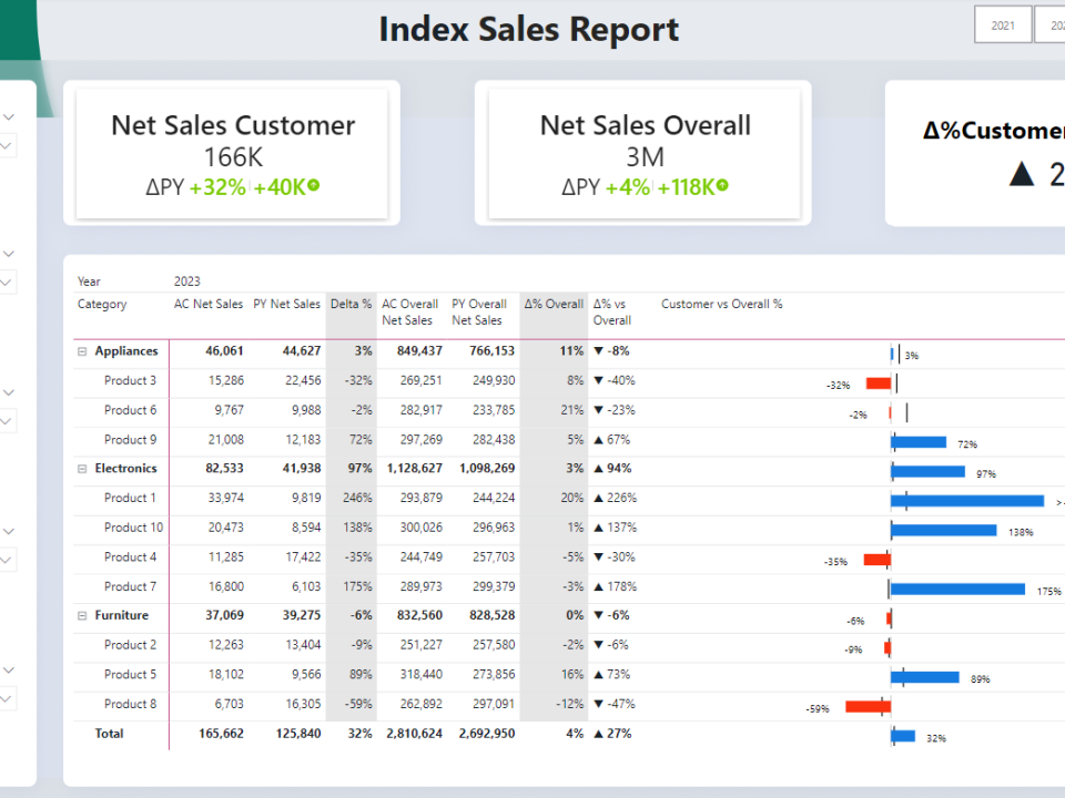
To achieve these objectives, I structured the dashboard to be intuitive and user-friendly. Key metrics like gross sales, net sales, and gross margin are presented using a combination of bar charts, line graphs, and Zebra BI visuals. These visuals allow for dynamic analysis by providing clear visual cues on performance, such as color-coded variances and trend lines. The dashboard also features dynamic KPI switches and time filters, making it easy to dive deeper into specific data points or periods.
Best Practices in Data Modeling: Using a Star Schema
One of the foundational steps in building this dashboard was designing an efficient data model. I used a star schema to organize the data, which is a best practice for optimizing performance in Power BI. A star schema is a type of database schema that separates data into fact tables and dimension tables. In this case, I created separate fact tables for actual sales, budget, and forecast data, and linked them with common dimension tables like date, region, and product.
Using a star schema has several advantages. It simplifies the data structure, making it easier to understand and maintain. More importantly, it optimizes query performance, which is crucial when working with large datasets in Power BI. By minimizing the number of joins needed to retrieve data, a star schema ensures that the dashboard remains responsive, even as the volume of data grows.
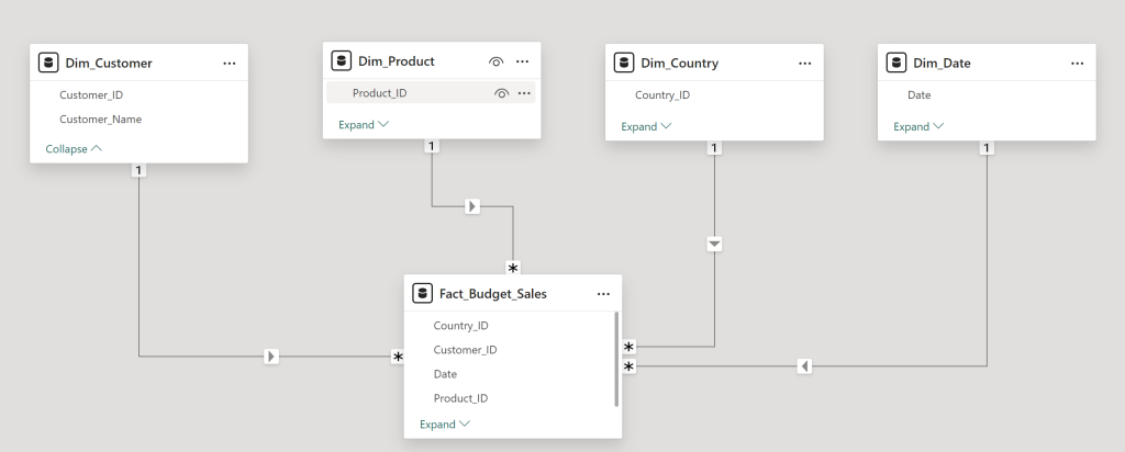
Building the Core Fact Tables: Actuals, Budget, and Forecast Data
For the data model, I started with three core fact tables: Actuals, Budget, and Forecast. The Actuals table contains all the real sales data, such as the sales amount per product, region, and time period. This table serves as the baseline for all comparisons, capturing every aspect of the sales data necessary for a complete analysis.
Next, I created the Budget table. This table mirrors the Actuals table in structure but contains the budgeted figures for the same periods. The goal here is to easily compare between plan and actuals, to understand what happened. By having a separate table for budget data, I can dynamically switch between actual and budget numbers within the dashboard, providing a clear view of variances.
The third table is the Forecast table, which includes projected sales based on historical trends and market analysis. This table is essential for forward-looking analysis, allowing users to understand not just how they performed in the past, but also what they can expect in the future. Each of these fact tables is connected to the dimension tables (like date, product, and region) via foreign keys, creating a robust and efficient star schema.
Designing the Power BI Dashboard: From Data to Insights
Once the data model was in place, the next step was to design the Power BI dashboard itself. I began by importing the fact tables and dimension tables into Power BI. The import process was smooth, thanks to the star schema design, which ensured all data points were correctly aligned and ready for analysis.
Creating the relationships between the tables was a critical step. By linking the fact tables with the common dimension tables, I ensured that the dashboard could dynamically filter, and sort data based on various criteria like date, region, or product. This relational model is the backbone of the dashboard’s interactivity, allowing users to drill down into specific data points and get insights at multiple levels of detail.
For the visual design, I chose a combination of bar graphs, line charts, and Zebra BI visuals. Each visual serves a specific purpose: bar graphs provide an at-a-glance view of sales performance by region, line charts show trends over time, and Zebra BI visuals highlight variances between actual and budgeted figures. This mix of visuals creates a compelling narrative, helping users quickly identify trends, outliers, and areas that need attention.
Enhancing the Dashboard with Dynamic Elements
To make the Power BI Portfolio dashboard more interactive, I added several dynamic elements. One of the key features is the KPI switch, which allows users to toggle between different performance metrics like gross sales, net sales, and gross margin. This feature provides flexibility, enabling users to customize their view based on their specific needs or interests.
I also included time period filters that let users compare data across different time frames—monthly, quarterly, or yearly. These filters are crucial for understanding how performance trends evolve and for spotting seasonality or unexpected changes in the data. By selecting a specific period, users can instantly see how performance has changed over time and what might be driving those changes.
Head over to my blog post series to learn how to make your Power BI Dashboard more dynamic:
Power BI Dashboard Template Free Download PBIX
For those interested in exploring this dashboard further, I’ve made the Power BI dashboard template available for free download. This PBIX file includes all the dynamic features, advanced visuals, and data modelling techniques discussed in this post. You can use it as a template to build your projects, learn best practices, or simply see how the dashboard functions up close. You can also play around with the user interface in the published report below.
Conclusion
This Power BI budget vs actual dashboard is a cornerstone of my power bi portfolio, demonstrating my skills in data modelling, visualization, and dynamic reporting. By using a star schema and advanced visuals, I’ve created a dashboard that is not only visually appealing but also highly functional, offering actionable insights for business decision-making.
Feel free to download the PBIX file and explore the features yourself. And if you want to know how I created the dataset from scratch, check out my blog post on “How to Create a Dataset Using ChatGPT.” I hope this inspires you to create your own dynamic dashboards!

