Introduction
In today’s competitive market, managing sales performance is crucial for long-term success. One of the most effective ways to track performance is by using a Power BI Sales Index Report. This report provides a detailed Year-over-Year (YoY) comparison of individual customer performance against the overall company growth. With this sales dashboard in Power BI, decision-makers can quickly identify which customers are driving growth and which ones may require more attention.
In this post, I’ll guide you through building a Power BI Sales Index Report—a creative Power BI dashboard example—that enables you to instantly compare the YoY performance of individual customers versus the entire company. You’ll also learn how to integrate dynamic filtering options, use DAX measures for advanced calculations, and implement a visually striking SVG bar chart that enhances customer and company performance comparison. Whether you’re looking for stunning Power BI dashboard designs or searching for Power BI dashboard templates, this report provides a comprehensive solution. At the end, you’ll be able to download the PBIX file and adapt it for your business.
What Is a Power BI Sales Index Report?
A Power BI Sales Index Report is a powerful, customizable Power BI sales dashboard that enables businesses to track and compare individual customer performance against overall company metrics over time. By utilizing Year-over-Year (YoY) comparisons, the report offers deep insights into how specific customers are contributing to the company’s growth. This tool is essential for decision-makers looking to pinpoint which customers are outperforming expectations and which are underperforming relative to the broader business. The Power BI Sales Index Report functions as more than just a standard sales dashboard in Power BI; it offers dynamic filtering capabilities by region, product, or segment, allowing users to drill down into specific territories or business areas. This feature enables sales reps, managers, and executives alike to view performance trends that are relevant to their specific goals, providing both high-level overviews and granular, detailed insights.
Furthermore, the Power BI Sales Index Report exemplifies the best of cool Power BI dashboards with its visually engaging design, including dynamic SVG bar charts that make it easy to compare individual customer performance. The report uses color-coded bars—blue for positive growth and red for negative—to instantly convey whether a customer is meeting or exceeding performance benchmarks. Along with these striking visuals, the report also integrates comparisons between customer metrics and overall company growth, offering actionable insights that help sales teams make more data-driven decisions. With its customizable design, the Power BI Sales Index Report stands out as one of the more stunning Power BI dashboard designs available today. For those looking for creative Power BI dashboard examples or a Power BI dashboard template to build from, this report provides a versatile, ready-to-use framework that can be adapted to suit any business needs.
How to use and interpret the Power BI Sales Index Report?
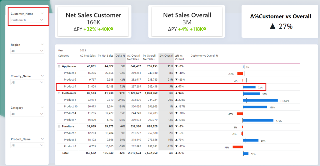
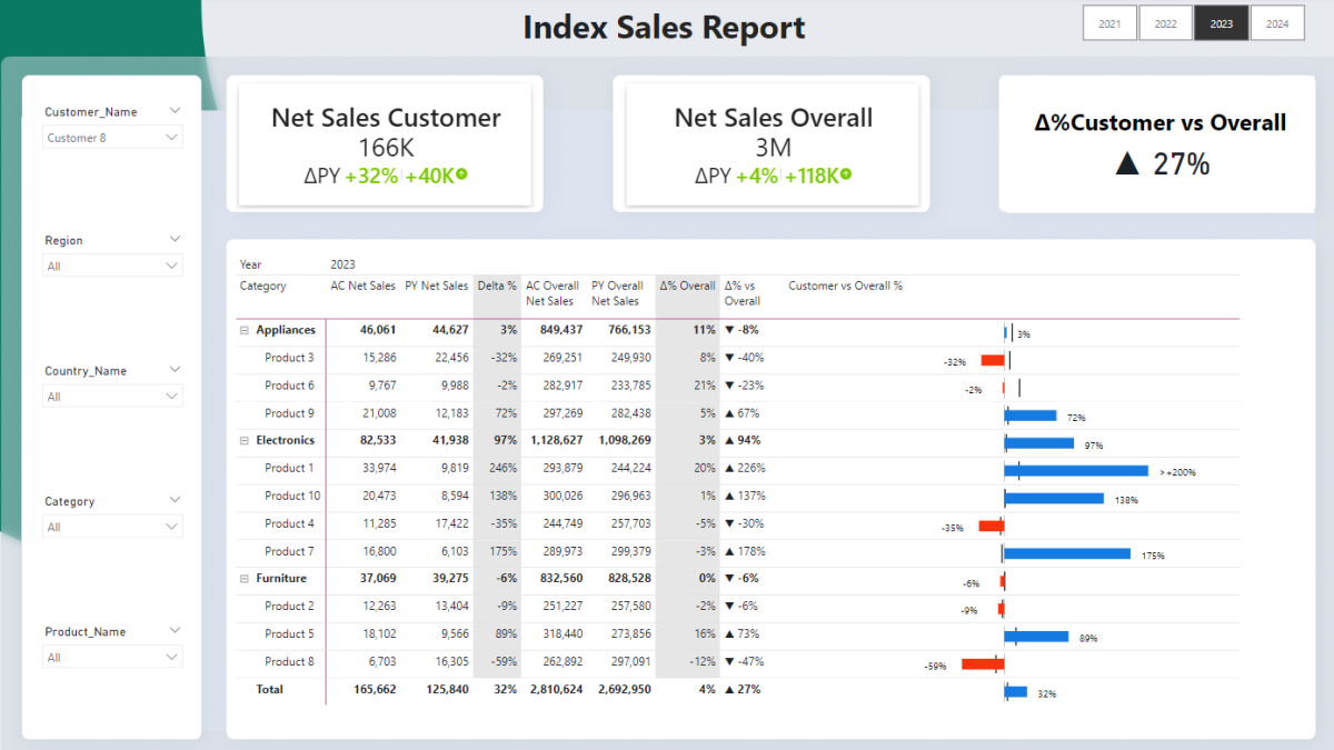
The Power BI Sales Index Report is a beautifully designed dashboard that allows users to compare individual customer performance with the overall company performance through a variety of features, including KPI cards, filter options, and an SVG chart embedded in a detailed table.
KPI Cards Overview
At the top of the Index Report, you’ll notice three KPI cards:
- Net Sales Customer: This card shows the current performance of the selected customer. In this case, Customer 8 has net sales of 166K with an impressive YoY growth of +32% (represented in green).
- Net Sales Overall: This card shows the total performance of the company, with 3M in net sales and a modest +4% YoY growth.
- Customer vs. Overall Performance: The final KPI card summarizes the difference between the customer’s performance and the company’s. Here, we can see that Customer 8 outperformed the company with a 27% higher growth rate, represented by a triangle indicating the positive trend.
Filter Options
On the left-hand side, we have a set of dynamic filters that allow users to drill down by Customer Name, Region, Country, Category, and Product Name. This gives users the flexibility to narrow their focus and analyze data relevant to specific regions, products, or customer segments. For example, you can choose a specific region to see how Customer 8 performed compared to the overall company in that region or focus on a particular product category.
Main Feature: Table with SVG Chart
The most visually engaging part of this Power Bi Sales Index Report is the table with the embedded SVG chart. This chart provides an instant visual representation of the YoY growth for individual products within the customer’s portfolio, compared to the overall company performance.

- Blue bars represent positive YoY growth for the customer, while red bars indicate negative growth.
- On each side of the bar, the percentage change for both the customer and the company is displayed. The | pipe symbol in the middle represents the overall company’s YoY growth, providing an immediate comparison between the customer and the company.
- If YoY growth exceeds 200%, the bar is capped, and a > symbol is shown (or < for negative growth), making it easy to spot significant outliers.
Example: Customer 8’s Performance
Now, let’s look at the highlighted section in red for Customer 8 in our Power BI Sales Index Report:
- Overall Performance: The total YoY growth for Customer 8 is +32%, compared to the company’s growth of just +4%, resulting in a 27% difference in performance.
- Product 9: One of the standout products for Customer 8 is Product 9, which had an impressive 72% YoY growth. When you compare this to the company’s overall growth for this product, which is 5%, there’s a clear 67% difference. This is a prime example of how the customer has significantly outperformed the company in this specific product category.
The SVG chart visually reinforces this with a long blue bar showing 72% YoY growth for Customer 8, compared to the smaller overall company growth represented by the pipe symbol. The difference is easy to spot due to the size of the bar and the positioning of the company’s growth marker.
Who Benefits from a Sales Index Report?
- Sales Managers: Monitor key customer performance.
- Marketing Teams: Assess campaign success and customer segmentation.
- Executives: Understand overall customer health and align strategy.
- Data Analysts: Spot trends and make informed recommendations.
Key Metrics in the Power BI Sales Index Report
Let’s walk through the DAX measures that form the backbone of the Power BI Sales Index Report. These measures calculate the total net sales, YoY growth, and comparisons between customer and company performance.
Net Sales and YoY Growth for Customers
These measures help calculate net sales for individual customers and compare YoY performance.
First up, a simple sum of the net sales of the current selected period:
01_Sum Net Sales =
SUM(Fact_Sales[Net_Sales])
Next, this measure calculates the previous year’s net sales for the selected customer.
01_Sum Net Sales PY =
    CALCULATE(
        [01_Sum Net Sales],
        DATEADD(
            Dim_Date[Date],
            -1, // Get the previous year value
            YEAR
        )
    )
The below measure computes the difference between the current year’s and previous year’s net sales, giving us the YoY delta for that customer.
02_Δ Net Sales PY =
[01_Sum Net Sales] – [01_Sum Net Sales PY]
This final measure calculates the percentage YoY growth for the customer.
02_Δ% Net Sales PY =
DIVIDE([02_Δ Net Sales PY],[01_Sum Net Sales PY])
Net Sales and YoY Growth for Overall Company
These measures help calculate net sales and YoY growth for the entire company, providing a reference point for customer comparisons. In this example I used the all function to get sum of net sales of all customers, even though when we apply a filter looking at only 1 customer. This way, we can compare the sales of one customer with sales of all customers. I only use the all function for customer, not for other dimension such as regions or products etc. The goal is still to be able to filter by these dimensions later on!
This measure calculates the total net sales for the entire company in the current year:
03_Sum Net Sales Overall =
CALCULATE(
    [01_Sum Net Sales],
    ALL(Dim_Customer[Customer_Name])
)
This measure calculates the previous year’s net sales for the entire company:
03_Sum Net Sales Overall PY =
CALCULATE(
[01_Sum Net Sales PY],
ALL(Dim_Customer[Customer_Name])
)
Now calculating the absolute delta YoY for the overall company net sales:
04_Δ Net Sales Overall PY =
[03_Sum Net Sales Overall] - [03_Sum Net Sales Overall PY]
This measure calculates the percentage YoY growth for the company:
04_Δ% Net Sales Overall PY =
DIVIDE([04_Δ Net Sales Overall PY],[03_Sum Net Sales Overall PY])
Comparing Customer Performance to Overall Company Growth
The real value of this index report comes from comparing individual customer performance to company-wide growth. This helps in identifying which customers are outperforming the company and which ones are underperforming.
This measure calculates the difference between the customer’s YoY growth and the company’s YoY growth, providing a direct comparison:
05_Δ% Net Sales AC - PY =
([02_Δ% Net Sales PY]- [04_Δ% Net Sales Overall PY])
This measure adds a visual representation by formatting the result with up or down arrows to indicate whether the customer’s performance is better or worse than the company:
05_Δ% vs Overall Formatted =
VAR Result = [05_Δ% Net Sales AC – PY]
RETURN
IF(
Result > 0,
UNICHAR(9650) & ” ” & FORMAT(Result, “0%”), // Unicode for upward triangle
IF(
Result < 0,
UNICHAR(9660) & ” ” & FORMAT(Result, “0%”), // Unicode for downward triangle
FORMAT(Result, “0%”) // No triangle if zero
)
)
The last measure “formatted” would return a triangle symbol, either up or down. If the performance of individual customer is better than overall performance, then the triangle symbol shows upwards, else downwards. See example below: Customer is up 33% YoY, but the company is up by only 10%, the difference is 23% which is highlighted by the measure.
| Customer | Net Sales (AC) | Net Sales (PY) | YoY Growth % | Company Growth % | Comparison |
|---|---|---|---|---|---|
| Customer 1 | $200,000 | $150,000 | 33% | 10% | ▲ 23% |
| Customer 2 | $100,000 | $110,000 | -9% | 10% | ▼ -19% |
Visualizing Customer Performance with SVG Bar Charts
One of the most captivating aspects of the Power BI Sales Index Report is the SVG bar chart, which offers a visually stunning way to compare customer performance against overall company performance. Each customer’s YoY growth is depicted as a bar—blue for positive growth and red for negative growth—while the company’s YoY growth is represented by a vertical | pipe symbol. This layout allows for an instant, side-by-side comparison of how an individual customer stacks up against the entire organization.
To make this report even more adaptable to your business needs, you can easily customize it by replacing the DAX measures within the Power BI dashboard template. For instance, swap out [02_Δ% Net Sales PY] to reflect the individual customer YoY performance and [04_Δ% Net Sales Overall PY] for the company-wide YoY growth. This flexibility allows for creating cool Power BI dashboards that are fully tailored to your performance metrics.
Whether you’re looking for stunning Power BI dashboard designs or simply want a creative way to display your sales data, the SVG bar chart feature in this Power BI sales dashboard delivers clear, actionable insights.
Dax Code for SVG Bar Chart:
07_SVG Bar Chart =
-- Canvas Definitions
VAR SVGWidth = 800                            -- Width of the SVG canvas
VAR SVGHeight = 40                            -- Height of the SVG canvas

-- Data and Formatting
VAR _Measure = [02_Δ% Net Sales PY]            -- Retrieve the ratio value from another measure/column
VAR Clamped_Measure =                         -- Clamp measure to 200% max or -200% min
    IF(_Measure > 2, 2, IF(_Measure < -2, -2, _Measure))
VAR Formatted_Measure =                       -- Format for display
    IF(_Measure > 2, ">+200%", IF(_Measure < -2, "<-200%", FORMAT(_Measure, "0%")))

VAR Company_Delta = [04_Δ% Net Sales Overall PY]  -- Measure for overall company's delta change
VAR Clamped_Company_Delta = IF(Company_Delta > 2, 2, IF(Company_Delta < -2, -2, Company_Delta))

-- Color Definitions
VAR PositiveBarColor = "#167be0"              -- Color for positive values
VAR NegativeBarColor = "#fa320e"              -- Color for negative values
VAR BarColor = IF(_Measure >= 0, PositiveBarColor, NegativeBarColor)
VAR CenterLineColor = "#989898"               -- Color for the center line
VAR CompanyLineColor = "#000000"              -- Color for company delta line

-- Bar Dimensions and Positioning
VAR CenterPosition = SVGWidth / 2                      -- Center of the SVG canvas for bar placement
VAR BarWidth = ABS(Clamped_Measure) * (SVGWidth / 6)   -- Width based on the ratio and canvas size
VAR BarHeight = 20                            -- Height of the bar
VAR BarStartX = IF(_Measure >= 0, CenterPosition, CenterPosition - BarWidth)  -- X position of the bar

VAR CompanyLineX =                           -- X position for the company delta line
    IF(Clamped_Company_Delta >= 0,
        CenterPosition + ABS(Clamped_Company_Delta) * (SVGWidth / 6),  -- For positive values, set at max point
        CenterPosition - ABS(Clamped_Company_Delta) * (SVGWidth / 6)   -- For negative values, set at min point
    )

VAR CompanyLineY1 = SVGHeight * 0.075         -- Starting y-coordinate at 7.5% of SVG height
VAR CompanyLineY2 = SVGHeight * 0.925         -- Ending y-coordinate at 92.5% of SVG height

-- SVG Text Positioning and Style
VAR TextPadding = 20                          -- Space between bar and text
VAR TextWidth = 50                            -- Estimated width of text
VAR TextFontFamily = "Segoe UI"               -- Font family for text
VAR TextFontSize = "18"                       -- Font size for text
VAR TextFill = "black"                        -- Font color
VAR NumberPositionX =                         -- Determine text X-position based on bar direction (positive or negative)
IF(
    _Measure >= 0,
    CenterPosition + BarWidth + TextPadding,
    CenterPosition - BarWidth - TextPadding - TextWidth
)
VAR TextYCenter = 10 + (BarHeight / 2) + 10    -- Center vertical position for text, relative to bar position

-- SVG Creation
VAR Img =
"data:image/svg+xml;utf8,<svg width='" & SVGWidth & "' height='" & SVGHeight & "' xmlns='http://www.w3.org/2000/svg'>
<line x1='" & CenterPosition & "' x2='" & CenterPosition & "' y1='0' y2='" & SVGHeight & "' stroke='" & CenterLineColor & "' stroke-width='1'></line>
<line x1='" & CompanyLineX & "' x2='" & CompanyLineX & "' y1='" & CompanyLineY1 & "' y2='" & CompanyLineY2 & "' stroke='" & CompanyLineColor & "' stroke-width='2'></line>
<rect x='" & BarStartX & "' y='10' width='" & BarWidth & "' height='" & BarHeight & "' fill='" & BarColor & "'></rect>
<text x='" & NumberPositionX & "' y='" & TextYCenter & "' font-family='" & TextFontFamily & "' font-size='" & TextFontSize & "' fill='" & TextFill & "'>" & Formatted_Measure & "</text>
</svg>"

RETURN Img
Pro tip: You need to format that SVG measure as an image URL!
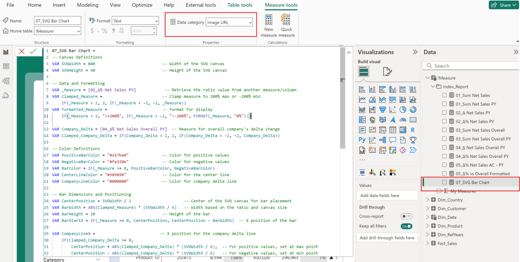
Moreover, make sure to adjust the image size in your table, else you might not be able to see anything! In my example, I used a height of 25 px and a width of 500 px. Select the visual, head to the formatting options and under Image Size you will find the settings! Controlling the size of SVG images is not a straightforward task and might require some trial and error, but I am confident you will get there!
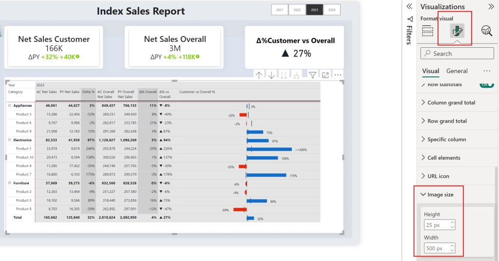
This DAX code dynamically creates the SVG bar chart. It compares the customer’s YoY growth to the company’s YoY growth, making it easy to spot differences at a glance.
Benefits of Using a Power BI Sales Index Report
A Power BI Sales Index Report is more than just a data dashboard. It provides actionable insights and visual clarity, allowing decision-makers to track and compare performance trends easily. Here are some benefits:
| Key Benefit | Description |
|---|---|
| Real-Time Insights | Instantly see which customers are driving growth and which are falling behind. |
| Customizable Visualizations | Use SVG charts and filters to customize the report to your needs. |
| Enhanced Data-Driven Decisions | Sales teams can use this report to identify opportunities for improvement and investment. |
| Detailed Comparisons | Compare a customer’s performance directly to the overall company’s growth rate, making it easier to track individual contributions. |
| Filter by Product, Region, and Segment | Compare individual customer performance with the whole company but still be able to filter by product, region, and segment to provide sales reps with detailed insights in their specific territory or product. |
How to Download and Use the Power BI Sales Index Report Template
If you’re ready to explore this powerful tool for your business, you can download the Power BI Sales Index Report template here. This Power BI dashboard template is fully customizable, enabling you to input your own data, apply dynamic filters, and modify the DAX measures to fit your specific needs.
Whether you’re looking to compare sales by region, product, or customer segment, this template provides a solid foundation to build upon. The Power BI sales dashboard is designed to be flexible, so you can tailor it to match the unique goals of your business. By using this template, you can create your own creative Power BI dashboard example or adapt it into one of your cool Power BI dashboards with stunning, data-driven insights.
Additionally, you can test out the live version of the Power BI Sales Index Report below to see how it functions in real-time before applying it to your business operations.
Conclusion
The Power BI Sales Index Report is an invaluable tool for sales teams, executives, and data analysts. It combines detailed, data-driven insights with visually engaging features, making it easy to compare individual customer performance against the company’s overall growth. With the integration of dynamic filters, YoY growth measures, and SVG bar charts, this report transforms raw data into a powerful decision-making tool that is both insightful and actionable.
If you’re looking to build custom Power BI sales dashboards or enhance your current Power BI solutions, feel free to reach out for a tailored approach. And don’t forget to download the PBIX report to start using it for your own data analysis. Whether you’re creating stunning Power BI dashboard designs or looking for more Power BI report examples, this tool will provide you with the insights needed to drive better business decisions.
For those interested in building custom reports or enhancing their current Power BI solutions, feel free to reach out for a tailored approach. And don’t forget to download the PBIX report to start using it for your own data analysis.
I highly recommend checking out my related portfolio item. Learn how to improve your business performance with an actionable Power BI Sales Dashboard: How A Power BI Sales Dashboard Drives Your Business Growth
More on using SVG in Power BI below:
If you like this post, please consider giving a comment. Thanks 🙂
Stay up to date with all of my content by following me on LinkedIn!

Leave a Reply