Exploring Power BI Themes
In Power BI, visuals are the secret sauce that makes data pop and tells a story. Let’s dive into the world of Power BI themes and see how they can transform your reports. Plus, I’ll introduce you to the nifty Power BI Theme Generator.
Why Visuals Matter in Power BI
Visuals are the heart and soul of any Power BI report. They turn boring numbers into eye-catching charts and graphs, making it easier for folks to understand what’s going on. Good visuals help you tell a story with your data, making it more engaging and easier to digest. When your audience can quickly grasp the insights, they can make smarter decisions on the fly.
Meet the Power BI Theme Generator
Now, let’s talk about the Power BI Theme Generator. This tool is a game-changer for anyone looking to jazz up their reports. With it, you can tweak colors, fonts, and styles to match your brand or just make things look cooler. It’s like having a magic wand for your data visuals.
Using the Theme Generator, you can create themes that make your reports look polished and professional. Imagine being able to set a consistent look and feel across all your dashboards. It’s not just about looking good; it’s about making your data easier to understand and more enjoyable to explore.
Curious about how to play with Power BI color themes or where to snag some cool themes? Check out our articles on power bi color theme and download power bi themes for more tips and tricks. Let’s make your data shine with Power BI themes!
Getting Started with Power BI Theme Generator
Ready to jazz up your Power BI reports? Let’s dive into the Theme Generator tool and see how you can make your data pop with custom themes.
Accessing the Theme Generator Tool
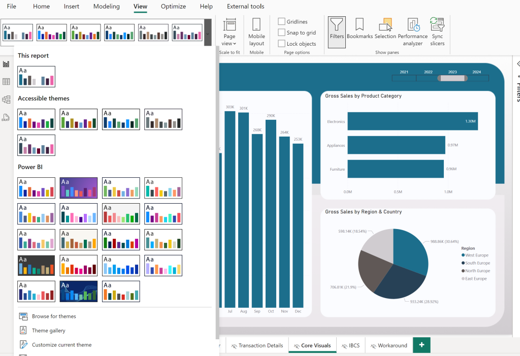
In Power BI Desktop, head to the View Tab, click on the expand icon. Now you can see your current theme, customize it or save it as a JSON file.

Click on the Theme Generator, and you’ll find a bunch of options to tweak and personalize your reports. This tool is all about making your dashboards look sharp and on-brand.
Understanding the Interface
Once you’re in, you’ll see a super user-friendly interface. No need to be a tech wizard here. The menus and options are straightforward, letting you change colors, fonts, and styles with just a few clicks.
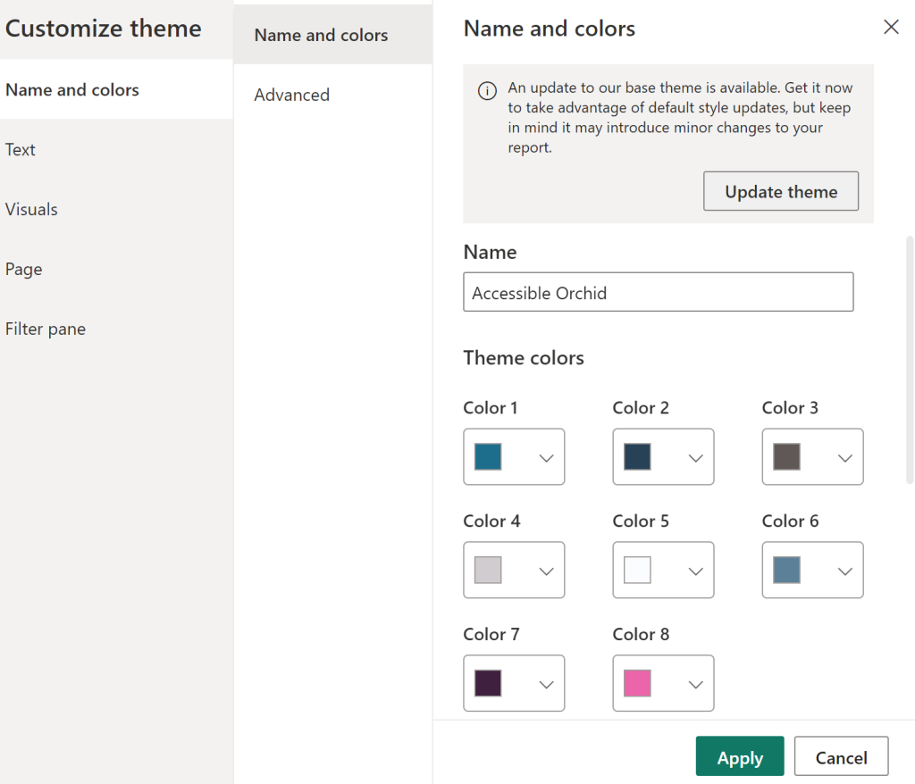
One of the coolest features is the color selection tool. You can pick your primary and accent colors from a palette, making sure everything looks cohesive. Plus, you can adjust font styles and sizes to keep things consistent across your reports.
Don’t be shy—play around with the customization options. The more you experiment, the better you’ll get at creating themes that really stand out.

For more tips and tricks, check out our articles on Power BI color themes and downloadable Power BI themes. Keep an eye out for more ways to up your data visualization game with Power BI themes.
Customizing Themes
Creating eye-catching reports in Power BI? Customizing themes is your secret weapon. Let’s break down how to pick colors, choose fonts, and set visual styles to make your reports pop.
Picking Colors
Colors can make or break your report. Power BI Theme Generator lets you pick colors that match your brand or the vibe you want. Consistent colors across your visuals give your report a polished, professional look.
Here’s a handy table to help you pick your colors:
| Color | Hex Code |
|---|---|
| Blue | #0072C6 |
| Green | #4DB74D |
| Red | #FF0000 |
| Yellow | #FFD966 |
| Purple | #6F52B8 |
| Orange | #FF8C00 |
Mix and match these colors to create a theme that speaks to your audience. Want more tips on color themes? Check out our article on power bi color theme.
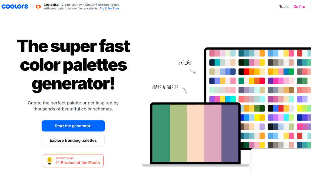
If you need inspiration from a website. Coolors.co (referal link) lets you create your own custom color palette in a matter of seconds. Plus they have many more intersting features, all around colors and design. Check it out!

Choosing Fonts
Fonts matter—a lot. They affect how easy your report is to read and how it looks overall. Power BI Theme Generator lets you pick fonts for your visuals, headers, and text boxes. The right fonts make your reports not just pretty, but also easy to read.
Here’s a quick look at some popular font choices:
| Font Family | Font Style |
|---|---|
| Arial | Regular |
| Calibri | Bold |
| Verdana | Italic |
| Times New Roman | Bold Italic |
| Roboto | Light |
Choosing the right fonts keeps your reports consistent and reinforces your brand. For more font ideas, visit our article on download power bi themes.
Setting Visual Styles
Colors and fonts are just the start. Visual styles like borders, backgrounds, and data labels tie everything together. Power BI Theme Generator lets you tweak these elements to make your visuals not just look good, but also communicate your data clearly.
Here’s a table to give you some ideas:
| Visual Style | Description |
|---|---|
| Borders | Style, color, and thickness of borders |
| Backgrounds | Customize backgrounds for visuals and pages |
| Data Labels | Font size, color, and positioning of data labels |
By fine-tuning these styles, you can create reports that are not just informative but also visually striking. For more on visual styles, check out our article on power bi json themes.
So, go ahead—experiment with colors, fonts, and styles to make your Power BI reports truly yours.
Sprucing Up Your Power BI Reports with Themes
Alright, let’s get down to the nitty-gritty of jazzing up your Power BI reports with themes. This guide will walk you through how to do it in both Power BI Desktop and Power BI Service.
Power BI Desktop: Making Your Reports Pop
Applying a theme in Power BI Desktop is a breeze and ensures your visuals look sharp and consistent. Here’s how you do it:
- Hit the ‘View’ Tab: Open Power BI Desktop and click on the ‘View’ tab to find the ‘Themes’ option.
- Pick ‘Switch Theme’: In the ‘Themes’ dropdown, choose ‘Switch Theme’ to browse through the available themes or import your own custom theme.
- Apply Your Theme: Click on your chosen theme, and voilà, your report gets a fresh new look.
Following these steps will make your reports in Power BI Desktop not just functional but also visually appealing. For more tips on customizing themes and picking colors, check out our article on power bi color theme.
Power BI Service: Keeping the Style Consistent
Once you’ve crafted your masterpiece in Power BI Desktop, you can easily carry over the same theme to Power BI Service. Here’s the lowdown:
- Publish Your Report: Send your report from Power BI Desktop to Power BI Service.
- Find the Theme Options: Open your report in Power BI Service and go to the ‘View’ tab.
- Select a Theme: Click on ‘Themes’ and pick one from the list or import a custom theme.
- Apply the Theme: Click to apply, and your report will look just as snazzy as it did in Desktop.
Using the same theme across Power BI Service ensures your reports look polished and professional. For more themes to explore and download, visit our article on download power bi themes.
Why Bother with Themes?
Implementing themes in both Power BI Desktop and Power BI Service isn’t just about making things look pretty. It’s about creating a seamless, branded experience that makes your data pop and keeps your audience engaged. So go ahead, play around with themes, and make your reports not just informative but also a joy to look at.
Best Practices for Using Power BI Themes
Using Power BI themes smartly can make your reports look sharp and user-friendly. Keep things consistent and always test and tweak your themes to get the best out of your Power BI visuals.
Keep It Consistent
Making sure your themes look the same across all reports is key to a polished, professional look. Stick to the same colors, fonts, and visual elements to create a unified style. This not only makes your reports look good but also helps in presenting information clearly.
Create a style guide that lists the colors, fonts, and design rules to follow in all reports. This guide will make it easier to pick themes and ensure all reports match your brand’s look. For more tips on creating a color theme, check out our article on Power BI color themes.
Test and Tweak
Always test and tweak your themes to make sure they look good and get your message across. Before you settle on a theme, preview your visuals with different options to see which one works best.
Get feedback from others to find out which themes your audience likes and which ones communicate your message well. Keep improving your themes based on this feedback to make your reports look better and be more user-friendly over time.
Use Power BI’s features to switch between themes easily and compare how they look. Tools like the Power BI Theme Generator can help you try out different color schemes and fonts until you find the right mix. For more on downloading themes, see our article on downloading Power BI themes.
By keeping your themes consistent and always testing and tweaking them, you can make the most of Power BI to create reports that look great and clearly present your data.
Boosting Visual Appeal
Want your Power BI reports to pop? Let’s talk about using themes to make your brand shine. Customizing themes to match your brand’s look and feel can turn your reports into eye-catching, cohesive masterpieces. Plus, getting feedback from users can make your reports even better.
Using Themes for Branding
Customizing themes in Power BI lets you tweak the visuals to match your brand’s colors, fonts, and style. Pick colors from your brand palette and use fonts that fit your brand guidelines to create a unified, professional look across all your reports.
Think about making a theme that not only looks good but also reinforces your brand message. Add your company logo, color schemes, and design elements that scream your brand identity. Consistent branding across reports helps build brand recognition and trust with your audience.
To take your branding up a notch, check out the Power BI Theme Generator tool. Play around with different color combos, font styles, and visual styles to create a theme that fits your brand’s vibe.
Getting User Feedback
User feedback is gold when it comes to fine-tuning the visual impact of your Power BI reports. Ask stakeholders, end users, and team members for their thoughts to see how your reports are landing and spot areas for improvement.
When you gather user feedback, think about running usability tests to get input on readability, accessibility, and overall visual appeal. Use this feedback to make smart choices about colors, font sizes, and layouts that boost user experience and engagement.
By involving users in the theme customization process, you can make sure your reports not only match your branding goals but also meet the needs and tastes of your audience. User feedback helps you create reports that are visually striking, easy to use, and tailored to what your stakeholders want.
Using themes for branding and incorporating user feedback can supercharge the visual appeal of your Power BI reports. Experiment with different customization options, listen to your users, and keep tweaking your themes to create reports that stand out and deliver valuable insights.
Conclusion: Power BI Theme Generator
In wrapping up, the Power BI Theme Generator emerges as an invaluable tool for any data professional seeking to elevate their reports. This tool not only allows for the customization of aesthetics—adjusting colors, fonts, and styles—but also ensures consistency across your visual presentations, making your data not only more appealing but also easier to digest. Whether you are a novice or an expert, the Power BI Theme Generator simplifies the process of creating and applying themes, making your data visualizations not only functional but also visually compelling.
Did you find this guide on how to utilize the Power BI Theme Generator helpful? I’d love to hear your thoughts or see examples of how you’ve implemented your own themes—please share in the comments below!

