📋 Table of Contents
Creating professional dashboards from scratch feels overwhelming without proper dashboard ui design inspiration. Many developers struggle with layout decisions, visual hierarchy, and component placement. This comprehensive guide provides dashboard ui design best practices, analyzes modern dashboard ui design examples, and reveals proven patterns for effective kpi dashboard design. Transform your approach to dashboard design inspiration with actionable insights and professional modern dashboard design principles that drive results.
Understanding Dashboard UI Design Inspiration
Effective dashboard ui design inspiration combines psychological principles with practical functionality. Professional dashboards guide user attention through strategic visual hierarchy and intuitive navigation patterns. Understanding these fundamentals transforms amateur layouts into executive-ready presentations.
The Psychology Behind Effective Dashboard Design
User behavior research reveals predictable scanning patterns that influence dashboard effectiveness. Eye-tracking studies consistently show users follow specific visual paths when processing dashboard information. These insights form the foundation of successful dashboard layouts.
Key Psychological Principles:
- Users scan dashboards within 3-5 seconds to determine value
- Critical metrics placed in top-left quadrant receive 40% more attention
- Visual clutter reduces comprehension by up to 50%
- Consistent spacing patterns improve user confidence
- Color psychology influences decision-making speed
Professional dashboard designers leverage these insights strategically. They position key performance indicators where natural attention flows. Moreover, they use visual contrast to highlight important trends and outliers. Consequently, stakeholders process information faster and make more informed decisions.
Dashboard UI Design Best Practices That Actually Work
Proven dashboard ui design best practices focus on clarity over creativity. Successful implementations prioritize data comprehension above visual spectacle. These principles apply regardless of industry or technical platform.
Effective dashboards balance information density with cognitive load management. They provide comprehensive insights without overwhelming users. Furthermore, they maintain consistency across pages and sections. This creates predictable user experiences that build confidence and adoption.
Essential Design Implementation Steps:
- Define clear information hierarchy based on business priorities
- Establish consistent grid system for alignment and spacing
- Apply brand colors strategically without overwhelming data
- Test layouts with actual stakeholders and real data
- Iterate based on usage patterns and feedback
Essential Dashboard Building Blocks
Professional dashboards consist of four fundamental components that work together seamlessly. Understanding these building blocks helps designers create cohesive layouts that enhance user experience. Each component serves specific functions while contributing to overall dashboard effectiveness.
Header Design Strategies
Dashboard headers establish brand identity and provide essential navigation elements. They typically occupy 10-15% of total canvas height while delivering maximum impact. Effective headers balance branding with functional requirements.
Modern headers include company logos, page titles, and primary navigation elements. They often incorporate breadcrumb navigation for complex multi-page reports. Additionally, headers may contain global filters or date range selectors that affect entire dashboard content.
Header Best Practices:
- Keep height proportional to overall dashboard size
- Use brand colors strategically without overwhelming content
- Include clear page identification and navigation
- Position global controls logically and consistently
- Maintain visual separation from content areas
Sidebar Navigation Patterns
Sidebar navigation provides intuitive access to different dashboard sections or pages. Well-designed sidebars enhance user experience by creating predictable navigation patterns. They work particularly well for applications with multiple dashboard views.
Effective sidebars balance functionality with visual space. They include clear section labels, visual indicators for active pages, and logical grouping of related items. Furthermore, responsive sidebars collapse appropriately on smaller screens while maintaining accessibility.
KPI Dashboard Design Principles
Key performance indicators represent the most critical dashboard elements for business decision-making. KPI dashboard design requires careful attention to hierarchy, readability, and visual emphasis. Successful implementations guide users to important metrics immediately.
Professional KPI sections use consistent card layouts with clear metric labels and contextual information. They include trend indicators, comparison values, and visual cues about performance status. Moreover, they maintain consistent spacing and alignment across all metrics.
KPI Design Implementation:
- Establish consistent card dimensions and spacing
- Use clear hierarchy between primary and secondary metrics
- Include contextual information like trends and targets
- Apply color coding strategically for status indication
- Ensure readability at different screen sizes
Visual Content Area Planning
Content areas house detailed charts, tables, and interactive visualizations that support KPI insights. These zones require careful planning to accommodate different chart types and data complexity levels. Effective content areas provide sufficient space while maintaining visual balance.
Professional content planning considers chart relationships, user interaction patterns, and responsive behavior. It establishes consistent margins, padding, and grid alignment that create visual harmony. Additionally, it accounts for filter panels and interactive elements.
| Component | Purpose | Best Size | Key Features | Common Mistakes |
|---|---|---|---|---|
| Header | Brand identity and navigation | 10-15% of height | Logo, title, global filters | Too much vertical space |
| Sidebar | Section navigation | 15-20% of width | Page links, collapsible | Poor responsive behavior |
| KPI Cards | Key metrics display | Consistent ratio | Values, trends, status | Inconsistent sizing |
| Content Areas | Detailed visualizations | Remaining space | Charts, tables, filters | Poor chart relationships |
Modern Dashboard UI Design Examples Analysis
Analyzing successful modern dashboard ui design examples reveals patterns that consistently deliver results. These implementations demonstrate how theoretical principles translate into practical solutions. Understanding these examples provides actionable insights for your own projects.
Contemporary dashboard design emphasizes clean layouts, intuitive navigation, and data-focused presentations. The best examples balance aesthetic appeal with functional requirements. They eliminate unnecessary elements while enhancing information clarity and user experience.
Design Evolution Insight: Modern dashboard design has shifted from information-dense layouts to focused, actionable presentations. Users prefer fewer, more meaningful metrics over comprehensive data dumps.
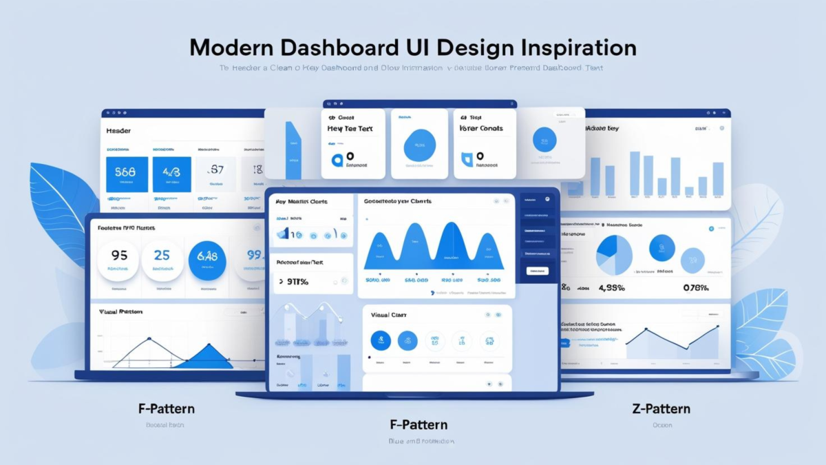
F-Pattern vs Z-Pattern Layout Psychology
Understanding eye-tracking patterns revolutionizes dashboard layout effectiveness. Research consistently shows users follow predictable visual paths when scanning dashboard content. Applying these insights strategically improves information processing and decision-making speed.
F-Pattern Implementation for Data-Heavy Dashboards
The F-pattern works exceptionally well for dashboards with extensive textual content and detailed metrics. Users naturally scan horizontally across the top section, then vertically down the left side while making periodic horizontal sweeps. This creates the characteristic F-shape scanning pattern.
Professional F-pattern implementations position critical KPIs across the top horizontal zone. Secondary metrics and navigation elements align along the left vertical zone. Supporting details and charts occupy the remaining content areas where users make selective horizontal scans.
F-Pattern Advantages:
- Ideal for dashboards with multiple KPIs and detailed metrics
- Works well with extensive filtering and navigation options
- Supports complex data relationships and drill-down capabilities
- Familiar pattern for users accustomed to reading interfaces
- Accommodates both desktop and tablet viewing experiences
Z-Pattern for Visual-First Dashboard Design
Z-pattern layouts excel in visually-driven dashboards with minimal text content. Users scan diagonally across the interface, creating a dynamic zigzag motion that works perfectly for graphical presentations. This pattern suits executive dashboards and summary reports.
Effective Z-pattern dashboards position the most important metric in the top-left corner. They guide attention to secondary information in the top-right area. The diagonal flow leads users to supporting details in the bottom-left, concluding with calls-to-action or summary information in the bottom-right.
Z-Pattern Implementation Strategy:
- Position primary KPI in top-left for immediate attention
- Place secondary metrics or navigation in top-right corner
- Use diagonal flow to guide users to supporting visualizations
- Conclude with action items or summary in bottom-right
- Maintain clear visual pathways between pattern zones
Pattern Selection Tip: Choose F-pattern for analytical dashboards with multiple metrics and filters. Select Z-pattern for executive summaries and visually-driven presentations. Never mix patterns within single dashboard pages.
Dashboard Background Creation Methods
Creating professional dashboard backgrounds requires understanding different approaches and their trade-offs. Each method offers distinct advantages depending on skills, timeline, and requirements. Selecting the right approach significantly impacts project success and maintenance efficiency.
PowerPoint Background Creation
Microsoft PowerPoint remains the most accessible tool for dashboard background creation. It provides familiar interface elements and built-in alignment tools that help non-designers create professional layouts. PowerPoint works particularly well for simple, structured designs.
PowerPoint Creation Process:
- Set custom slide dimensions matching your dashboard canvas
- Create header area using rectangles with brand colors
- Add KPI placeholder cards with consistent spacing
- Design content zones using subtle background colors
- Export as PNG with exact canvas dimensions
Professional Design Tool Implementation
Professional design platforms like Figma, Canva, and Adobe Creative Suite offer advanced capabilities for sophisticated backgrounds. These tools provide precise control over spacing, typography, and visual effects. They excel when brand consistency and pixel-perfect accuracy are priorities.
Professional tools support component-based design systems that ensure consistency across multiple dashboard pages. They offer collaboration features that streamline team workflows. Additionally, they provide advanced export options and responsive design capabilities.
Automated Background Generation
Automated background generators represent the fastest path to professional results. These specialized tools combine design expertise with technical precision to create production-ready backgrounds in minutes. They eliminate common design mistakes while ensuring technical compatibility.
Generator Advantages:
- Create professional backgrounds in minutes instead of hours
- Ensure consistent spacing and alignment automatically
- Apply brand colors and typography systematically
- Generate multiple variations for A/B testing
- Export exact dimensions for various platforms
71 Free Dashboard Wireframe Examples
Accelerate your dashboard design process with comprehensive wireframe templates that eliminate guesswork. This free collection contains 71 professionally designed layout examples covering every major dashboard scenario. Each template demonstrates optimal spacing, component placement, and visual hierarchy principles.
Free Resource Alert: Get instant access to 71 dashboard wireframe examples – a comprehensive PDF collection featuring executive dashboards, KPI layouts, analytics templates, and mobile-responsive designs. This free template library provides professional starting points for any dashboard project, complete with layout specifications and implementation guidelines.
These wireframe examples showcase proven layouts for different business scenarios and user needs. Executive templates emphasize high-level metrics and strategic insights. Operational dashboards focus on detailed monitoring and trend analysis. Analytics layouts accommodate complex filtering and drill-down capabilities.
What’s Included in the Free Collection:
- Executive summary dashboard wireframes
- KPI-focused layouts with various card arrangements
- Analytics dashboards with complex filtering
- Mobile-responsive design patterns
- Implementation guidelines and spacing specifications
Each wireframe template includes detailed specifications for responsive behavior and technical implementation. You’ll find guidance on optimal KPI card sizes, content area proportions, and navigation patterns. Moreover, the collection covers both light and dark theme variations.
🎯 Download 71 Free Dashboard Wireframe Examples
Save hours of design time with professionally crafted wireframe templates. Perfect starting points for Power BI, Tableau, or any dashboard platform.
Get Free TemplatesWhy Manual Dashboard Design Takes So Long (And How to Fix It)
Most Power BI developers waste 3-4 hours per project just setting up dashboard layouts. Drawing headers, aligning KPI cards, spacing visual zones, and ensuring consistent proportions becomes a repetitive nightmare. You end up switching between PowerPoint, Figma, or manual positioning in Power BI itself.
The real problem isn’t the tools—it’s the process. Every new dashboard wireframe starts from scratch. You recreate the same header structures, redraw KPI zones, and manually calculate spacing ratios. Meanwhile, your stakeholders wait for mockups while you wrestle with pixel-perfect alignment.
Traditional dashboard mockup creation involves multiple painful steps. First, you sketch rough layouts in PowerPoint or draw.io. Then you refine spacing and proportions manually. Next, you export static images for stakeholder review. Finally, you recreate everything again in Power BI with slightly different dimensions.
This fragmented workflow creates inconsistency across projects and teams. One developer uses 20px margins, another prefers 24px. KPI card heights vary between dashboards. Brand colors get approximated differently each time. The result? Dashboard wireframe examples that look amateurish despite hours of effort.
Create Perfect Dashboard Wireframes in Minutes with Power BI Background Designer
Stop spending hours drawing layouts from scratch! Our Power BI Background Designer transforms dashboard wireframe examples into professional backgrounds instantly. What used to take 3-4 hours of manual design work now takes just minutes.
Revolutionary Advantages:
- Generate wireframes in seconds instead of hours
- Perfect pixel-precision with no manual alignment
- Export-ready PNG/JPG/SVG files instantly
- Brand-consistent colors and spacing automatically
- Responsive layouts for all screen sizes
- Professional KPI card positioning built-in
🚀 Coming September 2025! The Power BI Background Designer is not published yet. Bookmark this page and follow us on LinkedIn to get notified when it launches.
Transform your Power BI dashboard design workflow. No more PowerPoint mockups, no more manual alignment struggles, no more inconsistent layouts across projects.
Bookmark for Launch Follow on LinkedInBe among the first to revolutionize your dashboard design process 🎯
Frequently Asked Questions
What makes effective dashboard UI design inspiration?
Effective dashboard UI design inspiration combines psychological principles with practical functionality. It leverages user behavior research, applies consistent visual hierarchy, and prioritizes data comprehension over decorative elements. The best inspiration examples demonstrate clear KPI placement, intuitive navigation, and responsive design patterns.
How do I choose between F-pattern and Z-pattern layouts?
Choose F-pattern layouts for data-heavy dashboards with multiple metrics, extensive filtering options, and detailed analysis requirements. Select Z-pattern layouts for executive summaries, visually-driven presentations, and dashboards with minimal text content. Never mix patterns within single dashboard pages.
What are the essential components of professional dashboard design?
Professional dashboards consist of four fundamental components: headers for branding and navigation (10-15% of height), sidebars for section navigation (15-20% of width), KPI cards for key metrics display, and content areas for detailed visualizations. Each component requires consistent spacing and alignment.
How can I create dashboard backgrounds efficiently?
The most efficient approach depends on your skills and requirements. PowerPoint works well for simple layouts and familiar interfaces. Professional design tools like Figma offer advanced capabilities for complex designs. Automated background generators provide the fastest path to professional results in minutes.
What are common dashboard design mistakes to avoid?
Common mistakes include using inconsistent spacing and alignment, overwhelming users with too many metrics, poor color contrast affecting readability, mixing different layout patterns, and neglecting responsive design for different screen sizes. Focus on clarity over creativity and test with actual users.
Where can I find free dashboard design templates?
The 71 free dashboard wireframe examples provide comprehensive starting points for any project. Additionally, explore design communities like Dribbble and Behance for inspiration, check platform-specific template libraries, and study successful implementations in your industry for proven patterns.
Transform Your Dashboard Design Process
Professional dashboard ui design inspiration transforms amateur layouts into executive-ready presentations that drive business results. Understanding psychological principles, implementing proven layout patterns, and leveraging professional creation methods accelerates your design process significantly.
Success lies in balancing visual appeal with functional requirements. The best modern dashboard design examples prioritize data comprehension while maintaining brand consistency and user experience excellence. Whether using F-pattern or Z-pattern layouts, focus on guiding user attention strategically.
Key Implementation Success Factors:
- Apply eye-tracking research insights to optimize layout effectiveness
- Maintain consistent spacing and alignment across all components
- Balance information density with cognitive load management
- Test designs with actual stakeholders and real data
- Iterate based on usage patterns and performance metrics
Start with the 71 free dashboard wireframe examples to accelerate your next project. Explore Power BI background creation techniques for technical implementation guidance. Learn about Power BI development services for complex project requirements.
🚀 Ready to Create Professional Dashboards?
Transform your dashboard design process with proven templates, professional techniques, and expert guidance. Start building dashboards that drive real business results.
Get Free Templates Now