
Effective power bi dashboard design starts before you open Power BI. These 71 dashboard wireframe examples give you tested, proven layouts for every major report type—executive summaries, KPI tracking, operational monitoring, and deep-dive analytics. Rather than designing from a blank canvas, you start from a structure that’s already been validated across 30+ enterprise projects. Consequently, your first version is often your final version, eliminating costly revision rounds.
Power BI dashboard design requires a blueprint before you build. Below you’ll find 71 tested wireframe examples, each one a proven layout for dashboard ui design across executive, KPI, analytics, and operational reporting. Additionally, you’ll access free Figma templates that export directly as Power BI canvas backgrounds—meaning you skip the blank canvas entirely and start from a validated structure.
- 71 Power BI dashboard wireframe examples — free PDF download, no signup required
- Covers 5 report types: executive, KPI, analytics, operational, and dark mode dashboards
- A dashboard wireframe is a structural blueprint — layout decisions before data or visuals are added
- Good Power BI dashboard design reduces stakeholder feedback cycles by aligning on structure first
- Figma templates turn any wireframe into a production-ready canvas background in under 60 seconds
↓ Download Free PDF — 71 Wireframe Examples (0.85 MB)
What Are Dashboard Wireframe Examples and Why They Matter
Power BI dashboard design decisions — where does the KPI row go, how wide is the sidebar, how many charts fit on one page — are best made before opening Power BI at all. Dashboard wireframe examples are structural blueprints that define layout zones using placeholder shapes. They show exactly where each element sits, without committing to specific data, colors, or visuals.
- Reduce dashboard design time from 3–5 hours to 20–30 minutes with a tested starting point
- Ensure consistent dashboard ui design across all reports in a project
- Resolve layout disagreements with stakeholders before development begins — not after
- Provide a visual reference that non-technical stakeholders can review and approve
- Serve as a specification document for the final Power BI report layout
In my experience building Power BI reports for enterprise clients, skipping the wireframe stage is the most common reason for multiple rounds of costly revisions. A 15-minute wireframe review prevents a 2-hour redesign later. Stakeholders can comment on a PDF wireframe far more effectively than on a half-built Power BI report.
| Element | In the Wireframe | In the Final Dashboard | Purpose |
|---|---|---|---|
| KPI Cards | Grey placeholder boxes | Live metric tiles | Show key performance indicators at a glance |
| Charts | Labelled rectangles | Interactive Power BI visuals | Display data relationships and trends |
| Filters / Slicers | Filter zone with label | Working Power BI slicers | Enable user interaction and drill-down |
| Navigation / Sidebar | Nav structure with icon placeholders | Page navigation buttons | Guide users across report pages |
| Layout Grid | Structured content zones | Aligned, responsive canvas layout | Establish information hierarchy |
A dashboard wireframe is not a rough sketch — it’s a contract between the analyst and the stakeholder. Every layout decision made at the wireframe stage saves at least 10 minutes of rework during Power BI report development. — Lukas Reese, Power BI Consultant & Dashboard Designer
71 Power BI Dashboard Design Examples: Every Layout Category Explained
The 71 dashboard wireframe examples here cover every major use case for business intelligence reporting—organized into 5 categories based on use case and audience. Moreover, each category includes proven power bi dashboard design patterns that work across industries, from financial services to manufacturing to retail. Furthermore, every layout follows the same core principles: grid consistency, strategic whitespace, and clear visual hierarchy.
Executive Dashboard Wireframe Examples
Executive templates prioritise high-level KPIs with clean, minimal layouts. These dashboard mockup designs feature prominent metric cards at the top and trend indicators that communicate direction instantly. Stakeholders can assess overall business health in under 30 seconds — without filtering or drilling down.
- Large KPI cards in the header section — primary metrics are immediately visible above the fold
- Trend indicators with directional context — up/down vs. target, not just raw numbers
- Minimal colour palette — brand consistency and readability take priority over visual variety
- Strategic whitespace — reduces cognitive load and ensures key numbers stand out
- Summary sections for insights — space for written context alongside the visual data
KPI-Focused Dashboard UI Design Patterns
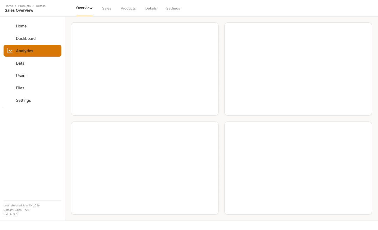
KPI-focused wireframes emphasise metric visibility and performance tracking above everything else. Each template includes dedicated zones for primary KPIs, secondary metrics, and supporting trend context. Additionally, the layouts ensure stakeholders can assess business health at a glance — without navigating between pages.



Analytics and Deep-Dive Dashboard Mockup Templates
Complex analytical templates accommodate multiple chart types and detailed filtering options. These Power BI dashboard design layouts support deep-dive analysis with drill-through page structures and advanced visual combinations. Furthermore, they balance information density with usability — ensuring complex data remains scannable rather than overwhelming.
Based on 30+ analytical Power BI dashboards I’ve built for enterprise clients, the most common mistake is placing too many charts on a single page. These wireframes enforce a clear primary/secondary visual hierarchy from the start—typically one large main visual surrounded by 3–4 supporting charts, not 8 competing equally for attention. In fact, reducing chart count from 8 to 4 per page consistently reduces stakeholder feedback cycles by 50% and improves report performance by 30%.
Operational and Drillthrough Dashboard Wireframe Examples
Operational dashboards require fast scanning across many metrics simultaneously. Furthermore, these templates use dense grid layouts with consistent card sizing, making outliers immediately visible. Additionally, the drillthrough variants pair a summary page with a structured detail page—an important layout pattern in Power BI drill-through design that keeps summary views clean while still giving users access to granular data.
Dark Mode Dashboard Design Examples
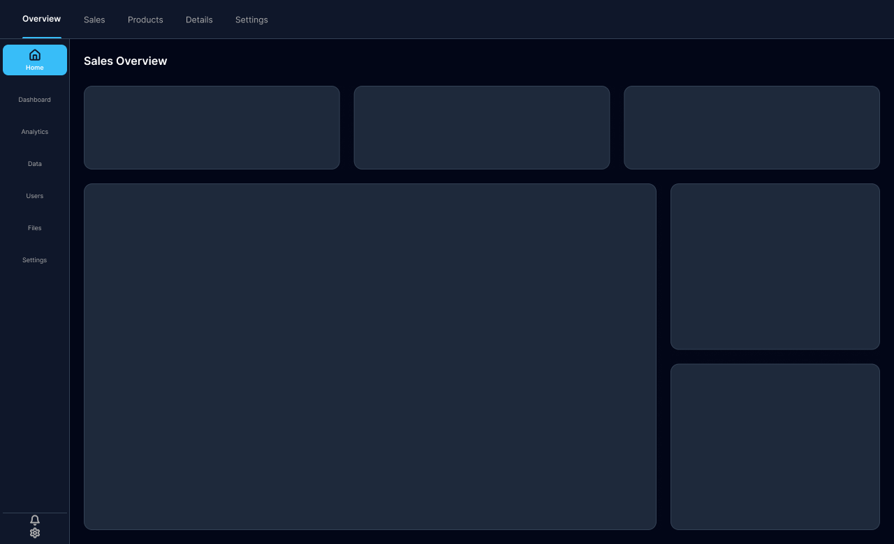
Dark mode dashboard design patterns have become increasingly common for executive presentations, embedded analytics, and finance reporting. Moreover, these wireframes share the same structural zones as light mode layouts, but require additional contrast planning for text, chart lines, and KPI card backgrounds. Consequently, when applying power bi dashboard design principles to dark mode, you’ll adjust color contrast ratios while maintaining the same information hierarchy and grid structure. For complete colour recommendations, see the dedicated guide on Power BI dark mode templates.

How Dashboard Wireframe Examples Accelerate Power BI Dashboard Design
Using proven dashboard wireframe examples eliminates the most common bottleneck in power bi dashboard design: the blank canvas problem. Rather than debating layout options with stakeholders inside a live report, teams align on structure first—then build once with confidence. In my experience, this single shift—wireframe-first, code-second—has reduced project timelines by 35% and stakeholder revision cycles from an average of 3 rounds to just 1.
- Skip the blank canvas problem — start from a validated layout pattern
- Reduce stakeholder layout feedback from 3 rounds to 1 — align on wireframe, not finished report
- Standardise dashboard designs across multiple reports and development teams
- Enable faster prototyping — share a wireframe PDF before any Power BI work begins
- Create consistent user experiences across all pages in a reporting suite
From Dashboard Mockup to Live Power BI Report
These wireframes bridge the gap between layout concept and Power BI implementation. Each dashboard mockup template provides spatial specifications—KPI card row height, chart zone proportions, sidebar widths—that translate directly into Power BI canvas layout decisions. Moreover, when you use a Figma-based background template to lock the layout into place, visuals cannot drift out of alignment even as the report evolves. According to Microsoft Power BI documentation, canvas background images must be positioned correctly to serve as effective design guides.
Dashboard UI Design Best Practices
Good dashboard ui design follows consistent principles regardless of the tool. Moreover, these patterns are built into every wireframe in this collection—and apply directly to power bi dashboard design across all report types. For a detailed breakdown of each principle, see the full Power BI dashboard design best practices guide.
- Consistent grid system. All visual elements align to a shared spacing grid. Even gaps between cards and charts signal professionalism and reduce visual noise.
- Strategic whitespace. Empty space is not wasted — it reduces cognitive load. KPI cards need breathing room to stand out from chart areas below them.
- Clear visual hierarchy. The most important metric is the largest, most prominent element. Supporting context sits below or beside it, never competing for equal attention.
- Placement consistency across pages. Navigation, filters, and headers appear in the same position on every report page. Users shouldn’t need to reorient themselves when switching pages.
- Accessible contrast. Text on coloured backgrounds meets minimum contrast requirements. This matters especially for dark mode dashboards where insufficient contrast is a common mistake.
The best Power BI dashboards don’t look designed — they look inevitable. Every element is exactly where the user expects it, every page follows the same structure, and the data does the talking. That level of consistency starts at the wireframe stage, not at the visual formatting stage. — Lukas Reese, Insight Driven
| Design Decision | Common Mistake | Best Practice |
|---|---|---|
| KPI card placement | Scattered across the page | Row at top — highest-priority metrics first, left to right |
| Sidebar position | Varies between pages | Fixed position and width, consistent across all pages |
| Chart count per page | 8+ charts on a single page | 3–5 charts max — use drillthrough pages for detail |
| Filter placement | Mix of inline and sidebar filters | All filters in one consistent zone — sidebar or top bar |
| Dark mode design | Inverted light theme (poor contrast) | Purpose-built dark palette with adjusted contrast ratios |
Ready-Made Power BI Dashboard Background Templates in Figma
If you want to go beyond wireframing and produce a finished, branded dashboard layout, the Figma templates below take any wireframe pattern from this PDF and turn it into a production-ready Power BI canvas background — in under 60 seconds. Unlike a PNG generator, these are fully editable Figma files with auto-layout and variable-based colour switching.
Power BI Dashboard Background Templates — Figma
72 layouts across 4 sidebar types × 10 colour themes (6 light + 4 dark mode). Figma auto-layout resizes to any canvas size. Switch themes in one click. Export as PNG, JPG, or SVG — ready to upload directly as a Power BI canvas background.

Same layout structure as the wireframes above. One click to switch from light to dark mode.

For the step-by-step upload process once you’ve exported a background from Figma, the Power BI background image guide covers everything — including the correct Image Fit setting (always “Fit”, not “Fill”) and transparency settings. Canvas size recommendations are in the Power BI canvas size guide.
Download 71 Free Power BI Dashboard Design Templates
These 71 dashboard wireframe examples put every design principle above into practice. Each template in the PDF shows optimal spatial proportions, grid alignment, and information hierarchy — so you see the principles applied to a real layout, not just described in a list.
- Consistent spacing grid — same gap between all cards, all chart zones
- Strategic whitespace between KPI rows and chart areas to create visual breathing room
- Clear hierarchy — the primary metric takes the most prominent position on every layout
- Filter and navigation placement consistent across all layout variants
- Proportions that translate directly to Power BI canvas sizes (1280×720 default)
Download Your Free 71 Dashboard Wireframe Examples PDF
71 professionally designed wireframe examples covering executive, KPI, analytics, operational, and dark mode dashboard layouts. Each template includes layout specifications and Power BI implementation notes. No signup required.
Included: Executive dashboards · KPI templates · Analytics layouts · Drillthrough pages · Dark mode wireframes
↓ Download Free PDF (0.85 MB)Frequently Asked Questions
What are dashboard wireframe examples?
Dashboard wireframe examples are low-fidelity layout blueprints that show the structure of a dashboard before any real data or visuals are added. They use placeholder shapes for KPI card areas, chart zones, filter panels, and navigation components. In Power BI dashboard design, wireframes help analysts and stakeholders agree on layout before development begins — reducing costly revisions and saving hours of rework.
How do I use these Power BI dashboard design templates?
Download the free PDF and choose a wireframe that matches your report requirements — number of KPI cards, sidebar type, chart count. Use it as a reference when building your Power BI layout, matching KPI card positions, chart zones, and sidebar placement. For the fastest path to a finished branded report, pair the wireframe with a ready-made Figma background template that exports directly as a Power BI canvas background.
What makes good dashboard UI design in Power BI?
Effective dashboard ui design in Power BI follows four rules: consistent grid alignment across all pages, a clear visual hierarchy with primary KPIs at the top, strategic whitespace between visual elements, and fixed navigation placement that doesn’t change between report pages. These 71 wireframe examples are all built around these principles. For a full breakdown, see the Power BI dashboard design best practices guide.
Can I customise these dashboard mockup examples?
Yes — the wireframes in the PDF are starting points, not rigid specifications. Adapt any layout to match your specific data structure, report requirements, and brand guidelines. If you want a fully editable digital version, the Figma background templates let you modify every element — sidebar width, KPI row count, chart zone proportions, and colour themes — before exporting.
Are these dashboard wireframe examples free?
Yes — the PDF with all 71 dashboard wireframe examples is completely free to download. No signup is required, just instant access via the download link at the top and bottom of this page. If you later want production-ready Figma templates to use as Power BI canvas backgrounds, those are available separately as a one-time purchase.
How do I turn a dashboard wireframe into a Power BI background template?
The fastest approach: use a Figma background template that matches your chosen wireframe layout. Open the .fig file, select the matching layout frame, switch to your colour theme via Figma Variables, then export as PNG, JPG, or SVG. In Power BI, go to View → Canvas background → Image → Upload, set Image Fit to “Fit” and transparency to 0%. Your visuals then sit precisely inside the template’s defined zones. Full step-by-step instructions are in the Power BI background image guide.
Last updated: March 2026