The Magic of a Power BI Dark Theme
When working with Power BI, I’ve found that the visual theme of a report can significantly influence its reception. Sometimes, opting for a Power BI dark theme is more than just a stylistic choice—it might be a specific requirement from a client or simply a nice alternative that enhances the overall presentation of data. Dark themes bring a certain sophistication and clarity, especially in environments where presentations benefit from less glare and more visual focus.
On several occasions, clients have specifically requested dark themes for their reports. They appreciate how these themes make their data visuals pop against the dark background, which not only looks modern but also makes it easier for their teams to view detailed charts during long review sessions. This experience has shown me how crucial it is to adapt to client preferences and requirements, ensuring that the final product not only meets but exceeds their expectations.
Why the Dark Theme Rocks
One of my favorite options in Power BI is the dark theme. It’s not just about looking cool; it has some real perks, especially when you’re presenting in dimly lit rooms. Here’s why I love it:
| Benefit | Why It Matters |
|---|---|
| Less Eye Strain | Easier on the eyes during long sessions. |
| Better Contrast | Bright colors pop against a dark background, making data points stand out. |
| Sleek Look | Gives reports a modern, professional vibe. |
| Fewer Distractions | Helps viewers focus on the data, not the background. |
Switching to the Power BI dark theme has changed how my reports are received. Whether I’m prepping for a client meeting or sharing insights with my team, the dark theme adds a touch of class that people notice. If you want to get creative, check out the Power BI theme generator to craft themes that fit your unique needs.
So, next time you’re working on a Power BI report, give themes a shot. They might just be the secret sauce you need to make your data shine.
Activating the Power BI Dark Theme
Want to give your Power BI reports a sleek, modern look? Let’s switch to the Power BI Dark Theme. It’s a breeze to set up and makes your data pop while being easier on the eyes.
Accessing Theme Options
First things first, head over to the View tab in Power BI. This is where the magic happens. You’ll see a Themes dropdown menu. Click on it, and voilà, a list of themes appears, including our star of the show—the Dark Theme.
| Step | Action |
|---|---|
| 1 | Go to the View tab |
| 2 | Click on the Themes dropdown |
| 3 | Select Dark Theme from the options |
Applying the Dark Theme to Your Reports
Now that you’re in the theme options, applying the Dark Theme is as easy as pie. Just click on it, and watch your report transform instantly. The dark background not only looks cool but also helps you focus on the data.
Want to keep this theme handy for future projects? Check out the Power BI Theme Generator to create custom themes or download Power BI themes that fit your style. If you’re feeling adventurous, you can even tweak or create new themes from scratch using Power BI JSON themes.
Switching to the Dark Theme is a game-changer for making your reports stand out. Can’t wait to see the reactions when your audience gets a look at the new, polished design.
Pimp Your Power BI Dark Theme
Want your Power BI reports to look slick and be easy on the eyes? Customizing the dark theme can make your data pop and keep your audience engaged. Let’s dive into some tips and tricks to make your reports not just good, but great.
Color and Contrast: The Basics
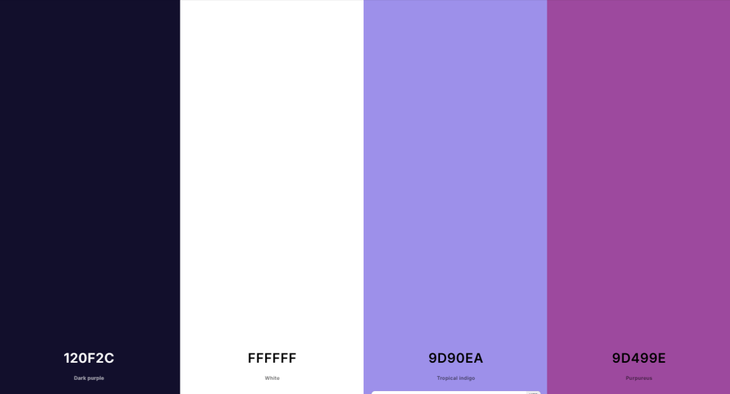
First things first, you gotta get those colors right. A good dark theme isn’t just about looking cool; it’s about making sure your data is clear and easy to read. Here’s a quick cheat sheet for picking your palette: See color palette below.
Need inspiration for your color palette? Check out coolors.co and create your palette in seconds!
| Element | Color Code | Why It Works |
|---|---|---|
| Background | #120F2C | Dark gray for a neutral backdrop |
| Text | #FFFFFF | White for high contrast |
| Primary Accent | #9d90ea | Tropical Indigo for bar and Line Charts |
| Secondary Accent | #9d499e | Purpureus for side navigation and other highlights |

High contrast is your friend here. You want your text to stand out against the background, and your accents to draw attention where it matters. And hey, don’t forget about accessibility—make sure your colors work for everyone, including folks with visual impairments. Need more tips? Check out power bi color theme.
Making Visuals Shine in Dark Mode
Got your colors sorted? Awesome. Now let’s make those visuals pop. Here are some pro tips:
- Clear Labels: Make sure your labels and titles are easy to read. No one likes squinting at their screen.
- Data Point Colors: Use bright or light colors for your data points. They should stand out against the dark background.
- Borders and Shadows: Add subtle borders or shadows to give your elements some depth. It helps separate different parts of your report.
Feeling lazy? No worries. You can use a power bi theme generator or grab some pre-made themes from download power bi themes. Saves time and ensures you’re following best practices.
Wrap-Up
By focusing on these customization tips, you’ll create reports that not only look awesome but also communicate your data clearly. So go ahead, give your Power BI reports the dark theme makeover they deserve. Your audience will thank you.
Best Practices for Dark Theme Usage
Making Text Easy to Read
When I dive into using the Power BI dark theme, readability is my top concern. Dark backgrounds can make text hard to read if the contrast isn’t right. So, I make sure my text is bright enough to pop against the dark backdrop. Usually, I go with white or light gray text to keep things clear.
Visit coolors.co (affiliate link) to check if two colors work well together. Simply use their Contrast Checker Tool. There you can also create custom color palettes in seconds.

I also double-check that the font styles and sizes are easy on the eyes. Sans-serif fonts are my go-to because they’re usually clearer on screens.
Using Contrast to Your Advantage
Contrast is your best friend when working with a dark theme. It not only makes text readable but also highlights important data points. I use contrasting colors for different elements like charts, graphs, and backgrounds.
For example, if I have a dark blue background, I might use bright colors like orange or yellow for key visuals. This helps highlight crucial info without overwhelming the viewer. I often refer to the Power BI color theme guidelines to make sure I’m using the right combos.
Here’s a quick contrast guide:
| Element | Recommended Color Pairing |
|---|---|
| Titles | White on Dark Gray |
| Data Labels | Yellow on Dark Blue |
| Chart Bars | Light Green on Dark Background |
| Gridlines | Light Gray on Black |
Making Data Stand Out
To make data pop in the Power BI dark theme, I focus on visual impact. I use bold visuals that are easy to tell apart. Bar charts and pie charts work great in dark mode, especially with vibrant colors.
I also think about using icons and images that fit the dark theme. These can add depth to the reports. To make the user experience even better, I explore Power BI JSON themes for custom settings that can take my reports to the next level.
For impactful data visualization, keep these tips in mind:
| Visual Element | Best Practices |
|---|---|
| Charts | Use bold, contrasting colors |
| Text | Keep font styles consistent |
| Icons | Choose simple designs for clarity |
| Images | Make sure they are high-contrast |
By sticking to these best practices for using the Power BI dark theme, I create reports that are not just visually appealing but also effective in getting the message across. For more creative options, I sometimes check out download Power BI themes to get inspired for my projects.
Conclusion:
Embracing the Power BI dark theme has redefined the aesthetic and functional quality of my reports, bringing out the vibrancy of data visualization in a way that’s both stylish and functional. The high contrast and sleek design not only enhance the visual appeal but also improve readability, making information pop against the dark background. If you’re looking to elevate your reporting game, switching to the dark theme in Power BI is a definite game-changer. It not only adds a professional touch but also significantly aids in data comprehension. Remember, the right theme can turn a mundane report into a compelling story. So go ahead, give your Power BI reports a dark theme makeover and watch your data storytelling transform.

