Introduction to Power BI Color Themes
Why Color Themes Matter in Power BI
Jumping into Power BI, one thing that pops out is how crucial color themes are. A good color theme can turn a plain report into a visual story. Colors don’t just make things pretty; they help tell the story. They highlight important data, separate categories, and make the whole experience better.
Sticking to a consistent color palette keeps reports looking sharp and professional. This is super important when sharing insights with stakeholders who might depend on visual cues to get the gist of complex data.
How Color Themes Boost Data Visualization
Color themes in Power BI aren’t just for show; they make data visualization way better. Here’s how:
- Clearer Data: Using different colors for different datasets makes it easy to spot information quickly.
- Emotional Punch: Colors can stir emotions, helping to tell the story behind the data. For example, warm colors can signal urgency, while cool colors can suggest calm.
- Brand Harmony: Matching color themes with brand colors creates a unified look. This is great for client presentations or marketing materials.
- Accessibility: Well-chosen colors can make reports easier to read and accessible to everyone, including those with visual impairments.
To nail down the perfect color themes, I often check out resources like the Power BI Theme Generator for custom palettes or Download Power BI Themes for ready-made options.
Here’s a quick table showing the emotional vibes of different colors often used in data visualization:
| Color | Emotional Vibe |
|---|---|
| Red | Urgency, Alertness |
| Blue | Trust, Calmness |
| Green | Growth, Stability |
| Yellow | Energy, Attention |
| Orange | Creativity, Enthusiasm |
By getting the hang of color themes and how they improve data visualization, I can make reports that really hit home with my audience. For more advanced themes, I dive into Power BI JSON Themes and sometimes go for the Power BI Dark Theme for a sleek, modern look.
Exploring Default Color Themes
Overview of Default Color Themes
In Power BI, default color themes are like ready-made outfits for your data. They make your reports look sharp and professional without you having to fuss over every little detail. These themes are crafted to make your data pop while keeping it easy on the eyes. Power BI offers a bunch of these themes, so you can pick one that matches your style and needs.
Here’s a quick rundown of some popular default color themes in Power BI:
| Theme Name | Description |
|---|---|
| Light | Bright and airy, perfect for presentations. |
| Dark | Sleek and modern, great for dashboards. |
| Colorful | Vibrant and eye-catching, makes data stand out. |
| High Contrast | Designed for clarity and easy reading. |
How to Apply Default Color Themes in Power BI
Applying a default color theme in Power BI is a breeze. Here’s how you can do it:
- Open Power BI Desktop: Fire up Power BI Desktop and load your report.
- Go to the View Tab: Click on the “View” tab in the ribbon at the top.
- Select a Theme: In the “Themes” group, you’ll see a bunch of default themes. Hover over each one to get a preview.
- Apply the Theme: Found one you like? Just click on it to apply it to your report.
If you’re feeling adventurous, you can also download Power BI themes or use a Power BI theme generator to create your own custom look.
Using these default color themes, you can make your data tell a story that’s not just informative but also visually appealing. Your audience will thank you for making insights easy to spot.
Jazz Up Your Power BI with Custom Color Themes
Creating custom color themes in Power BI lets you add a personal touch to your reports and dashboards. It’s a fun way to make your data pop and reflect your brand or style.
How to Create Custom Color Themes
Pick Your Colors: Start by choosing a color palette that matches your brand or the vibe you want. A good mix usually includes primary, secondary, and accent colors.
Use the Power BI Theme Generator: Head over to the Power BI Theme Generator to create a JSON file. This tool helps you see how your colors will look together.
Build Your JSON File: Once you’ve got your colors, put them into a JSON format. Here’s a simple example:
   {
       "name": "My Custom Theme",
       "dataColors": ["#FF5733", "#33FF57", "#3357FF"],
       "background": "#FFFFFF",
       "foreground": "#000000",
       "tableAccent": "#FF5733"
   }
Import the Theme into Power BI: Go to the ‘View’ tab in Power BI, select ‘Themes’, and then ‘Browse for themes’ to upload your custom JSON file.
Apply and Tweak: Once imported, apply the theme to your report and tweak it as needed to make sure everything looks just right.
Tips for Killer Custom Color Themes
Keep It Simple: Stick to around five colors to keep things clear. Too many colors can be overwhelming.
Think About Color Blindness: Use colors that everyone can distinguish. There are online tools to help you check your choices.
Check Readability: Make sure your text stands out against the background. High contrast is key for readability.
Use Colors with Purpose: Assign colors meaningfully, like red for warnings and green for positive trends. This makes your data easier to understand.
Be Consistent: Use the same colors across different reports and dashboards. Consistency builds familiarity and looks professional.
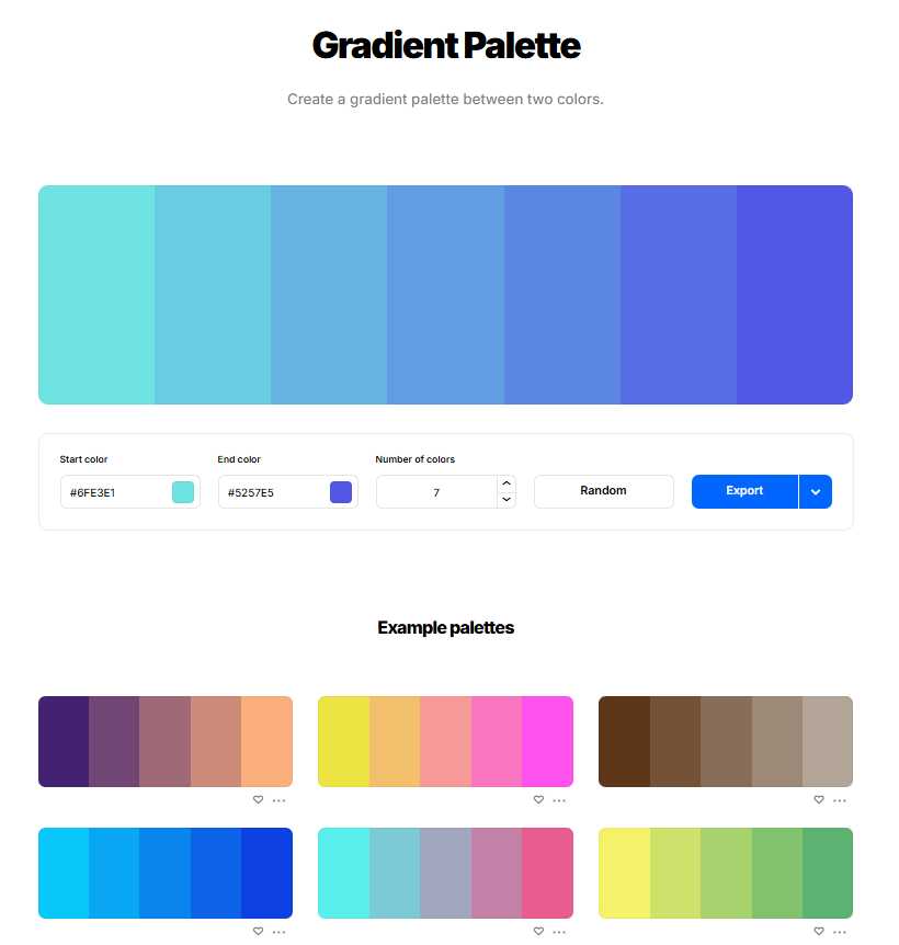
Head over to coolors.co (affiliate link) the create an amazing gradient within a matter of seconds. If you don’t know the starting or ending color you can select random and simply choose the one that you like. It’s super easy!

By following these steps and tips, you can create custom color themes that not only look awesome but also make your Power BI reports more effective. If you want more inspiration, check out download power bi themes or power bi json themes. For a darker look, the power bi dark theme is also worth a peek.
Best Practices for Using Color Themes in Power BI
When diving into Power BI, nailing the color themes is a game-changer. It’s not just about making things look pretty; it’s about making data pop and easy to understand. Here’s my go-to guide for making your reports not just stand out, but shine.
Making Sure Everyone Can See It
First things first, accessibility is king. You want everyone, even those with color vision issues, to get the full picture. Here’s what I keep in mind:
| Aspect | What to Do |
|---|---|
| Color Contrast | Go for high contrast between background and text. |
| Color Combos | Steer clear of red/green mixes—they’re a nightmare for color-blind folks. |
| Font Readability | Pick fonts that are easy to read against your colors. |
Keeping It On-Brand
Branding isn’t just for marketing materials; it’s crucial for your Power BI reports too. Consistent colors help reinforce your brand identity. Here’s my playbook:
| Branding Element | How to Use Colors |
|---|---|
| Primary Color | Use it for main visuals and key metrics. |
| Secondary Color | Perfect for supporting visuals and highlights. |
| Accent Color | Great for calls to action and important notes. |
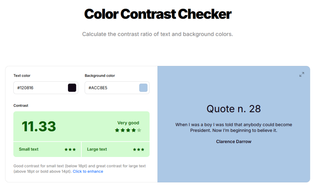
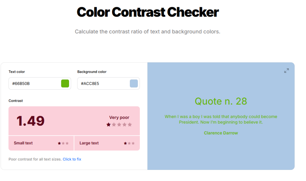
Coolors.co (affiliate link) also offers a color contrast checker that tells you how good or bad two colors are matching. It’s amazing because personally I don’t know much about color combinations. But this tool is a great starting point, check it out!
Example of well matching colors:

Example of colors that dont match well:

I often hit up a Power BI theme generator to whip up themes that match my brand’s colors. This keeps things looking sharp and professional.
Using Colors to Tell a Story
Colors aren’t just for looks—they can tell a story. Here’s how I use them to make data insights crystal clear:
| Purpose | Color Choice |
|---|---|
| Positive Trends | Greens for growth or good performance. |
| Negative Trends | Reds to show declines or problems. |
| Neutral Info | Grays or blues for general data. |
By using these color strategies, I can direct attention to the most important data points. This makes my reports not just engaging, but also super useful for making decisions.
For more tips on downloading and using specific themes, check out download Power BI themes and Power BI JSON themes. These resources help me manage and tweak my color themes like a pro.
Conclusion:
Incorporating the right Power BI color theme into your reports can transform them from mere numbers and charts into engaging, informative visual stories that resonate with your audience. Whether you opt for the simplicity of default themes or dive into customizing your own with the Power BI Theme Generator, the power of color in data visualization cannot be overstated. Remember, the goal is to not only present data but to make it accessible and actionable. Consistency in your color choices can also reinforce brand identity and enhance overall readability, making your reports not just visually appealing but also strategically effective. As you explore and implement these color themes, keep accessibility and brand alignment in mind to ensure your data storytelling is effective across all fronts.

