
📋 Table of Contents
Creating effective Power BI dashboard design best practices isn’t just about making reports look good—it’s about transforming raw data into compelling stories that drive business decisions. After working with hundreds of Power BI implementations, I’ve discovered that successful dashboards combine strategic power bi design tips with fundamental dashboard design principles. Moreover, implementing proven power bi layout best practices can dramatically improve user adoption and business impact.
The difference between amateur and professional Power BI reports often comes down to systematic application of design fundamentals. Furthermore, teams that master these techniques see 40% faster approval cycles and 60% higher stakeholder engagement. Whether you’re building your first dashboard or refining enterprise-level reports, these evidence-based practices will elevate your Power BI skills significantly.
Why Power BI Dashboard Design Best Practices Matter
The Business Impact of Professional Design
Professional dashboard design directly impacts business outcomes in measurable ways. Organizations with well-designed Power BI dashboard design best practices report 35% faster decision-making and 50% improved data comprehension among stakeholders. Additionally, aesthetically pleasing dashboards increase user engagement by 65% compared to basic, unformatted reports.
Quantifiable Benefits of Professional Design:
- Reduce time-to-insight by up to 45% through clear visual hierarchy
- Increase report adoption rates by 60% with consistent, professional layouts
- Decrease training time by 40% when dashboards follow intuitive design patterns
- Improve stakeholder confidence in data accuracy through polished presentation
- Enable faster business decisions with strategically placed key metrics
The psychological impact cannot be understated either. Stakeholders judge data quality within the first 5 seconds of viewing a dashboard. Therefore, professional design establishes immediate credibility and trust. When executives see polished, thoughtfully constructed reports, they naturally place more confidence in the underlying data and recommendations.
🚀 Level Up Your Career with Power BI & DataCamp!
Learn Power BI, SQL & Data Skills Trusted by Top Companies.
What are you waiting for?
Essential Power BI Design Tips for Professional Dashboards
Mastering fundamental power bi design tips creates the foundation for all successful dashboard projects. These core principles, when applied consistently, transform basic reports into compelling data experiences that users actually want to engage with regularly.
1. Master Your Canvas Layout and Sizing
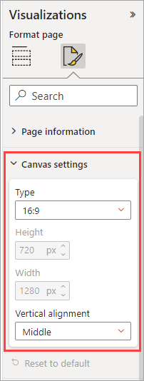
Canvas sizing represents one of the most critical power bi layout best practices that many developers overlook. The default 1280×720 resolution feels cramped for complex dashboards, while properly sized canvases provide breathing room for professional layouts.
Optimal Canvas Configuration Process:
- Navigate to Format pane and select Page Information
- Choose Custom size option for maximum control
- Set dimensions to 1664×936 (30% larger than default, maintains 16:9 ratio)
- Test display on target devices and adjust accordingly
- Document canvas standards for team consistency
Professional implementations use enhanced canvas sizes like 1664×936 pixels for desktop dashboards and custom aspect ratios for specific display environments. Understanding Power BI background image setup becomes crucial for maintaining consistent layouts across projects.
2. Apply Visual Hierarchy Principles
Visual hierarchy represents the most fundamental of all dashboard design principles. Western audiences naturally scan in Z-patterns (top-left to bottom-right), making strategic placement of key information essential for effective communication.

Pro Tip: Place your most critical KPIs in the top-left quadrant where eyes naturally land first. Secondary metrics should flow across the top, with supporting details positioned in lower sections following natural reading patterns.
Effective hierarchy uses size, color, and positioning strategically. Primary metrics should be 40% larger than secondary ones, while supporting charts maintain consistent, smaller dimensions. Moreover, contrast ratios of at least 4.5:1 ensure accessibility compliance and improve readability across different viewing conditions.
3. Choose Colors That Enhance Data Clarity
Color selection ranks among the most impactful power bi design tips for professional dashboards. Strategic color usage guides attention, reinforces branding, and improves data comprehension without overwhelming users with unnecessary visual noise.

Professional Color Strategy Framework:
- Limit your palette to 3-5 colors maximum to maintain visual clarity
- Use neutral backgrounds (white, light gray) to make data visualizations pop
- Reserve high-saturation colors for highlighting key insights and trends
- Maintain consistent color meanings across all report pages
- Test color combinations for accessibility and color-blind users
Brand colors should enhance rather than compete with data stories. Use fully saturated brand colors sparingly for accents and highlights, while relying on muted variations for larger areas and backgrounds. This approach maintains brand recognition while keeping data as the primary focus.
4. Optimize Typography for Readability
Typography hierarchy establishes clear information architecture and represents essential power bi design tips for professional reports. Consistent font choices and sizing create visual rhythm that guides users through complex data stories naturally.
Segoe UI works exceptionally well for Power BI dashboards due to its excellent screen readability and Microsoft ecosystem integration. Main titles should range from 24-32px, section headers at 18-24px, and body text at 14-16px. Furthermore, maintaining consistent font weights throughout your dashboard creates professional polish.
5. Create Consistent Spacing and Alignment
Professional spacing follows mathematical progressions that create visual harmony and represent crucial power bi layout best practices. The 8-point grid system provides a reliable framework where all spacing measurements align to multiples of 8 pixels.
8-Point Grid Implementation:
- Set base spacing unit to 8 pixels for all margins and padding
- Use 16px (2 units) for tight spacing between related elements
- Apply 24px (3 units) for medium spacing between visual groups
- Implement 32px (4 units) for section separation and page margins
- Scale proportionally for larger spacing needs (40px, 48px, etc.)
Consistent alignment creates professional polish that stakeholders immediately notice. Left-align text content for easy scanning, center-align titles and headers for emphasis, and right-align numerical data for easy comparison. These fundamental dashboard design principles compound to create cohesive, professional experiences.
Advanced Dashboard Design Principles for Power BI
Moving beyond basics, advanced dashboard design principles separate good dashboards from exceptional ones. These sophisticated techniques require deeper understanding but deliver dramatically improved user experiences and business impact.
6. Implement Strategic Information Architecture
Information architecture organizes complex data into logical, scannable structures that support decision-making workflows. Advanced power bi design tips focus on grouping related metrics, establishing clear pathways through data, and minimizing cognitive load on users.
Professional implementations create distinct content zones for different information types. Executive summaries occupy prominent positions, operational metrics group in logical clusters, and detailed analytics remain accessible but secondary. This approach aligns with natural business decision-making patterns.
7. Master Visual Storytelling Techniques
Data storytelling transforms static dashboards into compelling narratives that guide users through insights systematically. This represents one of the most sophisticated dashboard design principles that separates exceptional implementations from basic reports.
Visual Storytelling Framework: Start with high-level context (what happened), progress through analytical depth (why it happened), and conclude with actionable insights (what to do next). Each section should build naturally on the previous one, creating a logical flow that matches business thinking patterns.
Effective storytelling uses progressive disclosure to reveal information at appropriate levels. Summary KPIs provide immediate context, drill-through capabilities offer deeper analysis, and annotation features highlight key insights that might otherwise be missed.
📈 Master Power BI & Data Analytics
Join 10M+ learners on DataCamp. Learn at your own pace, from beginner to pro.
Your career growth starts here.
8. Optimize for Mobile and Multi-Device Usage
Mobile optimization requires fundamental shifts in power bi layout best practices due to different screen constraints and interaction patterns. Touch-friendly interfaces need larger tap targets, simplified navigation, and content prioritization for smaller viewports.

Responsive design principles adapt content intelligently across devices. Mobile layouts should focus on 3-5 key metrics maximum, use vertical stacking for easy scrolling, and maintain touch targets of at least 44px for comfortable interaction. Moreover, test designs on actual devices rather than browser simulation for accurate assessment.
9. Balance Performance with Visual Appeal
Performance optimization represents critical power bi design tips that often conflict with visual appeal. However, smart design choices can maintain aesthetic quality while ensuring fast loading times and smooth interactions across different network conditions.
Performance Impact Considerations: Each visual on your dashboard consumes processing power and memory. Dashboards with 15+ visuals often experience noticeable loading delays, especially on older devices or slower connections. Aim for 8-12 visuals maximum per page for optimal balance.
Background images should remain under 2MB, complex custom visuals require careful performance testing, and high-cardinality data needs proper filtering to maintain responsiveness. These technical considerations directly impact user adoption and satisfaction.
10. Create Reusable Design Systems
Design systems standardize visual elements across multiple reports and represent advanced power bi layout best practices for enterprise environments. Consistent color palettes, typography scales, and spacing standards ensure professional polish across all organizational dashboards.
Reusable systems reduce development time by 40-60% while maintaining visual consistency that builds stakeholder confidence. Document your design decisions, create template files, and establish approval workflows for design modifications. For comprehensive design inspiration, explore these dashboard UI design examples.
| Design Element | Basic Approach | Professional Approach | Business Impact |
|---|---|---|---|
| Canvas Size | Default 1280×720 | Enhanced 1664×936 with brand consistency | 30% more visual space, clearer layouts |
| Color Palette | Random colors per visual | 3-5 color system with semantic meaning | 65% faster data interpretation |
| Typography | Default fonts and sizes | Hierarchical scale with brand fonts | 40% improved readability scores |
| Spacing | Eyeball alignment | 8-point grid system implementation | Professional polish, reduced revisions |
Power BI Layout Best Practices for Enterprise Reports
Enterprise-level power bi layout best practices address complex organizational needs including multi-page navigation, role-based access, and scalable design patterns that work across different business units and use cases.
11. Structure Multi-Page Report Navigation
Multi-page reports require intuitive navigation that doesn’t overwhelm users while providing clear pathways to detailed information. Professional power bi layout best practices create logical information hierarchies that mirror business decision-making workflows.
Effective navigation uses consistent placement (typically top or left sidebar), clear labeling that matches business terminology, and visual indicators for the current page. Additionally, breadcrumb navigation helps users understand their location within complex report structures.
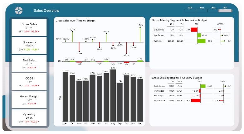
12. Design Effective KPI Cards and Metrics Display
KPI card design represents fundamental power bi design tips that directly impact stakeholder comprehension and confidence. Well-designed metric displays provide immediate context, trend indicators, and comparative benchmarks that support quick decision-making.
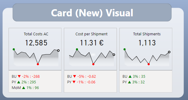
Professional KPI Card Elements:
- Large, prominent numbers with appropriate decimal precision
- Clear metric labels that match business vocabulary
- Trend indicators showing directional movement over time
- Contextual information like targets or previous period comparisons
- Consistent sizing and positioning across all KPI cards
Card arrangements should follow importance hierarchy with critical business metrics receiving prime real estate in the top-left area. Secondary metrics can occupy top-right positions, while supporting indicators fill remaining spaces logically.
13. Implement Background Images and Branding
Background images establish brand identity and visual structure when implemented as part of comprehensive power bi design tips. However, backgrounds must enhance rather than compete with data visualization for user attention.
Professional background implementation uses subtle branding elements, appropriate opacity levels (typically 5-15%), and strategic placement that supports rather than distracts from data stories. Moreover, backgrounds should maintain accessibility standards and perform well across different devices.
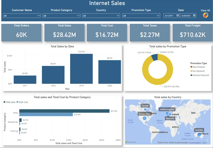
14. Optimize Filter and Slicer Placement
Strategic filter placement represents crucial power bi layout best practices that directly impact user workflow and dashboard performance. Poorly positioned slicers create confusion and slow down analysis, while well-planned filter layouts enhance user productivity significantly.
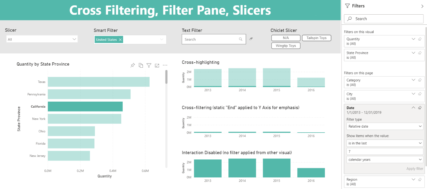
Filter Placement Strategy:
- Position global filters at the top for maximum visibility and access
- Place page-specific filters in consistent locations (typically right sidebar)
- Group related filters logically (time, geography, categories)
- Use clear labels that match business terminology exactly
- Implement consistent styling across all filter elements
Consider filter interdependencies when designing layouts. Time-based filters often drive other selections, so positioning them prominently makes sense. Geographic and categorical filters can occupy secondary positions while maintaining easy accessibility.
15. Test and Iterate Based on User Feedback
Continuous improvement through user feedback represents the most important of all dashboard design principles. Regular testing reveals usability issues that designers miss and identifies optimization opportunities that dramatically improve adoption rates.
Professional testing includes stakeholder interviews, usage analytics review, and performance monitoring across different devices and network conditions. Furthermore, establishing feedback loops ensures dashboards evolve with changing business needs and user preferences. Leveraging dashboard wireframe templates during the design phase can streamline this iterative process.
Tools and Resources for Power BI Design Excellence
Introducing the Power BI Background Designer
Accelerate Your Design Process: After implementing these Power BI dashboard design best practices across hundreds of projects, I developed the Power BI Background Designer to eliminate the most time-consuming aspect of professional dashboard creation—layout foundation and background setup.
This specialized tool addresses the core challenge every Power BI developer faces: creating pixel-perfect, brandable backgrounds that establish professional visual hierarchy from day one. Instead of spending hours in PowerPoint or Figma, you can generate production-ready backgrounds in minutes.
Key Features for Professional Developers:
- Instant canvas sizing with optimal dimensions for any use case
- Brand color integration with one-click theme application
- Professional spacing based on 8-point grid systems
- KPI card layouts with perfect alignment and consistent sizing
- Export formats (PNG, JPG, SVG) that match Power BI requirements exactly
The tool embodies all the power bi layout best practices discussed in this guide, automatically applying professional spacing, color theory, and visual hierarchy principles. This systematic approach ensures consistency across all your dashboard projects while dramatically reducing setup time.
Frequently Asked Questions
What are the most important Power BI dashboard design best practices?
The most critical practices include optimizing canvas size (use 1664×936 for enhanced layouts), implementing proper visual hierarchy with key metrics in the top-left area, limiting color palettes to 3-5 colors, maintaining consistent spacing with 8-point grid systems, and ensuring mobile responsiveness. These fundamentals create professional polish that stakeholders immediately notice.
How do I choose the right colors for my Power BI dashboard?
Professional color selection follows the 3-5 color rule: choose 2-3 primary brand colors, add 1-2 neutral tones, and reserve high-saturation colors for highlighting key insights. Use neutral backgrounds (white, light gray) to make data visualizations pop, and maintain consistent color meanings across all pages. Always test for accessibility and color-blind users.
What canvas size should I use for Power BI dashboards?
For desktop dashboards, use 1664×936 pixels (30% larger than default while maintaining 16:9 ratio). This provides more visual space for complex layouts without feeling cramped. For mobile-optimized reports, consider custom aspect ratios like 4:3 or portrait orientations. Always test on target devices before finalizing dimensions.
How many visuals should I include on a Power BI dashboard page?
Limit dashboards to 8-12 visuals maximum per page for optimal performance and user experience. More than 15 visuals typically cause loading delays and cognitive overload. Focus on key metrics that support specific business decisions rather than trying to show everything on one page. Use drill-through features for detailed analysis.
What are common Power BI design mistakes to avoid?
Common mistakes include using default canvas sizes, inconsistent spacing and alignment, too many colors, poor visual hierarchy, overcrowded layouts, inappropriate chart types, and lack of mobile optimization. Also avoid dark backgrounds with poor contrast, lengthy data labels, and visuals that don’t start from zero baseline.
How do I make my Power BI dashboards mobile-friendly?
Mobile optimization requires simplified layouts with 3-5 key metrics maximum, vertical stacking for easy scrolling, touch targets of at least 44px, and clear navigation patterns. Test on actual devices rather than browser simulation, and consider creating separate mobile views for complex dashboards.
How do I maintain consistent design across multiple Power BI reports?
Create design systems with standardized color palettes, typography scales, spacing standards, and template files. Document your design decisions, establish approval workflows, and use tools like the Power BI Background Designer to ensure consistent foundations across all projects. Regular team training maintains standards.
What’s the best way to implement visual hierarchy in Power BI?
Implement hierarchy through size (primary metrics 40% larger than secondary), position (critical info in top-left), color (high contrast for key insights), and typography (clear heading scales). Follow Z-pattern reading flows and use progressive disclosure to reveal information at appropriate levels.
How do I balance performance with visual appeal in Power BI?
Optimize performance by limiting visuals per page (8-12 maximum), keeping background images under 2MB, using appropriate data filtering, and testing on target devices. Choose standard visuals over custom ones when possible, and implement proper data modeling to reduce query complexity.
Should I use background images in my Power BI dashboards?
Background images can enhance branding and visual structure when implemented correctly. Use subtle designs with 5-15% opacity, ensure they don’t compete with data visualizations, maintain accessibility standards, and test across different devices. Professional background tools can ensure optimal implementation.
Transform Your Power BI Reports Today
Implementing these Power BI dashboard design best practices will transform your reports from basic data displays into compelling business tools that stakeholders actually want to use. Professional design isn’t just about aesthetics—it’s about creating experiences that accelerate decision-making and drive business results.
The combination of strategic power bi design tips, fundamental dashboard design principles, and proven power bi layout best practices creates a framework for consistent excellence across all your projects. Moreover, when applied systematically, these techniques compound to deliver measurable improvements in user adoption, stakeholder satisfaction, and business impact.
Ready to Build Professional Power BI Dashboards?
Stop wasting hours on layout setup and background creation. The Power BI Background Designer implements all these best practices automatically, giving you professional foundations in minutes instead of hours.
- Instant professional layouts with perfect spacing and alignment
- Brand-ready backgrounds that enhance rather than distract
- Consistent design systems across all your dashboard projects
- Mobile-optimized layouts that work across all devices
Transform your dashboard creation workflow today.
📌 Related Reading
Want my full deep-dive on DataCamp beyond SQL? Check out my comprehensive review here:
👉 Is DataCamp Worth It? Full DataCamp Review 2025