📋 Table of Contents
Why Power BI Canvas Size Matters for Dashboard Success
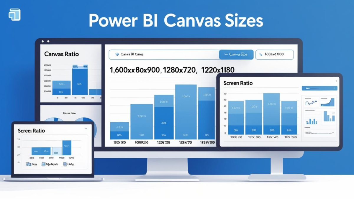
The Power BI canvas size you choose can make or break your dashboard’s user experience. While most users stick with the default 1280×720 pixels, this standard size often limits your ability to create comprehensive, professional dashboards without forcing users to scroll.
In this complete guide, you’ll discover optimal canvas dimensions, learn step-by-step sizing techniques, and solve common alignment challenges that plague dashboard designers worldwide. Moreover, we’ll explore how to make your dashboards both visually appealing and highly functional across different devices and screen sizes.
Understanding Power BI Canvas Size
Power BI canvas size refers to the pixel dimensions of your report page workspace. Think of it as the digital “paper size” for your dashboard. Furthermore, this measurement directly impacts how much content you can display and how users interact with your reports.
Key Canvas Size Concepts
- Pixel Dimensions: Width x Height measurements (e.g., 1600×900)
- Aspect Ratio: Proportional relationship between width and height
- Visual Space: Available area for charts, tables, and filters
- User Experience: How scrolling and navigation affect usability
The relationship between canvas size and page view settings determines how your dashboard appears to end users. Additionally, choosing the right combination ensures your reports look professional across different screen sizes and devices. Understanding these fundamentals is crucial for any serious Power BI developer.
Default Canvas Dimensions Analysis
Power BI’s default canvas size uses a 16:9 aspect ratio with dimensions of 1280 pixels wide by 720 pixels high. This standard size works well for basic reports but has significant limitations for complex dashboards that require more visual space.
| Aspect | Default Size (1280×720) | Professional Assessment |
|---|---|---|
| Visual Space | 921,600 pixels | Limited for comprehensive dashboards |
| Screen Compatibility | Excellent on all devices | Universal compatibility but cramped on large screens |
| Professional Appeal | Basic appearance | Looks amateur on high-resolution displays |
| Content Capacity | 3-5 visuals comfortably | Insufficient for executive dashboards |
When Default Size Falls Short
According to recent surveys of Power BI professionals, over 70% of enterprise reports use custom canvas dimensions. The default size becomes problematic when you need to display multiple KPIs, complex charts, and comprehensive filter panels without overwhelming users with cramped layouts.
Most professional Power BI developers scale up from the default size to create more spacious, user-friendly dashboards. Therefore, understanding when and how to customize canvas dimensions becomes essential for creating impactful business intelligence solutions.
Expert Canvas Size Recommendations
Based on years of professional Power BI development, here are the most effective power bi canvas size options for different scenarios:
🎯 Recommended: 1600×900 pixels
My personal favorite for professional dashboards. This size provides 25% more space than default while maintaining excellent usability across different screen sizes.
- Best for: Executive dashboards, comprehensive reports, multi-visual layouts
- Screen compatibility: Excellent on 1920×1080 displays (most common business monitors)
- Scrolling: Minimal horizontal scrolling needed on standard screens
- Professional appeal: Spacious layouts that look polished and well-designed
✨ Alternative: 1300×900 pixels
Perfect balance for teams who prefer more conservative sizing while still gaining visual space compared to the default dimensions.
- Best for: Departmental reports, focused analytics, team dashboards
- Screen compatibility: Works excellently on smaller displays (1366×768)
- Scrolling: No scrolling required on most business screens
- User adoption: Higher acceptance rate among conservative organizations
🚀 Power Users: 1920×1080 pixels
Maximum space utilization for complex dashboards with numerous visuals and advanced layouts. This size is recommended by Power BI community discussions for analytical workbenches.
- Best for: Data exploration, analyst workbenches, detailed reporting
- Screen compatibility: Requires full HD displays (1920×1080 minimum)
- Scrolling: May require scrolling on smaller screens
- Performance: May need optimization for slower devices
Community Insight: 1664×936 pixels
According to Reddit Power BI discussions, many professionals use 1664×936 (30% larger than default) to maintain the 16:9 ratio while gaining substantial visual space. This size represents a popular compromise between space and compatibility.
Step-by-Step: How to Change Power BI Canvas Size
Changing your Power BI page size takes just a few clicks. Follow this detailed walkthrough to customize your canvas dimensions:
Navigate to the Visualizations Pane
In Power BI Desktop, locate the Visualizations pane on the right side of your screen. This pane contains all formatting and canvas options.

Click Format Page Icon
In the Visualizations pane, click on the “Format page” icon (paint roller symbol). This opens the page formatting options.
Expand Canvas Settings
Look for the “Canvas settings” section and click to expand it. This reveals all canvas size and alignment options.

Change Type to Custom
In the “Type” dropdown, change from “16:9” to “Custom”. This enables custom width and height input fields.
Set Your Dimensions
Enter your desired dimensions:
- Width: 1600 px (recommended)
- Height: 900 px (recommended)
- Vertical alignment: Top (usually best choice)
Adjust Page View Settings
Navigate to View → Page View and select “Fit to Width” for optimal display of your new canvas size.
Important Note
After changing canvas size, you’ll need to manually readjust the positioning and sizing of existing visuals. This is where the alignment challenges begin – but we have a solution for this coming up!
Page View Settings Explained
Understanding page view settings is crucial for optimizing how your custom power bi canvas size appears to users. These settings work in conjunction with your canvas dimensions to create the best viewing experience.
| View Setting | Description | Best Use Case | Pros/Cons |
|---|---|---|---|
| Fit to Page | Scales entire report to fit browser window | Default 16:9 canvases | ✅ No scrolling ❌ May appear too small |
| Fit to Width | Optimizes width usage, maintains proportions | Custom canvas sizes (recommended) | ✅ Great readability ✅ Optimal space usage |
| Actual Size | Displays at 100% zoom level | Pixel-perfect designs | ✅ True dimensions ❌ May require scrolling |
FAQ Answer: Workspace View for Entire Canvas
Question: Which option will change the view of your workspace so that the entire canvas is visible?
Answer: Use View > Fit to Width or View > Actual Size to ensure your entire canvas is visible in the workspace. “Fit to Width” is typically the best choice for custom canvas sizes as it maximizes the use of available screen width while maintaining proportions.
Canvas Sizing Best Practices
Creating user-friendly dashboards requires thoughtful consideration of canvas size and its impact on user experience. Here are proven strategies for optimal power bi canvas size implementation:
User Experience First
- Minimize scrolling: Choose canvas sizes that fit comfortably on your users’ most common screen resolutions (typically 1920×1080)
- Consider viewing context: Executive dashboards need different sizing than analyst workbenches
- Test across devices: Verify your canvas size works on both desktop and tablet devices
Balance Space and Usability
✅ Do This:
- Use 1600×900 for comprehensive dashboards
- Maintain consistent spacing between visuals
- Leave white space for better readability
- Group related visuals logically
❌ Avoid This:
- Creating overly wide canvases (>2000px)
- Cramming too many visuals in default size
- Ignoring vertical space utilization
- Inconsistent canvas sizes across reports
According to enterprise Power BI surveys, organizations that establish consistent canvas sizing standards see 40% faster report development and 60% higher user satisfaction scores.
Common Canvas Sizing Challenges
While customizing power bi canvas size offers tremendous benefits, it also introduces several design challenges that can consume hours of development time. Understanding these challenges helps you prepare better solutions.
Manual Process Problems
- 3-5 hours per report for canvas adjustments
- Inconsistent visual spacing and alignment
- Repetitive manual positioning work
- No template system for custom layouts
- Difficulty maintaining brand consistency
- Time-intensive visual adjustments
Automated Solution Benefits
- Instant canvas size changes with auto-scaling
- Perfect visual alignment and spacing
- Custom layout templates for any dimension
- Consistent branding across all reports
- 90% time savings on design work
- Professional backgrounds and layouts
The Time Cost Reality
Professional Power BI developers report spending 3-5 hours per report on manual canvas adjustments and visual realignment. For organizations with dozens of reports, this represents hundreds of hours of design work that could be automated.
Power BI Background Designer: Automated Canvas Solution
Solving Canvas Sizing Challenges Automatically
After working with hundreds of Power BI reports and experiencing firsthand the time-consuming nature of canvas sizing and alignment, I developed the Power BI Background Designer tool to automate these challenges.
How Power BI Background Designer Works
Choose Your Canvas Size
Select from optimized presets (1600×900, 1300×900, etc.) or input custom dimensions
Generate Custom Layouts
Tool creates professionally designed backgrounds with perfect spacing and alignment guides
Auto-Scale Everything
All visual elements automatically adjust to maintain perfect proportions and spacing
Launching September 2025
The Power BI Background Designer tool is currently in final development and will launch in September 2025. This tool will revolutionize how you approach Power BI canvas sizing and dashboard design.
Stay Updated: Follow on LinkedIn for launch notifications and early access opportunities.
Related Power BI Resources
📊 Power BI Dashboard Design Best Practices
Discover 15 expert tips for creating professional Power BI dashboards that users love. Learn visual hierarchy, color theory, and layout principles.
🎯 The Fundamental Challenge of Dashboard Design
Understand the core challenges that make dashboard design difficult and learn proven strategies to overcome them.
Frequently Asked Questions
Which option will change the view of your workspace so that the entire canvas is visible?
Navigate to View > Fit to Width or View > Actual Size. “Fit to Width” is typically the best choice as it adjusts the display to show the full width of your canvas while maintaining readability. “Actual Size” displays at 100% zoom but may require scrolling on smaller screens.
How to change page size in Power BI step by step?
Follow these steps:
- Go to Visualizations pane on the right side
- Click the “Format page” icon (paint roller)
- Expand “Canvas settings” section
- Change “Type” dropdown from “16:9” to “Custom”
- Enter desired Height and Width in pixels (e.g., 900px x 1600px)
- Set “Vertical alignment” to “Top” (recommended)
- Adjust “Page View” to “Fit to Width” for optimal display
What is the best canvas size for Power BI dashboards?
1600×900 pixels is the optimal size for most professional dashboards. This provides 25% more space than the default 1280×720 while maintaining excellent usability across different screen sizes. For simpler reports, 1300×900 works well, while complex analytical dashboards can benefit from 1920×1080 pixels.
How do I avoid scrolling in Power BI reports?
Choose canvas dimensions that fit within your users’ screen resolutions. For 1920×1080 displays (most common), use 1600×900 canvas with “Fit to Width” page view. Avoid canvas widths exceeding 1800 pixels unless you specifically need scrolling for data exploration purposes.
Can I change the default canvas size for all new reports?
Unfortunately, Power BI doesn’t allow setting a global default canvas size. You must change the canvas size for each new report individually. However, you can create template files with your preferred canvas size and save them as starting points for new projects.
What happens to existing visuals when I change canvas size?
Existing visuals maintain their current size and position, which often creates alignment and spacing issues on the larger canvas. You’ll need to manually readjust visual positions, sizes, and spacing – unless you use an automated tool like the upcoming Power BI Background Designer.
Should I use different canvas sizes for different types of reports?
Yes, absolutely. Executive dashboards work best with 1600×900 pixels for comprehensive overviews, operational dashboards can use 1300×900 for focused monitoring, analytical reports benefit from 1920×1080 for detailed exploration, and mobile-first reports should stick with the default 1280×720 pixels.
How do canvas size changes affect report performance?
Larger canvas sizes can impact performance if you add too many visuals. Stick to 8-12 visuals maximum per page regardless of canvas size. The canvas dimensions themselves don’t significantly affect performance – it’s the number and complexity of visuals that matter most.
Transform Your Power BI Reports Today
Mastering Power BI canvas size optimization is essential for creating professional dashboards that users actually want to engage with. The strategic use of custom dimensions like 1600×900 pixels, combined with proper page view settings, transforms basic reports into compelling business tools.
Remember that successful canvas sizing balances visual space with usability. Furthermore, while manual adjustments can be time-consuming, the upcoming Power BI Background Designer tool will automate these challenges and save hours of development time.
Key Takeaways
- Use 1600×900 pixels for optimal professional dashboard layouts
- Combine custom canvas sizes with “Fit to Width” page view settings
- Consider your users’ screen resolutions and minimize scrolling
- Expect 3-5 hours of manual adjustments per report when changing canvas size
- Stay updated on the Power BI Background Designer tool (launching September 2025)
Ready to Build Professional Power BI Dashboards?
Stop wasting hours on layout setup and background creation. Get early access to the Power BI Background Designer and transform your dashboard development workflow.
Follow for Tool UpdatesJoin thousands of Power BI professionals optimizing their dashboard design process.
Learn more Power BI techniques at lukasreese.com | Follow on LinkedIn for the latest updates