

Power BI background design is basically the art of creating a clean “canvas” that your visuals can sit on top of. Although Power BI can format page backgrounds, most teams still need a practical workflow for designing the structure: headers, KPI rows, visual zones, and consistent spacing. In practice, there are four common ways to do it: build the background manually inside Power BI, design a background image in PowerPoint, design it in Figma, or use a dedicated background generator. And yes, the last one is the one most developers haven’t tried yet.
Quick Summary
- Manual backgrounds in Power BI are flexible, but they’re slow and hard to maintain when layouts change.
- PowerPoint is a solid middle ground for shapes and simple gradients, but you still align visuals manually in Power BI.
- Figma is the most powerful for design systems, but it adds setup time and still doesn’t solve spacing drift in Power BI.
- A dedicated generator can create a Power BI dashboard background in minutes with consistent alignment, but it’s less “free-form” than Figma.
Table of Contents
- Designing backgrounds directly in Power BI
- Creating Power BI backgrounds with PowerPoint
- Designing dashboard backgrounds in Figma
- Using a dedicated Power BI background designer
- Comparison table: all four approaches side by side
- Which approach should you use?
- Step-by-step: from background to finished report page
- FAQ
👨💻 Design Tips by Lukas Reese
Power BI Developer & Business Intelligence Consultant working across multiple industries, delivering end-to-end dashboard solutions to hundreds of users. Published Power BI expert on LinkedIn with 6,000+ followers.
Experience: Enterprise Power BI implementations | Advanced dashboard design | International consulting projects
Reading Time: 4 minutes
The fastest way yet: backgrounds and pages with AI
My free guide covers backgrounds, mock-ups and the full build with Claude Code: 25 pages, 7 prompts you can copy, and the PBIP file.
How I Build Power BI Reports with AI
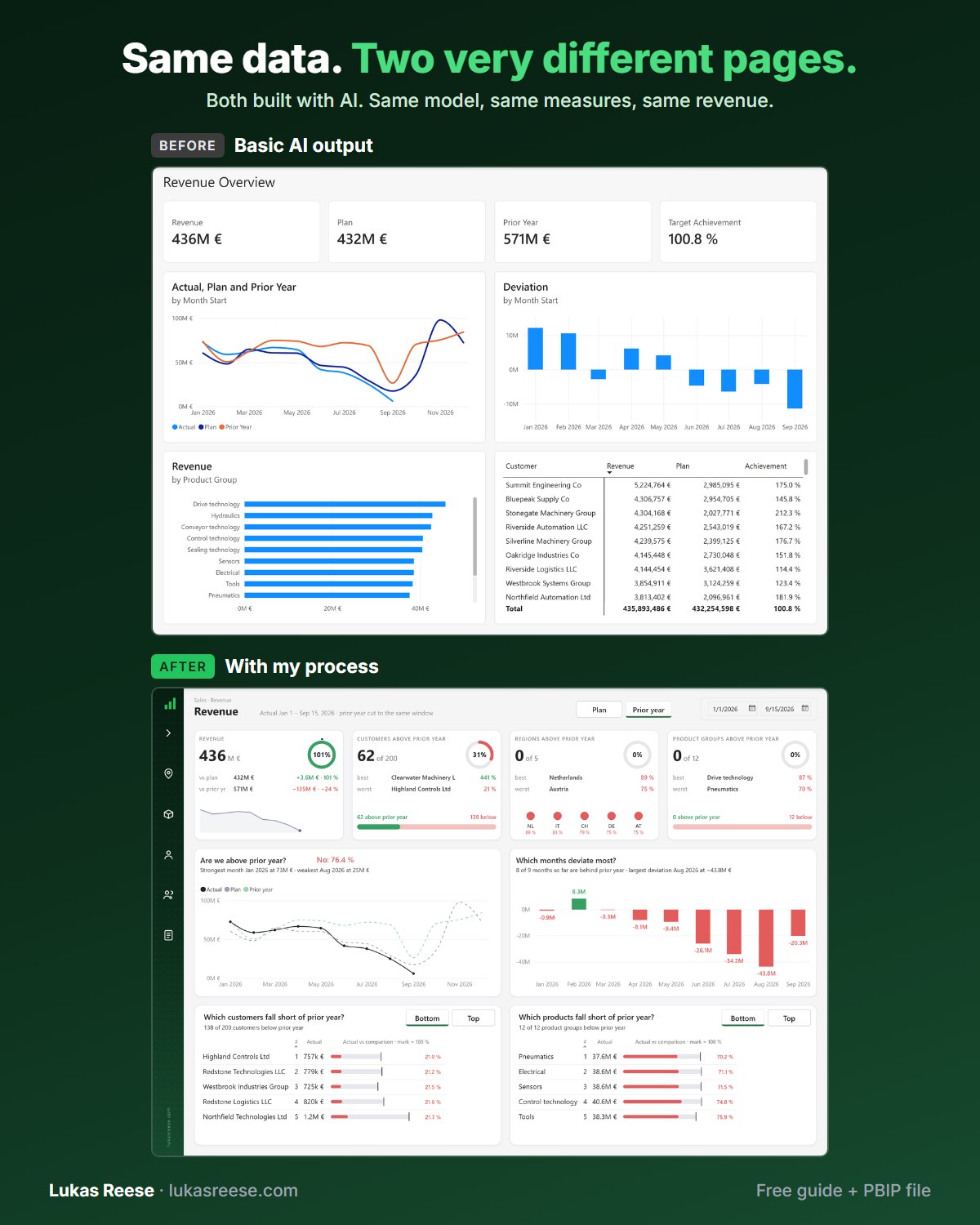
Same data, two very different pages. Both built with AI. This is the process behind the second one.
What you get:
- The 25-page guide: my full process, tool stack and 7 prompts you can copy
- The PBIP file with the same revenue page twice: the basic AI output and the finished page
- Step-by-step explanation, inspiration and real output.
Important: confirm your email
- After you sign up, you get a confirmation email. Click the button in it, then the guide and PBIP file are on their way.
1. Designing backgrounds directly in Power BI (manual method)
If you want the fastest “start right now” option, you can build your Power BI dashboard design directly on the canvas using shapes, text boxes, and lines. However, as soon as your report layout evolves, the manual approach becomes the bottleneck. In client work, I’ve seen this happen repeatedly: the report starts clean, then a new KPI appears, and suddenly you’re nudging rectangles for an hour.
Here’s what the fully manual method looks like in practice: shapes on the canvas, aligned by hand.

What’s good about the manual approach
- Zero tool switching. You stay inside Power BI, so you don’t break flow.
- Maximum freedom. You can tweak anything, anytime, even late in the project.
- No export/import step. There’s no “background image” file to manage.
What usually goes wrong
- Spacing drift. Over time, every little “just move it a bit” change adds up.
- Slow iteration. Because alignment is manual, every layout change costs you time.
- Maintenance pain. When stakeholders request a new visual lineup, you rebuild parts of the structure.
- Clutter risk. More shapes and decoration can turn into noise, especially on smaller screens.
Also, the “manual method” is often confused with a Power BI background image approach. Yet they’re different: manual shapes live as report objects, while a background image sits behind visuals. If you want the “image workflow,” the next two methods are the ones most teams adopt.
If you want broader layout principles (hierarchy, whitespace, scan paths), link this idea to your design fundamentals instead of your background keyword cluster. For example: Power BI dashboard design best practices.
2. Creating Power BI backgrounds with PowerPoint
PowerPoint is the classic “developer-friendly” upgrade. Because you get better shape tools and easier visual styling, you can build a Power BI background image that looks more polished than native Power BI shapes. However, you still pay the alignment tax later, because your visuals must be placed precisely on top of the exported image.
PowerPoint is popular because it’s familiar, yet it still gives you more design control than Power BI’s shape tools.

When PowerPoint works best
- If your team already lives in Office tools and wants a low-learning-curve option.
- If you need simple gradients, panels, icons, and a clear layout grid.
- If you’re aiming for a professional Power BI report layout without becoming a full designer.
Common PowerPoint pitfalls
- Canvas mismatch. If your PowerPoint slide size doesn’t match your Power BI page size, alignment becomes guesswork.
- “Looks right” isn’t the same as “fits.” Even small size differences make visuals drift off the intended zones.
- Layout changes are expensive. If the stakeholder requests “one more KPI,” you often redesign the slide.
Because canvas sizing matters, it’s worth having a consistent sizing reference. If you want a dedicated sizing walkthrough, link readers to your sizing guide: Power BI canvas size guide.
Finally, Power BI itself supports wallpaper/background formatting on report pages, so after you export your image, you typically set it on the page and adjust transparency. The official reference on report visual elements is here: https://learn.microsoft.com/en-us/power-bi/create-reports/desktop-visual-elements-for-reports
3. Designing dashboard backgrounds in Figma
If PowerPoint is the “power user” path, Figma is the “design pro” path. Because Figma supports components, grids, styles, and rapid theme changes, it’s the most flexible method for Power BI background design. Still, your background will usually end up as a Power BI background image, which means you’ll do manual alignment in Power BI anyway.
Figma shines when you want consistent styling, reusable components, and fast color changes.

Why developers like Figma (even if they aren’t designers)
- Style systems. You change one color token and the whole layout updates.
- Grid discipline. With guides and spacing rules, layouts feel “designed,” not accidental.
- Template ecosystem. Many creators publish Figma dashboard kits and wireframes.
The problem that doesn’t go away
Even with a perfect Figma file, you still face the same reality: your Power BI visuals are not “snapping” into your image zones by default. So, you align charts and cards manually. And then, when the report changes, you repeat the alignment work. That’s why spacing becomes the ongoing cost in a Power BI report layout workflow.
If you’re combining backgrounds with consistent colors and fonts, you can also leverage theme approaches. For example, Power BI supports theming, and some teams embed background styling via themes. One reference example: https://www.intellus.group/add-an-embedded-background-image-to-your-power-bi-theme/
4. Using a dedicated Power BI background designer (the one most people haven’t tried)
This is the fourth approach: instead of drawing every shape, you generate a structured canvas that’s already aligned. In other words, you treat layout as a system. Because the layout rules are built for Power BI, you stop recalculating spacing every time the report evolves. This method is especially useful when you build many reports, or when you want consistent design across pages and projects.
This is what it looks like when the “layout math” is handled upfront, so you can focus on your visuals.

Want to skip the first three methods and save hours per report?
Here’s method #4 in action — a full walkthrough of the Background Designer Figma plugin building a dashboard background end-to-end.
Highlights that matter (honest and practical)
- Speed. You can create a professional Power BI dashboard background in minutes instead of rebuilding shapes every time.
- Consistency. Because layouts follow a grid, spacing and alignment stay stable across pages.
- Common layout patterns. Headers, KPI rows, sidebars, and visual zones are pre-structured so the page starts “organized.”
- Light mode and dark mode. You can generate different styles without redoing the full layout.
- Export workflow. You export a background image (PNG/JPG/SVG) and then import it into Power BI.
The core trade-off is simple: you gain speed and consistency, but you lose some of the free-form flexibility you’d have in Figma. That’s not a bug. Instead, it’s the point: most reports need proven layout structures more than unlimited artistic freedom.
Here’s the “variation” angle: change colors and shapes without breaking spacing and alignment.

The tool: If you want to see the dedicated tool workflow, start here: the background designer page.
And if you want the longer educational walkthrough (backgrounds + sizing + pitfalls), this post is the best companion resource: the background image guide (with tool context).
Comparison table: all four approaches side by side
If you’re deciding fast, compare the methods by the thing that usually kills momentum: rework. Because even if a method looks good today, you still need it to survive tomorrow’s changes.
| Method | Speed | Flexibility | Alignment effort in Power BI | Maintenance | Best for |
|---|---|---|---|---|---|
| Manual in Power BI | Slow | High | High | Hard | Quick prototypes, small reports, one-off pages |
| PowerPoint background image | Medium | Medium | High | Medium | Analysts who want better styling without learning Figma |
| Figma background image | Medium | Very high | High | Medium | Design-heavy teams, template creators, brand-first dashboards |
| Dedicated background designer | Fast | Medium | Low to medium | Easy | Teams that ship many reports and want consistent layout foundations |
Which approach should you use?
Use this decision framework when you’re choosing a workflow. It’s not about “best tool.” Instead, it’s about “lowest regret” when the report changes.
A simple decision framework
- Choose manual Power BI shapes if you need something today and the layout will probably be thrown away anyway.
- Choose PowerPoint if you want a cleaner look and you’re fine aligning everything manually afterward.
- Choose Figma if you need full control, reusable components, and a real design system.
- Choose a dedicated designer if you want the fastest path to consistent, professional structure across many pages.
If you also want broader operational best practices (performance, structure, collaboration), it helps to reference a general guide rather than repeating it here. For example: real user Power BI best practices.
Step-by-step: from background to finished report page
No matter which method you choose, the “import and align” stage is the same. So, here’s the practical workflow that keeps Power BI background design from turning into endless alignment work.
- Pick your canvas size first. Decide the report page dimensions before you design anything. Otherwise, you redesign later. Use a sizing reference if needed: Power BI canvas size guide.
- Choose your method. Manual, PowerPoint, Figma, or a dedicated generator. Commit early, because switching midstream is expensive.
- Design the background with clear zones. Create obvious containers for KPI cards, charts, filters, and headers. Keep decoration subtle.
- Export the background image correctly. Use a crisp format (PNG is common) and keep the exact pixel dimensions. If you change the size, you break alignment.
- Set the background/wallpaper in Power BI. On the page formatting, set your wallpaper/background and adjust transparency if needed. Reference: https://learn.microsoft.com/en-us/power-bi/create-reports/desktop-visual-elements-for-reports
- Place visuals on top and align to the zones. Use Power BI’s alignment tools and keep spacing rules consistent.
- Lock your spacing rules. When a stakeholder asks for a new visual, adjust the layout system first, not just one chart.
- Check readability. Verify contrast, especially on dark backgrounds. WCAG contrast guidance is here: https://www.w3.org/WAI/WCAG21/Understanding/contrast-minimum.html
FAQ
Can you create background images directly in Power BI?
Yes. You can set wallpaper/background on a report page and also use shapes for manual layout. For report-page visual elements and wallpaper options, see: https://learn.microsoft.com/en-us/power-bi/create-reports/desktop-visual-elements-for-reports
What size should a Power BI background image be?
It should match your report page dimensions exactly. If the background image and canvas size differ, alignment becomes guesswork. A practical walkthrough is here: https://lukasreese.com/2025/08/22/power-bi-canvas-size-guide/
Does using many shapes affect Power BI performance?
It can, especially when reports become complex, because extra objects increase layout complexity and maintenance overhead. Even when performance impact is minor, the bigger cost is usually manual rework and “spacing drift” over time.
Is PowerPoint good enough for professional dashboards?
Often, yes. PowerPoint can produce clean panel designs and structured zones. However, you still need to align all visuals manually inside Power BI after importing the image, so changes later can be expensive.
Why do Power BI visuals never align perfectly with background images?
Because the background image is static while visuals are interactive objects. As a result, any change in canvas size, visual padding, or layout rules can cause drift. That’s why sizing and consistent spacing rules matter.
Do I need Figma to design modern Power BI dashboards?
No. Figma is great for design systems, but you can still build modern dashboards using PowerPoint or a structured generator. What matters most is a consistent grid, clear hierarchy, and readable contrast.
Can I reuse the same background across multiple reports?
Yes, as long as you keep the same canvas size and layout structure. If you need multiple layouts (different KPI counts, sidebars, or visual grids), a reusable layout system becomes more practical than one static image.
There is now a fifth route worth knowing about: because an SVG is text rather than pixels, a language model can write one directly. I cover that in AI-generated Power BI background SVGs.
Save hours and create professional dashboard backgrounds in minutes
If you want to skip manual spacing work and start every report with a clean structure, try the Power BI Background Designer. The plugin runs inside Figma at €199 launch price (first 25 customers · then €249) — one-time purchase, no subscription.