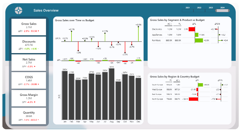
A sales report built with AI that leads to action.
A revenue report that answers four questions: how did we perform, how good or bad was it, why, and what do we do about it. Model, measures, visuals and background were built with AI in PBIP. The questions, the story and every check came from me.
Four questions, one story.
A marketing, logistics or sales report all look different. In essence they answer the same four questions. Each page is designed around them.
How did we perform?
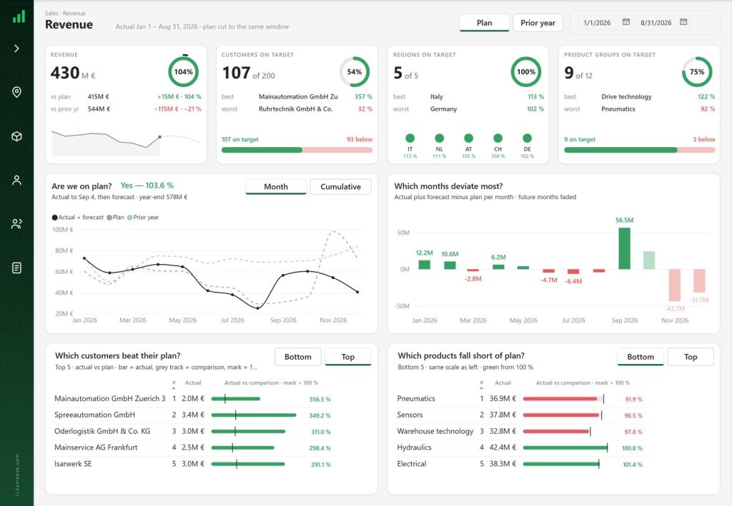
One number at the top. 431 M€ in revenue.
Revenue pageHow good or bad was it?
The number alone says nothing. Against plan we are ahead, against the prior year we are behind.
Revenue pageWhy?
Which customer, region, product or month causes the difference.
Revenue + root causeWhat do we do about it?
The most important one. Numbers have to turn into a follow-up.
Customer detail + review“The goal of Power BI reports is not to display data. It is to act on data.”From the walkthrough
Page 1: Revenue
1
2
3
4
5
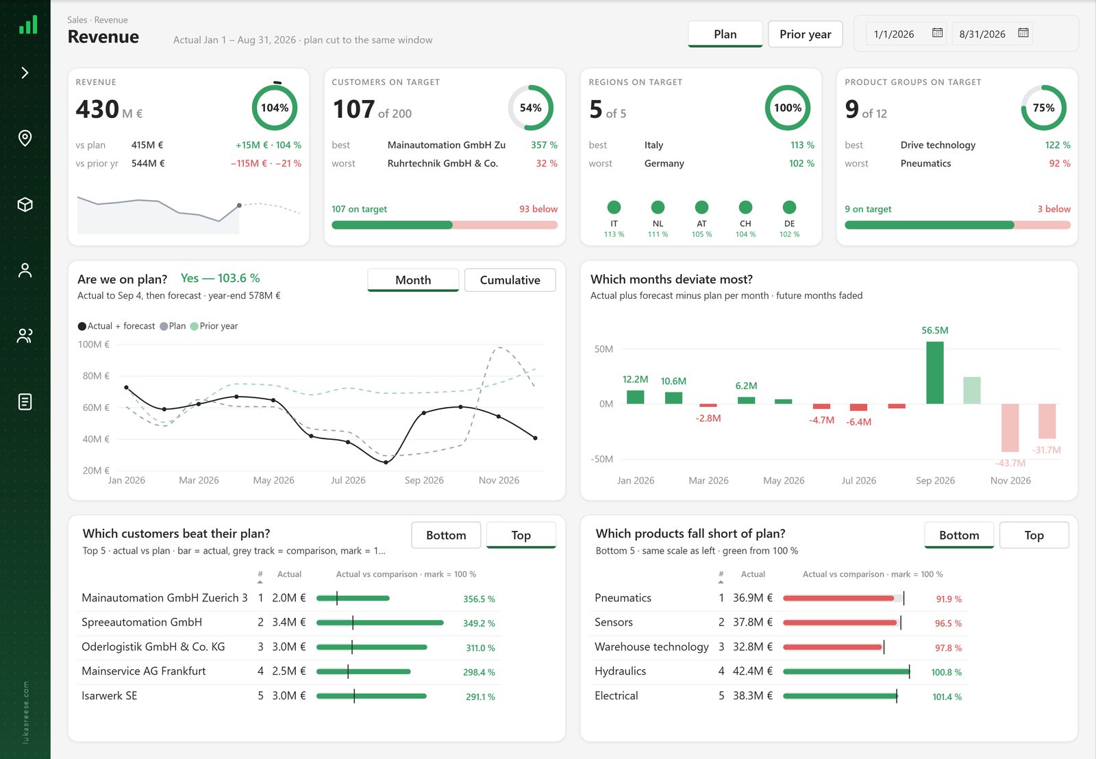
- 1One number, already in context
Revenue with the gap to plan and to the prior year right underneath. The ring shows target achievement at a glance.
- 2Plan or prior year, one click
The whole page switches its comparison. Built with a disconnected table, so one page does the job of two.
- 3How good or bad, in counts
Customers, regions and product groups on target, with the best and the worst one named.
- 4Which months deviate most?
Monthly trend next to the deviation per month. Future months are faded, so actuals and forecast never mix.
- 5Why: the five main drivers
Bottom or top five customers and products. Right-click a customer to drill through to the detail page.
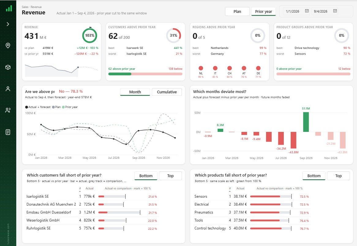
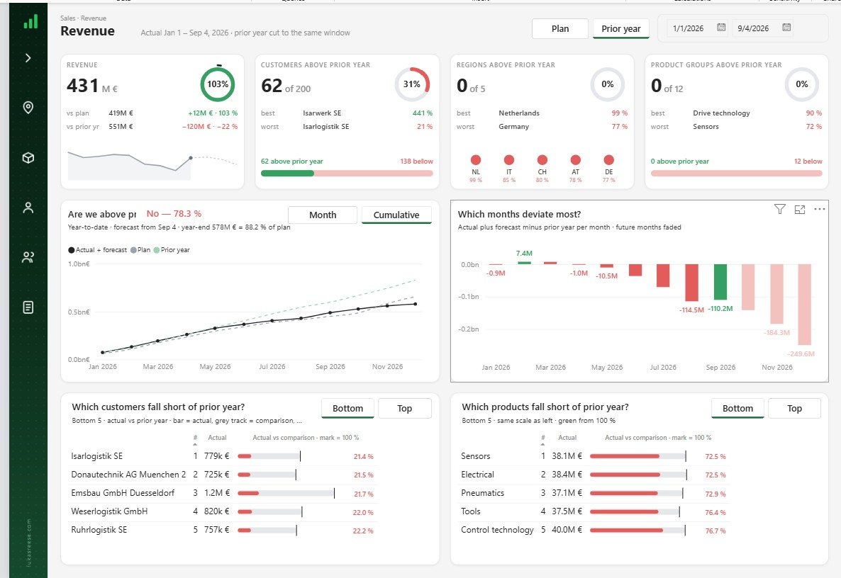
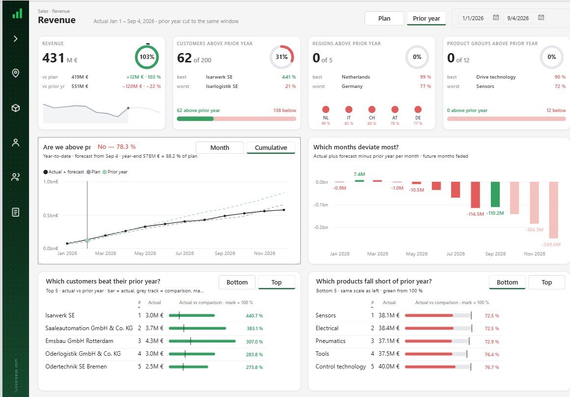
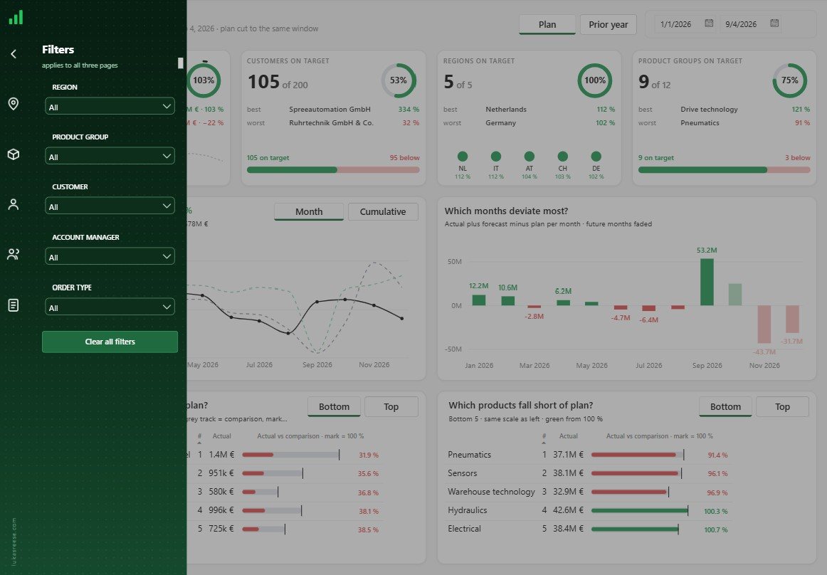
Bookmarks and disconnected tables keep it to one page. No twelve visuals, just the main story.
Page 2: Root cause
 1
2
3
4
5
1
2
3
4
5
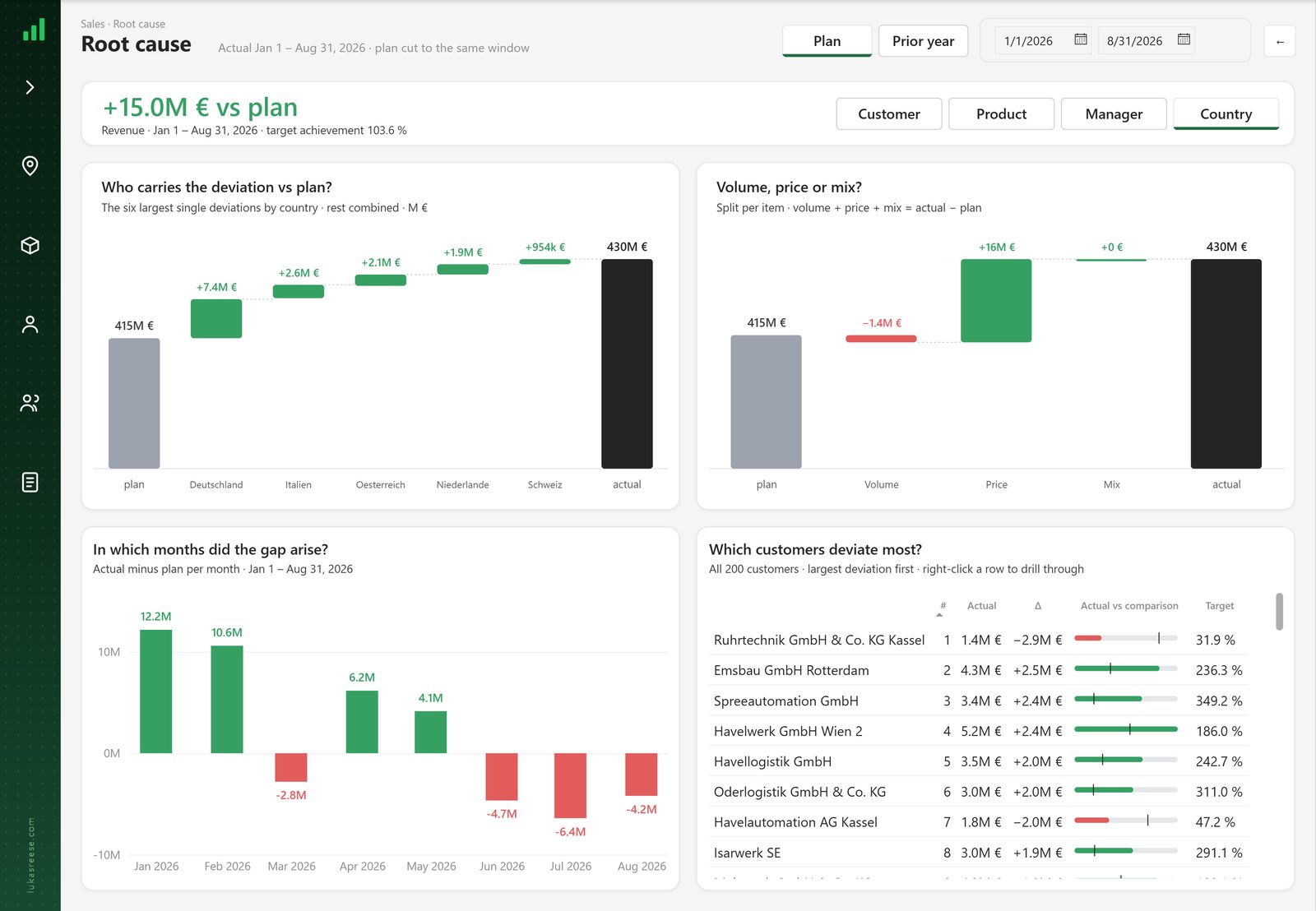
- 1The gap, then the lens
+15.0 M€ vs plan as the headline. Switch the view between customer, product, manager and country.
- 2Who carries the deviation?
A bridge from plan to actual: the six largest deviations, the rest combined. You see who adds and who takes away.
- 3Volume, price or mix?
Did we sell less, sell at a different price, or did the product mix shift? Here it was mostly price.
- 4In which months did the gap arise?
Click a month and the page shows which customers drove it.
- 5Which customers deviate most?
All 200 customers, largest deviation first. Right-click a row to drill through.
Page 3: Customer detail
 1
2
3
4
5
1
2
3
4
5
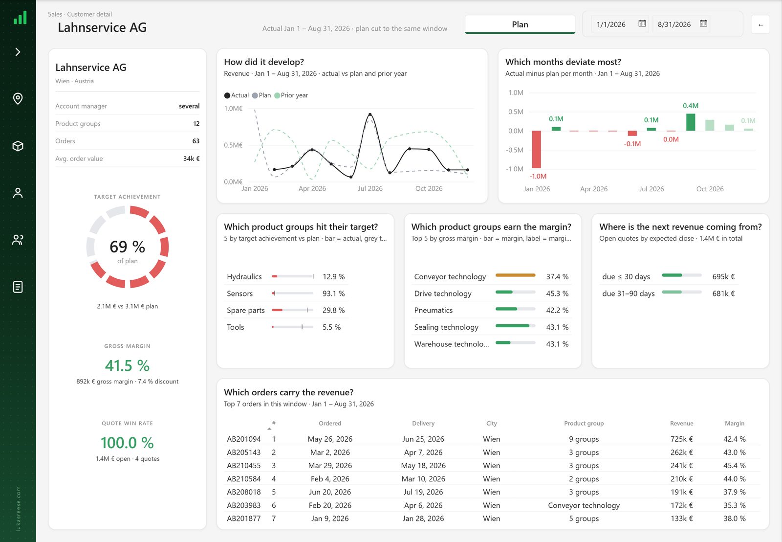
- 169 % of plan, in one ring
An SVG drawn by a measure: red is what the customer bought so far, grey is what is missing to plan.
- 2How did it develop?
Actual against plan and prior year, month by month, plus the months that deviate most.
- 3Which product groups hit target and earn the margin?
Where the revenue is missing and where the money is made.
- 4Where is the next revenue coming from?
Open quotes by expected close. This is the follow-up: 1.4 M€ in quotes for the account manager to chase.
- 5Which orders carry the revenue?
The top orders in the window, so the conversation is about real orders, not averages.
The report shows it. A meeting acts on it.
Maybe the drop is fine: the contract ended or the customer switched product. Maybe it is not. Either way someone has to follow up. The simplest way: a weekly or monthly review where you go through the report and write down what looks odd, who owns it and what happens next. A simple table is enough to start.
Design tricks worth stealing.
Filters on the page, not in the way
No filter bar on top, no permanent side panel. A button in the sidebar opens a panel that applies to all three pages. The sidebar is a PNG background, and the panel lines up with it to the pixel.
Visuals Power BI does not have
The four KPI cards are HTML visuals. Bridges, rings and the bars in the tables are SVG images drawn by DAX measures. Flexible, and nothing to buy.
AI built it. I decided what it says.
I did not create a single visual or measure by hand. I told the AI what the background should look like, how deviations are shown and which brand colours to use. Then I checked every page in Power BI Desktop.
AI did
- Semantic model and relationships
- Every measure, including the SVG measures
- Visuals, layout and the background
- Bookmarks and switches
I did
- The four questions and the story
- The design rules: background, deviations, colours
- Reviewing every number and page
- Deciding what stays off the page
Look inside the project.
Open the PBIP file, read the measures, see how the SVG and HTML visuals are built.
- The 25-page guide: my full process, tool stack and 7 prompts
- The PBIP file with the revenue page: the basic AI output and the finished page
- The process on one page, to print
How I Build Power BI Reports with AI
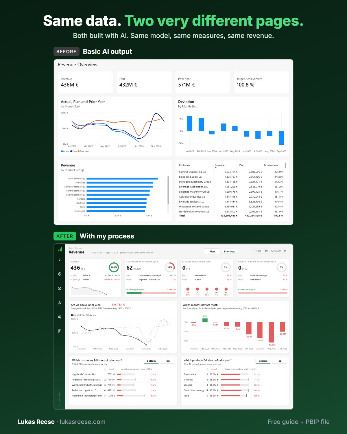
Same data, two very different pages. Both built with AI. This is the process behind the second one.
What you get:
- The 25-page guide: my full process, tool stack and 7 prompts you can copy
- The PBIP file with the same revenue page twice: the basic AI output and the finished page
- Step-by-step explanation, inspiration and real output.
Important: confirm your email
- After you sign up, you get a confirmation email. Click the button in it, then the guide and PBIP file are on their way.
Want a report like this for your team?
Tell me what it is for and who reads it. I reply with what I would change first, in English or German.