
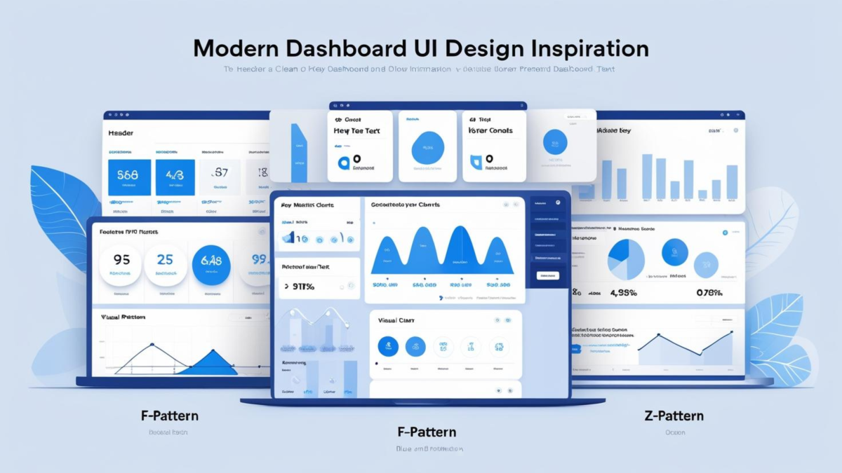
Dashboard design is the discipline of structuring a dashboard’s visual layout before data and charts are added. Specifically, it covers the placement of KPI rows, chart zones, sidebars, and headers — creating a foundation that keeps reports clear, consistent, and professional as requirements evolve. For Power BI developers, good dashboard design is the difference between a report that communicates immediately and one that requires a tour guide.
In this guide, we cover the core dashboard design principles every Power BI developer should know, explore the most useful dashboard layout types for inspiration, and compare the best dashboard design tools available in 2026 — so you can choose the right approach for your workflow.
The best dashboard design tool for Power BI in 2026 is a dedicated background designer — a tool that creates pixel-perfect layout images (PNG/JPG/SVG) matching your exact Power BI canvas dimensions. Unlike Figma or PowerPoint, background-based tools eliminate the gap between design and implementation because the exported image is the layout. Below we compare 7 tools including Figma, PowerPoint, Canva, Mokkup.ai, and the Power BI Background Designer.
- Specifically, dashboard design defines visual structure before data is added — it is not the same as data modeling or report building
- Moreover, the F-pattern and Z-pattern are the two most effective dashboard layout frameworks for professional Power BI reports
- In particular, Figma with Auto Layout is a strong design option; however, it still requires manual recreation in Power BI Desktop
- Overall, background-based design tools are the fastest workflow for consistent, reusable Power BI dashboard layouts
- Additionally, the Power BI Background Designer Figma plugin is now shipping — €199 launch price (first 25 customers · then €249)
- Furthermore, the Figma Plugin for direct Power BI background export is now shipping — closing the design-to-build gap

What Is Dashboard Design?
Dashboard design is the process of planning the visual structure and layout of a dashboard before data and visuals are added. Rather than dragging charts around Power BI Desktop until things look right, dashboard design defines the structure first — headers, KPI rows, sidebars, and content zones — and then places visuals on that foundation.
For Power BI specifically, dashboard design typically involves creating background images, wireframes, or layout templates that pre-define where every element lives. As a result, reports maintain consistent spacing, clear visual hierarchy, and professional appearance across pages and projects. For a deeper dive into layout principles, see our guide on Power BI dashboard design best practices.
“Dashboard design is architecture, not decoration. You wouldn’t build a house by randomly placing walls — similarly, you shouldn’t build a dashboard by randomly placing visuals. Structure first, data second.” — Lukas Reese, Power BI Developer
Dashboard Design Principles: What Makes a Professional Layout
Modern dashboard design follows a small set of universal principles. However, applying them consistently is what separates professional reports from cluttered ones. The three most important principles for Power BI dashboard design are visual hierarchy, color contrast, and layout patterns.
Visual Hierarchy: Place What Matters Most First
Specifically, visual hierarchy means ensuring that the most important information is the most visually prominent. In practice, this means the primary KPIs — revenue, margin, headcount, whatever drives decisions — belong at the top of the dashboard, displayed large and clearly labeled. Supporting details and drill-down charts belong below, progressively smaller and less visually dominant.
Moreover, Microsoft’s official Power BI design guidelines recommend placing the most critical metrics at the top-left of every page — the position users’ eyes reach first. Similarly, Nielsen Norman Group’s research on dashboard design confirms that clear visual hierarchy is the single most impactful factor for user comprehension. Above all, consistent hierarchy should be maintained across every page of a multi-page report.
Color, Contrast, and Modern Dashboard UI
A modern dashboard UI relies on a restrained color palette — typically one brand accent color, one positive/negative indicator pair (green/red), and neutral grays for secondary information. Consequently, every color in the dashboard should carry a specific meaning rather than being decorative. For example, green indicates positive performance, red indicates negative, and gray indicates neutral or secondary data.
Furthermore, dark mode dashboard designs have grown significantly in popularity for executive-facing Power BI reports. Indeed, dark backgrounds improve contrast for KPI cards and reduce eye strain in low-light environments. Additionally, professional dark mode templates require careful color selection — specifically, white text with green accents on dark navy or charcoal backgrounds produces the strongest visual clarity. See our collection of Power BI dark mode templates for examples.
Layout Patterns: F-Pattern, Z-Pattern, and Grid Systems
Dashboard layout follows two primary reading patterns from eye-tracking research by Nielsen Norman Group. Specifically, the F-pattern describes how users scan left-to-right across the top row, then down the left side — making it ideal for data-heavy dashboards with multiple KPI groups. The Z-pattern, however, describes a diagonal scan from top-left to top-right, then bottom-left to bottom-right — making it better suited for executive summary pages with a single clear message and one call-to-action.
In practice, most professional Power BI dashboards use a grid system — a structured set of columns and rows that define visual zones. As a result, every visual snaps to a predefined position rather than floating freely, which dramatically reduces alignment drift over time. For layout inspiration based on these patterns, explore our 71 dashboard wireframe examples.
F-Pattern — Data-Heavy Dashboards
Best for: operations, sales & finance dashboards. Users scan the full KPI row first, then move down — reading less on each pass. Place your most important metrics top-left and span them across the full width.
Z-Pattern — Executive Summary Pages
Best for: executive briefings with one clear message. One big number top-left, supporting data top-right, eye travels diagonally to context bottom-left, then to the drill-through or action bottom-right. One page = one story.
Dashboard Layout Types & Inspiration
Before choosing a design tool, it helps to know which dashboard layout type fits your reporting goal. Moreover, having a target layout in mind makes the design process significantly faster — whether you use Figma, PowerPoint, or a dedicated background designer. The three most common layouts for professional Power BI dashboards are described below.
KPI Strip + Grid Layout
KPI Strip + Chart Grid
Specifically, a horizontal row of 3–5 KPI cards spans the top of the page. Below, a 2×2 or 3×2 grid of charts fills the content area. Consequently, this layout places headline metrics immediately visible on load, with supporting analysis below. It works best for operational dashboards, sales performance, and financial summaries. For example, a monthly revenue dashboard would show Revenue, Margin %, Units Sold, and YoY Growth in the KPI strip, with trend lines and regional breakdowns in the grid below.
Executive Summary Layout
Executive Summary with Narrative

In this layout, a large KPI panel dominates the top half of the page, displaying 1–3 headline metrics at a large size. Additionally, a narrative text block or commentary zone sits alongside or below the KPIs, providing context. As a result, executives get a single-screen answer without needing to interpret charts. Furthermore, drill-through buttons or page links allow deeper analysis on demand. This layout follows the Z-pattern reading path — headline top-left, supporting data top-right, CTA bottom-right.
Sidebar Navigation Layout
Sidebar Navigation + Content Area
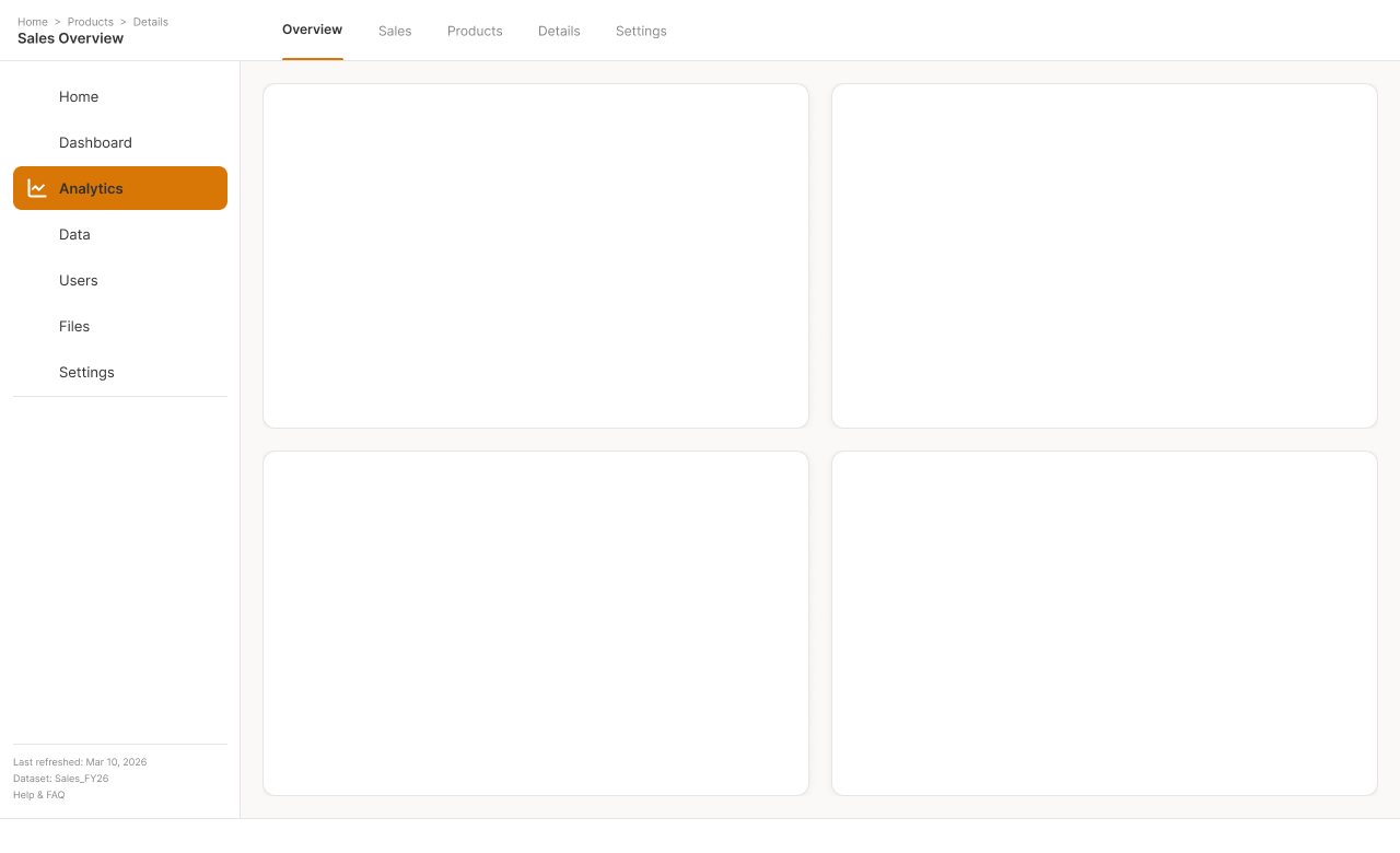
Indeed, for multi-page Power BI reports, a persistent sidebar on the left provides navigation between report pages. The main content area to the right changes with each page selection. Accordingly, users always know where they are in the report and can navigate without returning to the Power BI service. This layout is particularly effective for self-service BI portals where different user groups need access to different views of the same data.
Skip the blank canvas. Moreover, each template is pre-built at exact Power BI canvas dimensions — just pick a layout, export, and place as your background.
For more dashboard design inspiration and ready-to-use wireframes, see our full collection of dashboard UI design inspiration examples.
Common Ways to Design Power BI Dashboards
There are five common approaches to Power BI dashboard design. Each has significant trade-offs in speed, quality, and long-term maintainability — here’s a quick overview before we go into each one in detail.
1. Designing Directly in Power BI Desktop
The default approach: open Power BI Desktop and start dragging visuals onto the canvas. For single-page reports or quick prototypes, this works fine. However, as dashboards grow to multiple pages or involve team collaboration, manual placement becomes a significant bottleneck.
- No additional tools needed
- What you see is what you get
- Fast for simple, single-page reports
- Alignment drifts with every change
- No reusable layout system
- Slow and inconsistent for multi-page reports
- Inconsistent across team members
2. Using PowerPoint for Dashboard Mockups
PowerPoint is a classic choice because everyone knows it. Specifically, you can sketch layouts with shapes, define color schemes, and present mockups to stakeholders before building anything in Power BI. For a detailed walkthrough of this and other methods, see four ways to create Power BI backgrounds.
- Familiar to all business users
- Good for client-facing mockups and stakeholder sign-off
- Can export as PNG background image
- Layouts must be manually recreated in Power BI Desktop
- No Power BI-specific canvas dimension settings
- Not designed for dashboard layout systems
3. Using Figma with Auto Layout
Figma is a powerful dashboard design option — particularly when used with Auto Layout, Figma’s feature for systematic spacing and component sizing. Specifically, Auto Layout allows you to define consistent padding, gap values, and alignment rules that scale automatically across components. As a result, dashboard cards, KPI zones, and sidebars maintain perfect spacing regardless of how content changes. For ready-to-use Figma components built for Power BI, see the Power BI dashboard background templates.
Furthermore, Lukas Reese’s Figma Plugin for Power BI backgrounds is now shipping — it directly generates pixel-perfect Power BI background images at exact canvas dimensions, eliminating the recreation gap entirely.
- Powerful with Auto Layout — systematic spacing at scale
- Component-based design systems
- Great for complex, pixel-perfect designs
- Plugin now shipping — eliminates recreation gap
- Currently requires manual recreation in Power BI Desktop
- Learning curve for non-designers
- Overhead for simple reporting dashboards
4. Using Pre-Built Dashboard Templates
Template-based design provides a fast start when your requirements closely match the template. For instance, the Power BI dashboard background templates collection provides pre-designed Figma components and layout systems specifically built for Power BI — available as free downloads to use as a starting point or direct reference.
- Fastest time to a first professional layout
- Professional dashboard designs out of the box
- Good for learning layout patterns and spacing conventions
- Often break when requirements change significantly
- Limited customization depth for unique business needs
- Can’t adapt easily to non-standard page sizes
5. Using a Dedicated Background Designer
Background-based design tools solve the layout problem at the root. Specifically, instead of designing in a separate tool and recreating in Power BI, you design the canvas background — and the exported image is the layout, placed directly in Power BI Desktop as a background image. Consequently, visuals are placed on predefined zones rather than aligned manually.
- No recreation gap — exported image IS the layout
- Exact Power BI canvas dimensions by default
- Reusable across pages and projects
- Light and dark mode support built in
- Less design flexibility than Figma for complex UI systems
- Preset-based — custom layouts require more configuration
Dashboard Design Tool Comparison
The table below compares the most popular dashboard design tools for Power BI across key criteria. However, the right tool depends on your workflow — specifically whether you need quick mockups, complex pixel-perfect designs, or a fast repeatable layout system.
Tool Comparison: Speed, Cost, and Power BI Integration
| Tool | Type | PBI Native | Pricing | Export | Best For |
|---|---|---|---|---|---|
| Power BI Background Designer | Background generator | Yes | €199 one-time | PNG / JPG / SVG | Fast, consistent PBI layouts |
| Power BI Figma Templates | Figma component set | Manual recreation | Free download | Figma / PNG | Figma-based dashboard design |
| Figma + Auto Layout | UI design tool | Manual recreation | Free plan | PNG / SVG | Complex, systematic designs |
| PowerPoint | Slide editor | Manual recreation | Included with M365 | PNG / JPG | Quick mockups, client-facing |
| Canva | Graphic design | Manual recreation | Free plan | PNG / JPG | Simple branded backgrounds |
| Mokkup.ai | AI wireframing | Partial (export) | Limited free | PNG / PDF | AI-generated layout ideas |
| DaTaxan | Background generator | Yes | Free | PNG | Basic free backgrounds |
Why Layouts Break Without a Design Tool
Without a structured dashboard design approach, layouts degrade over time. Specifically, every stakeholder request — “add one more KPI,” “swap the bar chart for a line chart,” “make room for the new filter” — shifts visuals a few pixels. However, over weeks and months, that drift adds up significantly.
The core issue is that Power BI Desktop treats layout as a visual property of each individual element. Specifically, there is no global grid, no snapping to defined zones, and no layout inheritance between pages. Consequently, each visual is positioned independently — which means consistency is entirely manual work.
This is the fundamental challenge of dashboard design — and it is exactly what a design tool solves. By defining layout zones once as a background image or template, you create a structural foundation that visuals are placed on top of, rather than next to.
“Every pixel of alignment drift costs time in review cycles. A background-based layout locks the structure in place — so visuals can change freely without the layout falling apart.” — Lukas Reese
As Microsoft’s documentation on Power BI display settings emphasizes, consistent page layout is key to professional reports. Moreover, according to Nielsen Norman Group’s dashboard design research, clear visual hierarchy is essential for users to quickly find and understand information.
The Best Dashboard Design Tool for Power BI
A background-based design approach solves the layout problem at the root. Specifically, instead of manually aligning visuals, you design the canvas behind them — headers, KPI rows, sidebars, and content zones are defined once as an image, and visuals are placed on predefined zones on top.
Calling it the best is one thing. Watching it work is another.
Here’s the Background Designer Figma plugin generating a dashboard layout end-to-end — the workflow this whole comparison is pointing at.
The Power BI Background Designer takes this approach and streamlines it into a purpose-built tool for Power BI teams. Specifically, it provides curated layout presets (header + sidebar, KPI strip + grid, executive summary), brand color controls, and exports at exact Power BI canvas dimensions in PNG, JPG, or SVG. Moreover, it supports both light and dark mode dashboard designs.
Furthermore, for teams who prefer Figma-based workflows, the Power BI dashboard background templates provide pre-designed Figma components as a free starting point. Additionally, the Figma Plugin Generator is now shipping — it exports Figma dashboard designs directly as Power BI-ready background images, eliminating the manual recreation step entirely.
What makes the background-based approach different from Figma or PowerPoint:
- No recreation gap — the exported image is the layout, placed directly as a Power BI background
- Exact dimensions — exports match your Power BI canvas size setting (1280×720, 1600×900, etc.)
- Reusable systems — layout zones are defined once and reused across pages and projects
- Light and dark mode — includes styles for both, with support for Power BI dark mode templates
For a step-by-step walkthrough of adding backgrounds to your reports, see our guide on how to add a background image in Power BI.
Power BI Background Designer — Figma plugin
Generate pixel-perfect dashboard backgrounds in 60 seconds inside Figma — curated layout presets, brand color controls, and exact Power BI canvas dimensions.
- Skip the manual recreation — works inside Figma
- Brand color controls and consistent layouts across reports
- Export PNG, JPG, or SVG at exact canvas dimensions
Frequently Asked Questions
What is dashboard design?
Specifically, dashboard design is the process of planning the visual layout and structure of a dashboard before data and charts are added. It covers placement of KPI rows, chart zones, sidebars, and headers — creating a foundation that keeps reports clear, consistent, and professional as requirements evolve. In other words, it is architecture for data visualization.
What makes a good dashboard layout?
A good dashboard layout places the most critical KPIs in the top-left zone — following the natural F-pattern reading path. Furthermore, it uses consistent spacing between elements, applies clear visual hierarchy through size and color, and limits each page to one primary message. Specifically, structured layout zones defined before adding data prevent alignment drift as dashboards evolve over time.
What is the best dashboard design tool for Power BI?
For most Power BI teams, a background-based dashboard design tool offers the best balance of speed and consistency. Specifically, unlike Figma or PowerPoint, background-based tools export pixel-perfect layout images at exact Power BI canvas dimensions. As a result, the exported image becomes the layout foundation — so visuals are placed on predefined zones rather than floating freely.
Is Figma good for Power BI dashboard design?
Yes — Figma is a powerful option, particularly when used with Auto Layout. Specifically, Auto Layout allows designers to create systematic spacing, consistent component sizing, and responsive structure that scales across pages. However, Figma designs currently require manual recreation in Power BI Desktop. The dedicated Figma Plugin for Power BI backgrounds is now shipping — it exports directly to Power BI-ready images, eliminating the recreation step.
Can I design Power BI dashboards directly in Power BI?
Yes, but manual layout work in Power BI Desktop becomes slow and inconsistent as dashboards evolve. Specifically, drag-and-drop visual placement works for initial builds, but alignment drifts with each change. Moreover, for multi-page reports or team environments, a dedicated design tool saves significant rework time across revision cycles.
Is PowerPoint good for dashboard design?
PowerPoint is easy to start with and familiar to most business users, making it useful for client-facing mockups. However, PowerPoint layouts must be manually recreated in Power BI, which adds time and introduces inconsistencies. Overall, it works well for brainstorming and stakeholder sign-off but doesn’t solve long-term layout maintenance.
Are dashboard templates a good solution?
Templates provide a fast start and work well when your requirements closely match the template design. However, templates often break when page sizes change, new KPIs are added, or stakeholders request layout adjustments. Consequently, for evolving dashboards, a design tool that generates reusable layout systems is more sustainable than static templates in the long run.
Are Power BI backgrounds a bad practice?
No — when used correctly, Power BI backgrounds improve structure, consistency, and visual hierarchy. Specifically, a background image defines layout zones that stay fixed regardless of visual changes. Moreover, Microsoft’s Power BI accessibility guidelines emphasize clear structure and contrast — which background-based layouts directly support by default.
How can I keep dashboards consistent across projects?
Use a dashboard design tool that provides reusable layout systems instead of manual alignment. Specifically, background-based tools let you define spacing, hierarchy, and visual zones once, then reuse that foundation across multiple reports and projects. As a result, this eliminates per-dashboard design work and ensures brand consistency at scale. For more on this topic, read about the fundamental challenge of dashboard design.
What size should a Power BI dashboard background be?
The default Power BI canvas is 1280×720 pixels (16:9 aspect ratio). For sharper backgrounds, professional designers use 1600×900 or 1920×1080 pixels. Specifically, the key is to match your background image dimensions exactly to your Power BI canvas size setting — to avoid scaling artifacts and alignment issues. See our Power BI canvas size guide for detailed dimension tables.

Estimated reading time: 10 minutes