
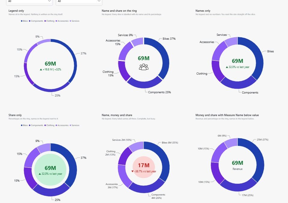
The Power BI donut chart center value is now a native setting. Since the August 2026 update you can put a live number inside the ring without overlaying a card visual, and you can bind that number, its caption, its background colour and even an image to your own measures.
I rebuilt the same donut twenty different ways to find out what the new card can actually do. Below are the settings that matter, the six labelling choices I would genuinely use, and, because I generate my reports from JSON rather than clicking, what it takes to automate all of this in the PBIR format.
Let AI build visuals like this for you
My free guide shows how I teach an AI agent my visual patterns and build full pages with them: 25 pages, 7 prompts you can copy, and the PBIP file.
How I Build Power BI Reports with AI
Same data, two very different pages. Both built with AI. This is the process behind the second one.
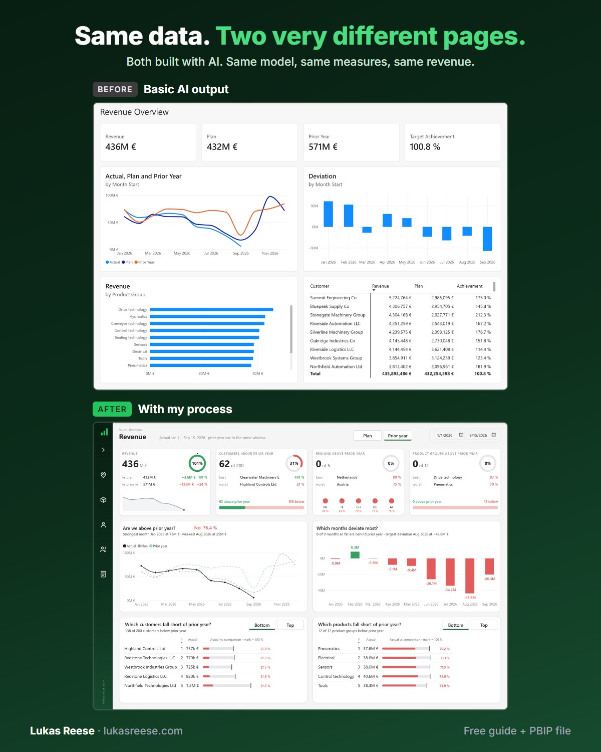
What you get:
- The 25-page guide: my full process, tool stack and 7 prompts you can copy
- The PBIP file with the same revenue page twice: the basic AI output and the finished page
- Step-by-step explanation, inspiration and real output.
Important: confirm your email
- After you sign up, you get a confirmation email. Click the button in it, then the guide and PBIP file are on their way.
- The centre value now lives inside the visual, so it stays aligned when you resize the chart and it survives mobile layouts and screen readers.
- You can point the centre value at any measure, not just the ring total, and the caption underneath accepts a measure that returns text.
- The centre background takes conditional formatting, so it can turn green when you beat last year and red when you did not.
- The gap control is an inset rather than a size, which means a bigger number shrinks the coloured disc onto the text.
- If you generate reports from PBIR JSON, none of these settings exist in the authoring tooling yet: you have to hand it the structure first.
powerbi-report-cli). Where this post says “report authoring skill”, that is now the authoring mode of the new skill. Read what changed: Power BI Report CLI: 4 Skills Merged Into 1.The card-overlay workaround is dead
For years the answer to “how do I show a total in the middle of my donut?” was the same: build a card visual, strip its background, and float it on top of the ring. However, that trick was always fragile. Resize the page and the card drifts off centre. Open the report on a phone and the layout collapses. A screen reader treats the card as an unrelated object, because as far as the report is concerned, it is one.
Microsoft closed that gap in the Power BI August 2026 update, and the Power BI donut chart center value is now a first-class property rather than a trick. Consequently, the number is part of the donut itself, and it behaves like part of the donut: filtering, cross-highlighting, drill-down and selection all flow through it. Above all, it stays put.
The card-overlay trick was never a design decision. It was a workaround for a missing property, and it has quietly been costing people alignment bugs on every resize.
In my own rebuild I deleted three card visuals from a page that had been carrying them for months. Nothing looked worse. Moreover, two alignment bugs I had been ignoring disappeared on their own.
What the Power BI donut chart center value card holds
Open a donut chart, go to the format pane, and you will find a new card called Center value. Turn it on and four sub-toggles appear underneath it.
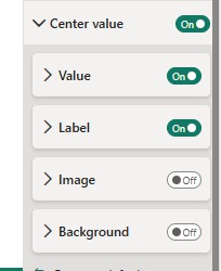
Center value is a formatting card on the Power BI donut chart that renders text, a number and optionally an image inside the ring’s hole, bound to the same filter context as the slices around it.
Specifically, the four parts are these. Value is the number, with its own font, display units and decimal places. Label is an optional caption that sits above or below the value. Image drops a picture into the hole. Background fills the hole behind the text with a colour or an image. Each one can be styled on its own, and the last three are off by default, which is why most people never find them.
Put a measure in the centre, not just the total
By default the centre shows the sum of whatever sits in the Values well. That is fine, but it is not the interesting part. Both the value and the label accept an fx binding, which means you can point either at a measure of your choosing.
For example, I bind the value to a headline number and the label to a short piece of commentary. Crucially, the label measure must return text, not a number. Here is the one I use:
Center Commentary =
VAR p = [Revenue YoY %]
VAR arrow = IF ( p >= 0, UNICHAR ( 9650 ), UNICHAR ( 9660 ) )
RETURN
    IF (
        ISBLANK ( p ),
        "no prior year",
        arrow & " " & FORMAT ( p, "0.0%" ) & " vs last year"
    )
As a result, the ring shows the composition while the hole answers the question everyone asks next: is this better or worse than last year? Similarly, you can bind the value itself to a different measure entirely (active customers, order count, margin), so the centre stops being a redundant total and starts carrying a second dimension.
Colour the centre by performance
The Background sub-card is where this gets genuinely useful. Its fill accepts conditional formatting, so instead of picking a colour you can bind it to a measure that returns a hex code. In effect, the middle of your donut becomes a status light.
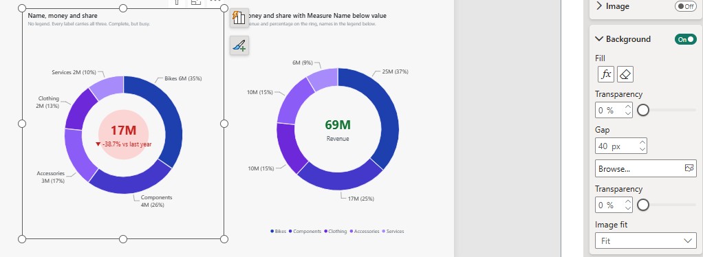
My colour measure is deliberately dull, because it only has one job:
Center Fill Tint =
VAR p = [Revenue YoY %]
RETURN
    IF ( ISBLANK ( p ), "#E7EAEE", IF ( p >= 0, "#C7F0D8", "#FBD5D3" ) )
One control deserves a warning. The Gap setting is an inset, not a size. Accordingly, a larger number shrinks the coloured disc inwards until it hugs the text, while a small number lets the fill spread across the whole hole. Furthermore, pair a saturated fill with a dark text colour and you will lose the number entirely. I did exactly that on my first attempt and spent ten minutes hunting a bug that was simply contrast.
Put an image inside the ring
The Image sub-card takes a PNG and places it above or below the centre text. Additionally, you get size in pixels, a gap, a transparency slider and the part most people scroll straight past: an alt-text box.
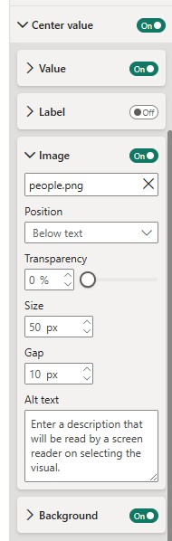
In practical terms, a small icon works and a logo usually does not. The hole is a circle, so anything wide gets cropped by the ring on both sides. Therefore I keep icons square, around 40 to 60 px, and I turn the value font down a step to make room. For example, a people icon above a customer count reads instantly; a full company logo in the same slot just looks squeezed.
Fill in the alt text while you are there. Above all, it costs five seconds, and it is the only way a screen-reader user learns that the icon is there at all.
Six ways to label the same donut
The Power BI donut chart center value is only half the story. The other half is how the slices get named, and this is where most donut charts go wrong. Notably, you have two competing places to put category names: the legend and the data labels. Using both is usually a waste.
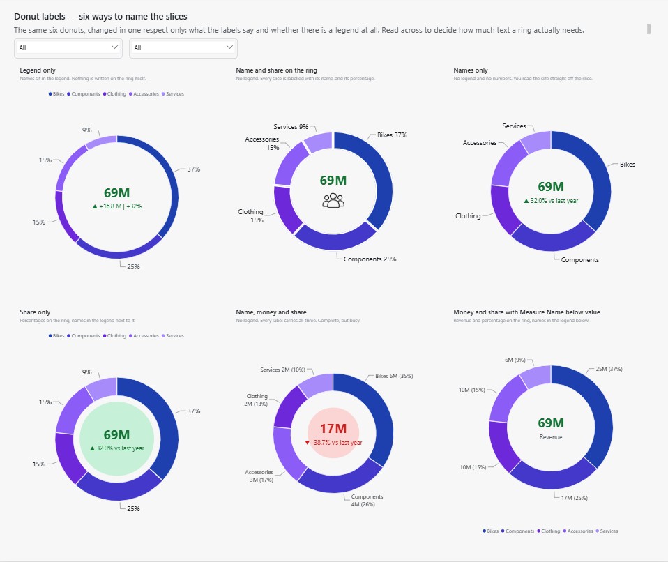
Choosing between the legend and the labels
Here is how the six options actually behave in a report:
| Setup | Best for | Cost |
|---|---|---|
| Legend only | Small tiles where the ring is decorative | However, readers must match colours by eye |
| Name and share on the ring | The default I reach for most | Additionally, it needs horizontal room for leader lines |
| Names only | When rank matters more than exact size | Consequently, nobody can read a precise number |
| Share only | Dense pages where the legend already exists | Similarly, the eye has to travel to the legend |
| Name, money and share | A single hero chart with space around it | In effect, it is complete but visually busy |
| Money and share, names below | Executive summaries that need absolutes | Moreover, the legend steals vertical space |
If the labels already name every slice, the legend is repeating itself. Turn one of them off.
The one setting that fixes unreadable inside labels
Labels placed inside the ring fail constantly, and the reason is geometry rather than font size. Specifically, a thin ring has no room for text. Therefore, if you want inside labels, drop the inner radius to around 45 so the band is wide enough to hold them. Otherwise, put the labels outside and let the leader lines do the work.
Automating the Power BI donut chart center value in PBIR
Everything above assumes you are clicking in Power BI Desktop. Increasingly I am not. I generate report pages as JSON in the PBIR format, which stores every visual as its own file instead of burying the layout in a binary. If the difference between the file types is new to you, I wrote a full comparison of PBIX, PBIP and PBIR; in short, PBIP is the project folder and PBIR is the report format inside it.
Here is the honest part. These settings are so new that the authoring tooling does not know they exist. Consequently, when I asked my Power BI report authoring skill to build these donuts, it could not: the property names are absent from its metadata, so it guessed, and the guesses were silently ignored. Rather than fight it, I configured one donut by hand in Desktop, saved, and read the JSON back out. Then I handed the skill the structure.
The object names the tooling does not have yet
| In the format pane | In the PBIR JSON |
|---|---|
| Center value toggle | centerValue.show. Accordingly, everything else is ignored without it |
| Background fill and gap | centerBackground.fillColor and centerBackground.padding, not color and gap |
| Value font colour | value.fontColor. Indeed, valueFontColor validates and does nothing |
| Label bound to a measure | A second entry carrying a dataViewWildcard selector; likewise, a bare property is dropped |
That last row cost me four attempts. In other words, writing label.text as a plain property looks correct, validates cleanly and never renders. The binding only takes when it sits on its own entry with a wildcard selector, which is the same pattern Power BI uses for conditional formatting elsewhere. Furthermore, the centre image is the one setting I could not automate at all: it binds only when the file is picked through the interface.
An AI skill cannot invent a property name it has never seen. Give it one working example read back out of Desktop, and it will build the other nineteen for you.
All twenty variations on one page
Everything in this post came off a single test board. Rather than change one donut repeatedly and lose track, I built twenty of them side by side on one tall page, each differing from its neighbour in exactly one respect. Consequently the comparison is visual instead of theoretical: you can see which combinations hold up and which fall apart at a glance.
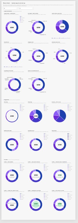
The board is grouped into three blocks. Firstly, legend and data labels: what the ring says about itself. Secondly, ring geometry: hole size, rotation and slice separation, including the point where a donut quietly becomes a pie. Finally, the centre treatments described above. Moreover, every chart uses the same measure and the same five categories, sorted largest first so the biggest slice always opens at twelve o’clock.
All 26 charts, the twelve commented DAX measures and a self-contained sample model, in one Power BI file. It is free. You only need to leave an email address. Moreover, if you save it as a .pbip project, every setting in it becomes readable JSON.
When a donut is still the wrong chart
None of this rescues a bad chart choice. Donuts compare parts of a whole, and human eyes are poor at judging angles. As a result, they stop working somewhere around five or six categories, and beyond that a sorted bar chart wins every time.
Nevertheless, the new centre changes the calculation slightly. A donut with a live total and a conditional caption in the middle is now doing two jobs at once: showing the split and reporting the headline. In that sense it competes with a KPI card rather than a bar chart. For the broader rules on when each visual earns its place, my dashboard design best practices guide goes deeper, and Microsoft’s own pie and donut chart reference covers the basics.
Frequently asked questions
How do I show a value in the middle of a Power BI donut chart?
Open the format pane, find the Center value card and switch it on. Consequently the ring total appears in the hole straight away, and you can then adjust its font, display units and decimal places.
Can I put a custom measure in the centre instead of the total?
Yes. Both the value and the label take an fx binding. However, the label measure has to return text rather than a number, otherwise nothing appears.
Can the centre change colour based on performance?
It can. Specifically, bind the Background fill to a measure that returns a hex code, so the hole turns green above target and red below it.
Should I use a legend or data labels on a donut chart?
Generally, pick one. If the data labels already carry the category names, then the legend repeats information and costs you space that the ring could use instead.
Why are my inside labels unreadable?
The ring is too thin. Therefore, lower the inner radius to roughly 45 so the band has room, or move the labels outside the ring instead.
Do I still need to overlay a card visual?
No, and you should stop. Above all, the native centre value stays aligned on resize and remains accessible, whereas a floating card does neither.
Where to go next
If you want to try the Power BI donut chart center value yourself, build one donut, turn on all four sub-toggles and see which ones survive contact with your actual data. Moreover, if you generate reports from JSON, configure one instance by hand first and read the file back. That single step saved me an afternoon of guessing.
If you would rather start from something that already works, the 26-chart example file is the exact board shown above, measures included, and it is free. Otherwise, for the layout underneath the charts, my Power BI Background Designer generates the canvas so the visuals have somewhere sensible to sit, and my write-up on Power BI JSON themes covers how to lock these colour choices in once rather than per visual.
Last updated: 25 August 2026.