
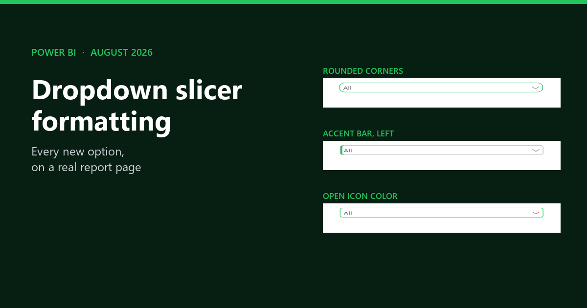
Power BI dropdown slicer formatting finally became a real thing in the August 2026 release. Specifically, a new Dropdown section appeared in the Visual formatting pane, and it carries border color, rounded corners, open icon color and an accent bar. Additionally, hierarchy slicers gained their own icon colors. All of it is generally available, and none of it needs a custom visual.
However, search for this today and you still land on forum threads saying it cannot be done. I rebuilt every one of the twelve new options on a single report page so I could see them side by side. Below is what each setting does, where it lives, and what it lets you delete.
Design whole pages faster with AI
My free guide shows how I plan and build a finished Power BI page with Claude Code: 25 pages, 7 prompts you can copy, and the PBIP file.
How I Build Power BI Reports with AI
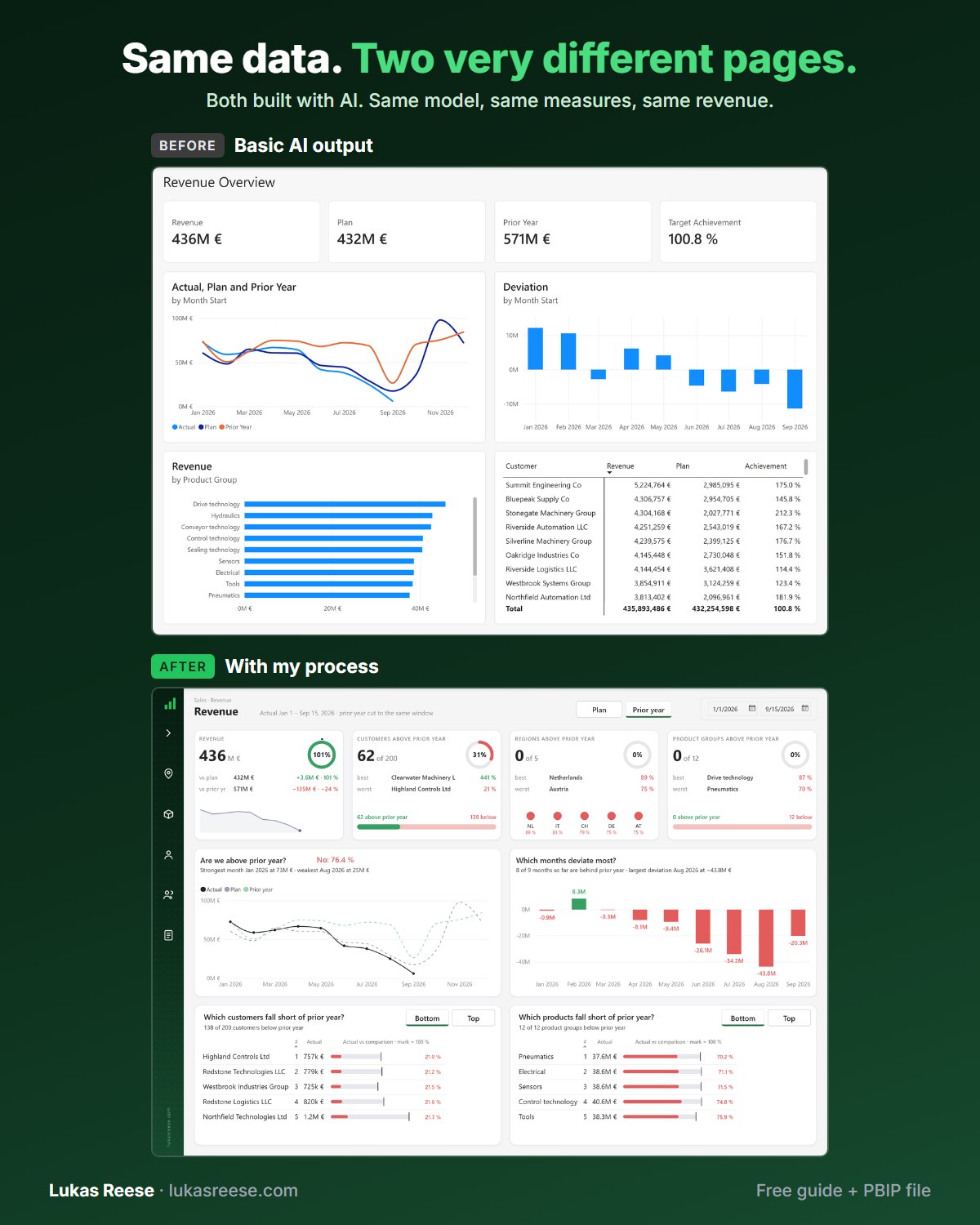
Same data, two very different pages. Both built with AI. This is the process behind the second one.
What you get:
- The 25-page guide: my full process, tool stack and 7 prompts you can copy
- The PBIP file with the same revenue page twice: the basic AI output and the finished page
- Step-by-step explanation, inspiration and real output.
Important: confirm your email
- After you sign up, you get a confirmation email. Click the button in it, then the guide and PBIP file are on their way.
- The Dropdown section only appears when Slicer settings, Options, Style is set to Dropdown.
- Rounded corners max out at 25 px, so a tall slicer will never go fully pill shaped.
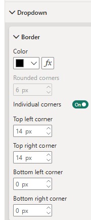
- Individual corners gives you four separate radii. Microsoft has not documented this option.
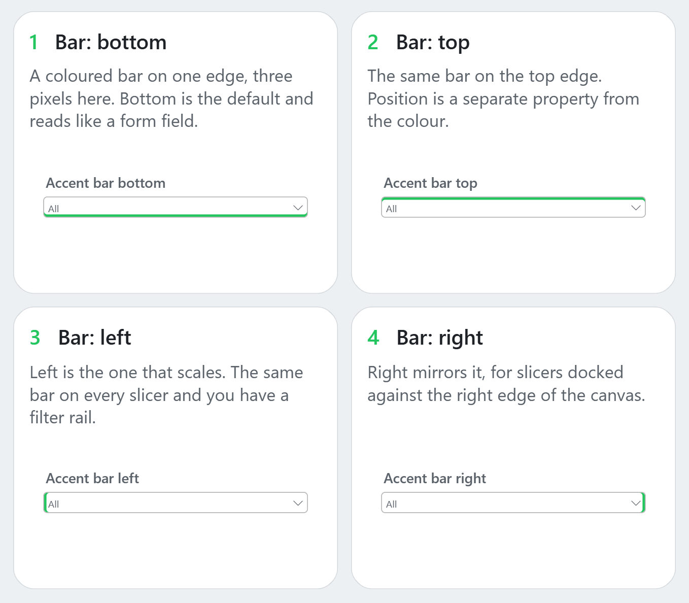
- The accent bar sits on the bottom, top, left or right, and its width defaults to 1 px.
- The Hierarchy section does not exist until you put two or more fields in the Values well.
- Border, open icon and accent bar colors each carry an fx button, so all three accept a measure.
You are probably reading about the wrong slicer
Power BI ships three different slicer visuals, and half the pages ranking for this topic describe the wrong one. In particular, the button slicer has had an accent bar for over a year. As a result, people follow those steps, look for the settings on a dropdown, and conclude that the feature never shipped.
Above all, check which visual you actually selected before you go hunting through the format pane.
Which slicer is which
| Visual | Looks like | This article? |
|---|---|---|
| Slicer | A list, or a dropdown box with a chevron. Moreover, it is the only one that supports hierarchies. | Yes |
| Button slicer | Tiles or pills you click. Consequently, its accent bar settings look similar but sit elsewhere. | No |
| List slicer | A scrollable list with tooltips. However, it is still in preview. | No |
Want to level up your Power BI skills?
DataCamp offers structured, hands-on courses in Power BI, DAX and data visualization, built for practitioners. New users get a significant discount on their first subscription.
Explore DataCamp Courses →Where the dropdown slicer formatting options live
The Dropdown section sits in the Visual tab of the format pane, and it only appears when the slicer style is set to Dropdown. Therefore, if the section looks missing, that is almost always why. Set it under Visual, Slicer settings, Options, Style.
Furthermore, the section is not a flat list of settings. Instead, it splits into three sub sections, and the paths matter when you are following a tutorial.
The three sub sections
| Sub section | Settings inside it |
|---|---|
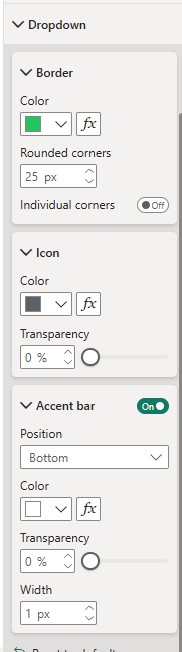
| Border | Color, Rounded corners, and an Individual corners toggle. In effect, this is where most of the visual change happens. |
| Icon | Specifically, Color and Transparency for the chevron that opens the dropdown. |
| Accent bar | Additionally, an on and off toggle, plus Position, Color, Transparency and Width. |
Rounded corners, and the ceiling nobody mentions
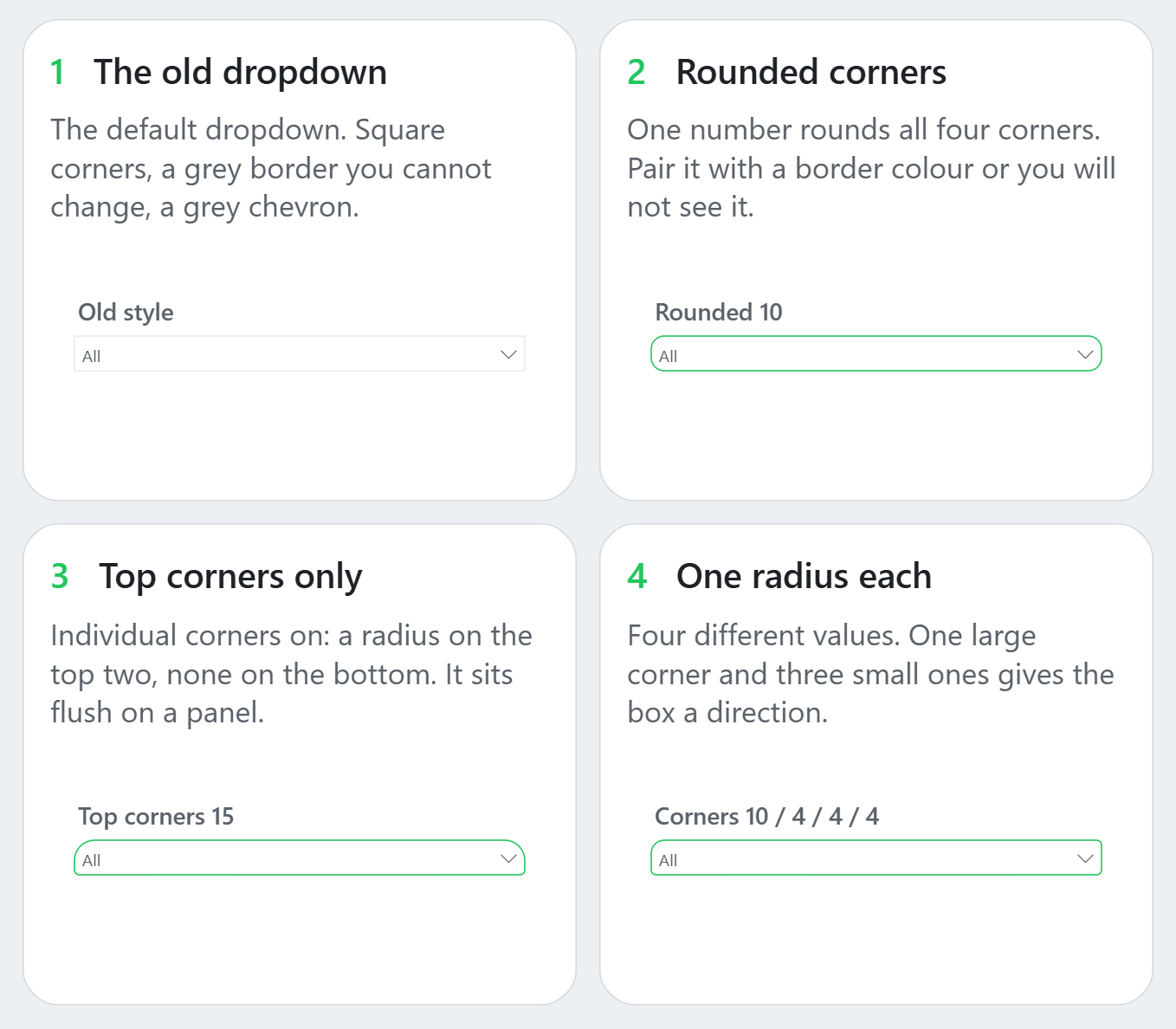
One number rounds all four corners at once. However, the maximum value is 25, which is the detail that trips people up. Consequently, a 60 px tall slicer will never look like a full pill, no matter what you type into the box.
Additionally, the border color matters as much as the radius does. On the default pale grey, a 10 px rounding is almost invisible in a screenshot, so the two settings really travel together.
Rounding a Power BI slicer used to mean a rounded shape behind it and a transparent background on top. Now it is one number in the format pane.
Individual corners, which Microsoft has not documented
The Border sub section also carries an Individual corners toggle. Once you switch it on, the single Rounded corners field greys out and four separate fields appear: top left, top right, bottom left and bottom right. Notably, this option does not appear in the Microsoft documentation at all.
In practical terms, it solves one specific problem. Rounded on top and square at the bottom makes a slicer sit flush on a panel edge instead of floating above it. Similarly, one large corner and three small ones gives the box a direction, which helps when a slicer sits in the corner of a pop up filter panel.
Border color and the open icon
Border color accepts any theme color or hex value, and it is the setting that makes the rounding visible at all. Moreover, the open icon is now separate. That is the chevron on the right of the box, and it takes its own color plus its own transparency.
For example, set the icon transparency to around 60 percent when the arrow should hint at the interaction rather than announce it. In my own testing, that reads better on a dense page than a full strength arrow does. If you are matching these to a palette, my guide to Power BI JSON themes covers where those values come from.
The accent bar is the one that scales
The accent bar is a colored bar along one edge of the dropdown box. Specifically, it takes four positions, and the width defaults to 1 px, which is thin enough that people sometimes think the setting did not apply. Push it to 3 px and it reads properly.
Which position to use
| Position | Good for |
|---|---|
| Bottom | The default. In effect, it reads like the underline on a form field. |
| Top | Similarly, a thin bar acts as a category tab above the control. |
| Left | The one that scales. Above all, it turns a stack of slicers into a rail. |
| Right | Likewise, for slicers docked against the right edge of the canvas. |
Give every slicer in a filter panel the same left accent bar and you have a rail down the side of that panel, without drawing a single shape behind it.
One design note from building the demo page. If the accent bar is the point, the box itself has to recede. Accordingly, I used a grey border with a colored bar. Two strongly colored elements on one small control simply cancel each other out.
Hierarchy slicers need two fields first
A hierarchy slicer is a slicer with two or more fields in the Values well, which renders the values as an expandable tree rather than a flat list. Crucially, the Hierarchy section does not appear in the format pane until that second field is there. In other words, this is the single most common reason people think the new icon options did not ship.
Drag one field above another in the Values well, and the slicer switches to a hierarchy on its own. Microsoft covers the mechanics in its guide to adding multiple fields to a hierarchy slicer.
Expand and collapse icon
Under Visual, Hierarchy, Expand/collapse you can swap the icon between Chevron, Plus/minus and Caret. Furthermore, the icon color is the part that is new in this release.
Indentation and check boxes
Stepped layout indentation lives under Visual, Hierarchy, Levels, and it defaults to 15 px. For example, drop it to 10 px to fit a three level hierarchy inside a narrow slicer. The check box color, meanwhile, sits in a separate top level section called Selection icon.
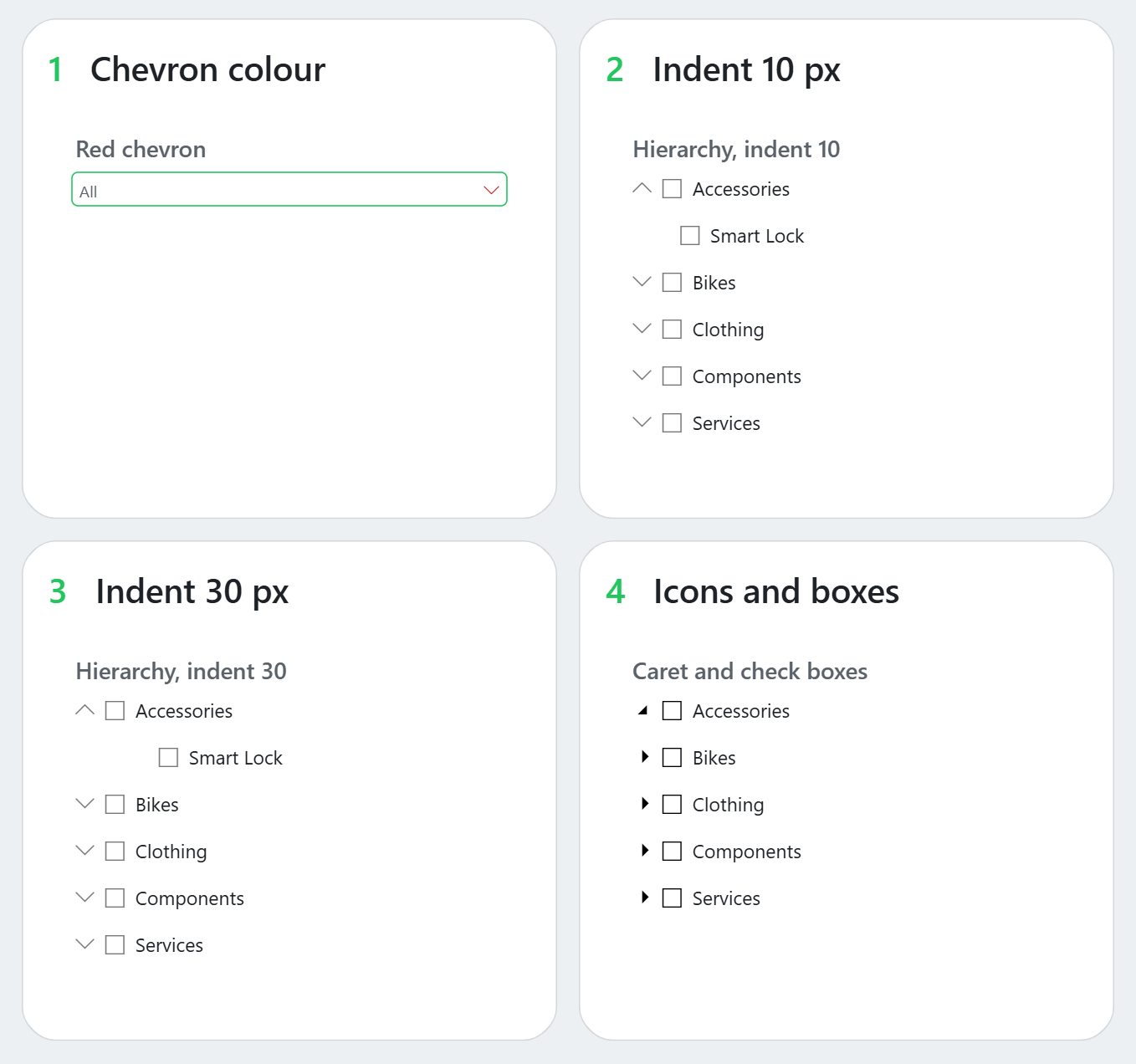
One practical warning. None of these settings are visible while the dropdown is closed, because the tree sits behind a click. Consequently, if you want to show the difference in documentation or a screenshot, switch the style to Vertical list first.
Three of these colors accept a measure
Border color, open icon color and accent bar color each show an fx button in the format pane. Therefore, all three accept conditional formatting, which means slicer chrome can respond to state instead of just sitting there. Microsoft also lists the hierarchy icon color as supporting conditional formatting, though I have not confirmed that one myself.
As a result, a border that turns green while the slicer is actively filtering is now a two minute build. Write a measure that checks ISFILTERED on the slicer column, return one hex value or another, then bind it through the fx button on Border color. No competing guide I found mentions this at all.
The slicer border is now a place to put information, not just a line around a box.
What you can now delete
This is the part that matters if you maintain existing reports. Previously, each of these effects needed something extra on the page. However, all three are now single settings.
Old workaround against new setting
| Effect | Old workaround | Now |
|---|---|---|
| Rounded slicer | Previously, a rounded shape behind it, plus a transparent slicer background. | Rounded corners |
| Colored outline | Similarly, a background image baked into the canvas. | Border color |
| Left rail on a filter panel | Likewise, a stack of thin rectangles, aligned by hand. | Accent bar, position left |
To be clear, page backgrounds are still worth building. Slicer chrome simply is not one of the reasons any more. If you are still generating those, I cover the options in four ways to create Power BI backgrounds, and the wider layout question in my dashboard design best practices guide.
Because every one of these settings is stored in the report layer, they are also visible in the underlying JSON if you work in the PBIR format. Accordingly, I wrote the whole demo page as PBIR JSON rather than clicking it together, which is the approach I described in speeding up Power BI report development.
Frequently asked questions
How do I round the corners of a slicer in Power BI?
First, select the slicer, open the Format pane, then go to Visual, Slicer settings, Options and set Style to Dropdown. Afterwards, open the new Dropdown section and set Border, Rounded corners. The maximum value is 25 px.
Why can I not find the Dropdown section in my format pane?
In most cases, the slicer style is still set to Vertical list. Additionally, check that you selected the standard Slicer visual rather than the button slicer, and that you are on the August 2026 release or later.
What is the maximum corner radius on a Power BI slicer?
Indeed, the maximum is 25 px. Consequently, a taller slicer cannot be made fully pill shaped through this setting alone, because the radius cannot reach half the box height.
How do I change the color of the dropdown arrow in a Power BI slicer?
Open Visual, Dropdown, Icon. Then set Color, and adjust Transparency if the arrow should sit back rather than stand out. Moreover, that color accepts a measure through its fx button.
How do I turn a normal slicer into a hierarchy slicer?
Specifically, add a second field to the Values well and place it below the first. As a result, the slicer renders a tree, and only then does the Hierarchy section appear in the format pane.
Do I still need a custom visual to style a Power BI slicer?
For the standard dropdown, no. Rounded corners, border color, the open icon and the accent bar are all native now. However, custom visuals still make sense for behaviours the built in slicer does not offer, such as advanced search.
Power BI dropdown slicer formatting in practice
Power BI dropdown slicer formatting is a small release on paper. In practice though, it removes three workarounds that every designed report used to carry. I would start with border color and a left accent bar on one filter panel, because that combination changes how a page reads faster than anything else in the list.
One limitation worth stating plainly. Everything above was checked on the August 2026 build of Power BI Desktop, and Microsoft has not documented the individual corners option, so treat that one as observed behaviour rather than a contract. For the official release notes, see the Power BI August 2026 update and the slicer visual reference.
Written by Lukas Reese, a freelance Power BI consultant working with clients in Germany and the United States. I build reporting systems end to end: data modeling, DAX, and dashboard design. Last updated 28 August 2026.