

To speed up Power BI report development, hand over the jobs that scale badly by hand rather than the ones that look impressive in a demo. Generating a report page with AI is no longer new. However, the outcome is often basic, and the real time saving sits somewhere far less glamorous: renaming measures, aligning visuals, building bookmarks, wiring button states, and assembling pop-up filter panels.
Consequently, this post ranks the five jobs I actually hand to the Power BI report authoring skill in production work. Each one follows the same rule: one page is fine by hand, but twelve pages become a mess to manage. Above all, I will be specific about where the tool still falls short.
Go beyond single jobs: build the whole page with AI
My free guide walks through my complete Claude Code workflow for Power BI reports: 25 pages, 7 prompts you can copy, and the PBIP file.
How I Build Power BI Reports with AI
Same data, two very different pages. Both built with AI. This is the process behind the second one.
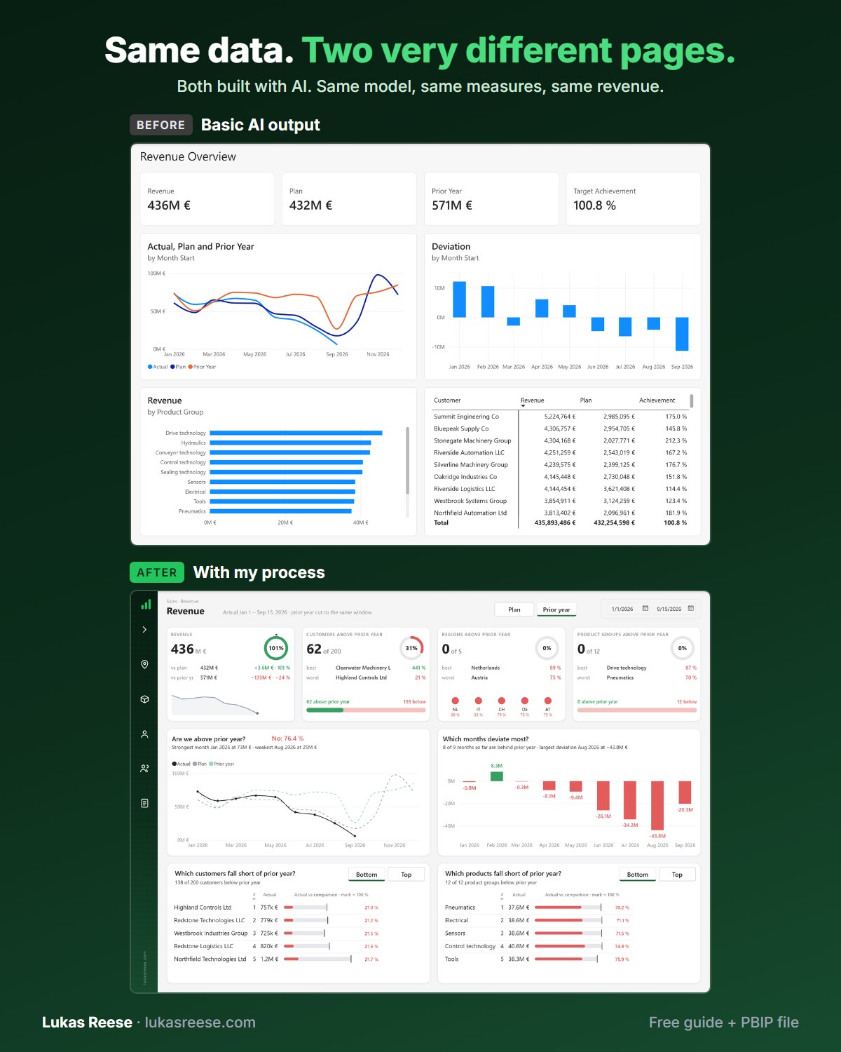
What you get:
- The 25-page guide: my full process, tool stack and 7 prompts you can copy
- The PBIP file with the same revenue page twice: the basic AI output and the finished page
- Step-by-step explanation, inspiration and real output.
Important: confirm your email
- After you sign up, you get a confirmation email. Click the button in it, then the guide and PBIP file are on their way.
- Measures. AI renames them and writes a description for each one, so you skip an afternoon of typing.
- Alignment. It puts every visual in the same place on every page, so you stop editing X and Y by hand.
- Bookmarks. It creates and names them in bulk, so fifteen bookmarks no longer eat your whole day.
- Buttons. It sets the hover and press state on all of them, so every button looks the same.
- Filter panel. It builds the whole pop-up panel for you, bookmarks and background included.
One catch: you have to teach it your style first. Show it one of your own reports and it will match that on every report after.
The short version. Five jobs, sixty seconds, no setup required.
Speed up Power BI report development by automating what scales badly
The best candidates for automation are jobs whose cost grows linearly with page count while the thinking stays identical. Renaming one measure takes seconds, for example, whereas renaming forty takes an afternoon and produces nothing you could call design work.
One page is fine by hand. Twelve pages is a mess to manage. The work worth handing over is the work that scales badly.
Notice, however, what this rule excludes. It excludes the choice of chart type, the narrative order of your pages, and the question of what the business actually needs to see. Those decisions do not get cheaper at volume, and accordingly they stay with you.
Want to level up your Power BI skills?
DataCamp offers structured, hands-on courses in Power BI, DAX, and data visualization — built for practitioners. New users get a significant discount on their first subscription.
Explore DataCamp Courses →1. Measure descriptions and renaming
Measure descriptions are, above all, the highest-payback job on this list, and they are also the one nobody volunteers for. A description is a short text field on a measure that explains what it returns and when to use it. Additionally, the synonyms field lists alternative names a business user might type.

Renaming measures one by one takes forever. Writing a description for each one is, frankly, the job nobody wants to do. Moreover, the work is pure transcription: you already know what Revenue YTD means, so typing it out forty times adds no insight.
Furthermore, there is a second reason to care. Microsoft documents descriptions and synonyms as inputs that improve how well Copilot answers questions about your semantic model. Consequently, filling them in stops being documentation hygiene and starts being a feature.
If you would rather clear out unused measures before documenting the rest, my guide on deleting multiple measures at once covers that step.
2. Visual alignment across pages
Alignment means, specifically, every visual sitting in the same position on every page, so that switching pages does not make the layout jump. In practice, a card that starts at x=24 on page one should start at x=24 on page eleven.

Making sure each visual lines up is a genuine pain. How many times have you opened the X and Y coordinate settings by hand? In my case, too many. Furthermore, the problem compounds: a filter pane that sits four pixels off on one page, or a visual that does not quite fit its background image, is invisible until someone screenshots it for a board pack.
Misalignment is never one big error. It is forty small ones, and each is individually too trivial to justify the fix.
Because the skill edits the PBIR file format directly, position is just a number in a JSON file. As a result, “align every visual on every page to the same grid” is a single instruction rather than an afternoon of clicking. For the design rules behind those grids, see my dashboard design best practices guide.
3. Bookmarks at volume
Bookmarks are, in practice, the job most likely to consume an entire afternoon. One bookmark is already annoying. However, having fifteen of them, or more, spread across different pages will eat your whole day.

The reason is that bookmarks are stateful, since each one stores a moment. Each one captures visibility, filters, and selection at a moment in time. Therefore adding a single visual to a page can invalidate every bookmark that touches it, and you will not find out until a button stops working in front of a client.
Fortunately, the skill creates and manages them in bulk. Similarly, it can rename them consistently, which matters because a selection pane holding thirty entries called Bookmark 14 is functionally unusable.
4. Button states
Every button in Power BI needs a hover-over colour, a press state, and the right text. That is fine for one button. Conversely, it is not fine for thirty.

Consequently, button state configuration is the clearest example of the scaling rule on this list, because the work is identical every time and the count grows with every navigation element you add. In effect, a report with a page rail, drillthrough buttons, and a reset control can easily carry thirty button definitions.
Likewise, consistency is the thing that breaks first. Indeed, one button with a slightly different hover green is the kind of detail that makes a report feel unfinished without anyone being able to say why.
5. Pop-up filter panels
A pop-up filter panel is, in short, a slide-out menu that holds your slicers, built from bookmarks plus a custom background image so it looks designed rather than bolted on. It is the most complex item here, and accordingly the one I would least want to build by hand.
Here is the whole build on video, mistakes included. Watch what happens after each screenshot — that feedback step is the entire difference between generating a panel and getting a working one.

The panel consists of bookmarks and custom SVG images that were automatically created to fit the background. In other words, two of the previous jobs on this list combine into a third. For that reason, building it manually is close to impossible at any reasonable speed.
I have written a full walkthrough of the pattern in my Power BI pop-up filter panel guide. Additionally, if you want the background images themselves generated to match, my post on four ways to create Power BI backgrounds covers the options.

Where the skill still falls short
The skill is not perfect by default, and pretending otherwise would waste your time. You need to iterate over time, you may encounter errors, and above all you need to teach it what actually looks good.
Teaching, in practical terms, means feeding it your own work. Specifically, get inspiration from other reports, use your own reports, and give it the JSON code behind them so the skill learns how you build. Otherwise it produces something technically valid and visually generic — which is precisely the “basic output” problem that gives AI-generated reports their reputation.
Out of the box it writes valid PBIR. After you teach it your patterns, it writes your reports. The gap between those two things is the whole job.
For a wider view of where this sits on the adoption curve, my post on the five levels of AI in Power BI development maps the progression from prompting to agentic authoring.
Power BI report development by hand versus with the skill
Overall, the table below summarises where the effort actually goes. Notably, the right-hand column is never zero, because reviewing the output is still your job.
| Job | By hand | With the skill |
|---|---|---|
| Measure descriptions (40 measures) | Typically an afternoon of transcription | One pass, and afterwards you review the wording |
| Aligning visuals across 11 pages | Manual X and Y editing, and therefore error-prone | One instruction, since position is just a number |
| 15+ bookmarks across pages | A full day, and fragile afterwards because state breaks | Created and named in bulk, so naming stays consistent |
| 30 buttons with hover and press states | Repetitive, so inconsistency creeps in | Defined once, and consequently applied uniformly |
| Pop-up filter panel | Effectively impractical, because the parts compound | Bookmarks plus generated SVG background |
Frequently asked questions
How can I speed up Power BI report development without AI?
Standardise first. Specifically, build a theme JSON, a page template, and a naming convention, because most lost time comes from re-deciding things you already decided. Consequently, automation amplifies whatever standard you already have, rather than replacing it.
Can AI build a complete Power BI report page on its own?
Yes, it can generate a valid page. However, the output tends to be basic until you feed it examples of your own work. In other words, treat the first result as a starting layout rather than a finished report.
Do I need PBIP files to use the report authoring skill?
Yes. The skill edits the PBIR format inside a PBIP project, so a .pbix file will not work. Therefore save your report as a Power BI Project first.
Which job should I automate first?
Start with measure descriptions. Above all, it is low risk, it is quick to verify, and it improves Copilot answers as a side effect. Afterwards, move to bookmarks, since that is where the largest single block of time disappears.
Is the Power BI report authoring skill free?
The skill itself is published by Microsoft in the open-source skills-for-fabric repository. However, you still need an agent to run it, such as Claude Code or GitHub Copilot CLI, and those carry their own subscription costs.
Where to go next
If this is new to you, then start with the reference guide rather than the use cases. My full walkthrough of the Power BI report authoring skill covers installation, capabilities, limits, and the Desktop Bridge. Alternatively, for the file format underneath it all, read PBIX vs PBIR vs PBIP.
- Power BI Desktop Bridge — the loop that lets the agent check its own work.
- Build a pop-up filter panel — the manual method behind job five, step by step.
- The five levels of AI in Power BI development — where this sits on the scale.