

Last updated: March 14, 2026
Heads up: Claude skills are very new, and everything you see here is actively being tested. This is a work-in-progress — not a polished, finished product. I’m sharing it because I believe in building in public. If you try it and something breaks, or you have ideas for new visuals and improvements, I’d love to hear from you. Open an issue, submit a pull request, or just reach out. Let’s improve this together.
The PBIR Report Builder is a Claude skill that lets you automate Power BI report creation with AI — generating IBCS variance charts, summary tables, and native visuals by writing valid PBIR JSON directly into your PBIP project folder. Three inputs, under two minutes, no paid add-ons. This is what Power BI code-first development looks like when you combine the Power BI Enhanced Report Format with AI.
Key Takeaways
- AI Power BI report generation is real — Claude writes valid PBIR JSON visuals directly into your project folder, no GUI clicks needed.
- IBCS variance charts without paid add-ons — four templates using only native Power BI visuals (column, bar, table).
- Three inputs are all you need — actual measure, comparison measure, and a category column. Claude generates all helper DAX measures and visual JSON.
- Open source and free — available on GitHub.
Update — August 2026
Published March 2026. Since then Microsoft officially released the Skills for Fabric repository — a Power BI report authoring skill, report management, and skills that work against real workspaces. Use those. They are maintained by Microsoft, they ship the Desktop Bridge, and they do what this skill did, better.
This post still stands as the reasoning behind it: why PBIR makes AI report building possible, and what an IBCS variance chart looks like when it is generated rather than drawn. Read it for the thinking, then go to the current tooling.
- The official Power BI report authoring skill — what it installs, what it does, where it stops.
- The Power BI Desktop Bridge — the write, look, judge, fix loop that closes the feedback gap.
- The five jobs I actually automate — what this replaced in day-to-day work.
What is PBIR?
PBIR (Power BI Enhanced Report Format) is Microsoft’s next-generation file format for Power BI reports that replaces the monolithic .pbix binary with a human-readable project structure — JSON files for visuals, semantic model definitions, and page layouts, all stored in a folder. This makes reports code-friendly, version-control-friendly, and AI-friendly.
According to the Microsoft Power BI Blog, PBIR became the default format for new reports in the Power BI Service starting January 2026, with Power BI Desktop following in March 2026. General availability is planned for Q3 2026. If you’re building Power BI projects today, understanding the Power BI Enhanced Report Format is essential — it enables PBIP automation, Git integration, and AI-assisted development workflows that simply weren’t possible with .pbix files. I’ve written a deeper dive into code-first Power BI if you want more context.
The Problem: Building IBCS Charts by Hand Takes Forever
After building many client reports with IBCS variance charts — the kind that show budget vs. actual with comparison bars, color-coded icons, and clean typography following International Business Communication Standards — I can confirm: the manual process is painfully repetitive. Only if you are using Zebra BI, a paid third party tool, the creation of those charts is easy and fast. The IBCS Association now has over 12,000 members across 139 countries, and for good reason — these charts are the gold standard for management reporting. But building them in Power BI by hand? Every single time, the process is the same:
- Create 15+ helper measures for variance calculations, percentages, and formatting logic
- Build conditional formatting rules across rows and columns
- Repurpose error bars as visual elements
- Manually align icons, text colors, and spacing
- Test in Desktop, fix alignment, reload, repeat
In my testing, a single variance table takes 30–45 minutes by hand. A full report with multiple IBCS charts? Hours. And if the client wants to change the structure? Start over.
“Building IBCS charts manually in Power BI means creating 15+ helper DAX measures, hacking error bars into variance indicators, and copy-pasting JSON while praying nothing breaks. The PBIR Report Builder reduces that to three inputs and under two minutes.”
This is exactly the kind of repetitive, structure-heavy work that AI excels at. So I built the PBIR Report Builder skill to automate Power BI report creation with AI — specifically targeting IBCS visuals built from native Power BI components.
Manual vs. AI-Assisted: What Changes?
| Factor | Manual (Power BI Desktop) | PBIR Report Builder Skill |
|---|---|---|
| Time per IBCS chart | 30–45 minutes | Under 2 minutes |
| DAX measures | Write 15+ by hand | Auto-generated |
| Inputs required | Dozens of settings per visual | 3 (actual, comparison, category) |
| Version control | Not possible with .pbix | Full Git support via PBIP |
| Paid add-ons needed | Often (Zebra BI, IBCS visuals) | None — native visuals only |
| Reproducibility | Copy-paste JSON manually | Template-driven, consistent output |
The Solution: A Claude Skill for Power BI
Claude skills are markdown instruction sets that give Claude deep domain expertise. They tell Claude how to think about a specific problem, what constraints to follow, and what outputs to produce. Think of them as a combination of documentation, templates, and guardrails — all in one readable file. Skills are part of the growing Claude ecosystem that includes Claude Code, MCP servers, and plugins.
The PBIR Report Builder skill — a Claude skill specifically designed for Power BI — does this:
- Teaches Claude the complete structure of PBIR JSON visuals — every required field, optional property, and naming convention
- Provides four IBCS visual templates using only native Power BI visuals (no marketplace purchases)
- Includes semantic model naming conventions, DAX measure patterns, and JSON theme integration guidance
- Defines validation rules so generated JSON is syntactically valid before writing to disk
When you point Claude at your PBIP folder and describe what you want, the skill ensures Claude understands your codebase structure and generates valid, production-ready JSON. The full skill is open source on GitHub.
How It Works: Step by Step
Here’s the actual workflow:
- Save as PBIP. In Power BI Desktop, save your report as a PBIP project (not a .pbix file). This creates a folder structure with
definition/,report/, and.pbirfiles. - Open Claude Code. Launch Claude Code and point it at your PBIP folder using
--skillsflag to load the PBIR Report Builder skill. - Describe what you want. “Add a column variance chart for monthly budget vs. actual. Use the Budget and Actual measures from the Finance table. Group by Month.”
- Claude generates files. The skill writes new measure definitions to the semantic model and creates visual JSON files in the
report/folder. - Reload Desktop. Switch back to Power BI Desktop and reload the project. Your new visual appears on the canvas.
- Validate and iterate. If something needs adjustment, ask Claude to regenerate with tweaks. No manual JSON editing required (unless you want to).
Exploring Your PBIP Project Folder
Before you hand anything to Claude, it helps to understand what’s inside a PBIP project. Let me walk you through it.
First, save your report as a PBIP file. In Power BI Desktop, go to File → Save As and select Power BI Project (.pbip). This creates a folder instead of a single .pbix binary.

Inside that folder, the definition/ directory contains everything about your report: pages, visuals, and the report configuration. This is where PBIR stores each element as a separate JSON file.

Drill into the pages/ folder and you’ll see a subfolder for each report page. Each one contains a page.json with dimensions, display name, and type settings.
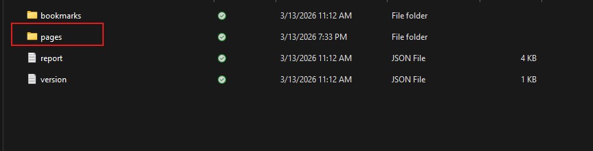
Pro Tip
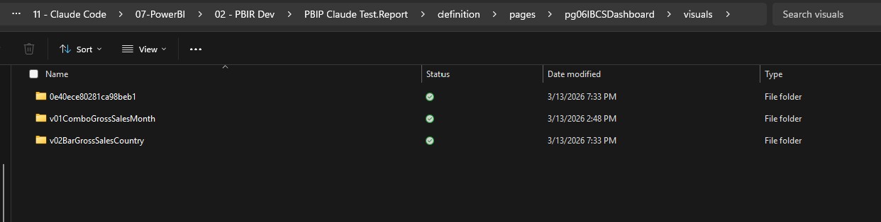
The default page folder names are auto-generated GUIDs — hard to read. Ask Claude to rename them to something meaningful like pg01Overview or pg02SalesDetail. Makes the whole project easier to navigate.

Inside each page folder, the visuals/ subfolder contains one folder per visual. Same idea — rename them to something meaningful so you know what you’re looking at.
Open any visual.json file in Notepad or VS Code and you’ll see the full PBIR structure: visual type, position, query bindings, formatting objects, everything. This is what the skill generates for you — valid JSON that Power BI Desktop can render.
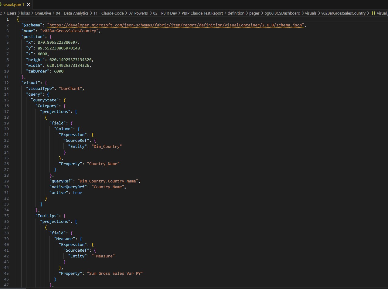
That’s it. That’s the structure. Now instead of hand-crafting these JSON files, you point Claude at this folder and say “create an IBCS column variance chart for Sales vs Sales PY by Month.” The skill handles the rest.
What’s Inside the Skill
The PBIR Report Builder skill is self-contained and includes:
- PBIR JSON Schema. Complete documentation of how PBIR visuals are structured, with all required and optional fields.
- IBCS Visual Templates. Ready-to-use JSON blueprints for column charts, bar charts, tables, and summary visuals.
- Measure Patterns. Common DAX patterns for variance calculations, percentages, and formatting logic.
- Validation Rules. Checks to ensure generated JSON is syntactically valid before writing to disk.
- Error Recovery. Guidance on common mistakes and how Claude should handle them.
The skill is documentation-first and code-second. If you open it, you’ll see a markdown file that reads like a detailed technical guide — similar to how you’d write Power BI best practices documentation. Claude reads this, learns the patterns, and applies them to your project.
IBCS Variance Charts Without Paid Add-ons
One of the biggest wins: you can build professional IBCS Power BI native visuals that follow International Business Communication Standards — without marketplace purchases or third-party dependencies. This matters because IBCS-certified tools like Zebra BI can cost €500+ per user annually. The skill achieves comparable results using only built-in Power BI column charts, bar charts, and tables with conditional formatting.
Watch an IBCS chart get built
This is the same idea running on the current tooling — the report authoring skill and the Desktop Bridge doing the work this skill was written for.
The skill includes four IBCS templates:
Column Variance Chart (Time Series) — Native Visual
Uses a native Line and Clustered Column Chart — two columns per period (Actual and Comparison), with variance bar overlaid. Perfect for monthly or quarterly trends. Because this is a native Power BI visual, it’s fully resizable and responsive — drag the edges and it reflows automatically. Inputs: Actual measure, Comparison measure, Date column.
Bar Variance Chart (Ranked Categories) — Native Visual
Uses a native Stacked Bar Chart — horizontal bars for Actual and Comparison, ranked by variance. Common in P&L or sales analysis. Like the column chart, this is a native visual, so it scales cleanly to any size on your report canvas. Inputs: Actual measure, Comparison measure, Category column (e.g., Product, Region).
Simple Variance Table (SVG Bars)
Grid with columns for Actual, Comparison, Variance %, and a small inline SVG bar chart showing variance visually. Clean and compact. Note: Because the bars are rendered as SVG inside table cells, resizing can be tricky — SVGs don’t reflow the same way native visuals do. Works best at a fixed size. Inputs: Same three measures/columns as above.

Full Variance Table (All-SVG)
Enterprise-grade table with row groups, variance trend sparklines, and conditional color coding. Designed for executive dashboards. Inputs: Multiple measures, hierarchical grouping columns.

Each template requires just three inputs: an Actual measure, a Comparison measure, and a category or time column. Claude handles the rest — all helper DAX measures, conditional formatting, layout, and tooltips. If you’re familiar with Power BI dashboard design best practices, you’ll appreciate that the templates follow established layout patterns for readability and information hierarchy.
Two-Layer Architecture: Semantic Model + Report Visuals
The real power comes from combining two tools:
Layer 1: Semantic Model. The PowerBI Desktop MCP Server (by maxanatsko) provides Claude deep access to your data model. Claude can read your existing measures, table structure, and relationships. This context is essential for generating accurate measures.
Layer 2: Report Visuals. The PBIR Report Builder skill generates the visual JSON—the presentation layer. It writes the files, but relies on Layer 1 to understand your data shape.
Together, they form a complete PBIP automation workflow: read your model, generate measures, build PBIR JSON visuals, write files, reload. All in code. No clicks in Power BI Desktop required.
“PBIR turns Power BI reports into code. Claude skills turn that code into something AI can write for you. Together, they make AI Power BI report generation practical — not theoretical.”
Work in Progress (And a Security Note)
Here’s a full sales dashboard created entirely from JSON — no Power BI Desktop interaction at all. Claude wrote every page, every visual, every measure binding. Is it perfect? Not yet. But the fact that this is possible with just code is wild.

The skill is actively improving. My next goal is getting KPI cards properly defined with reference values and reference lines — that formatting takes a lot of manual time in Desktop, and it’s a perfect candidate for code-first generation. I’m also working on integrating Power BI theme generation so the skill can write consistent themes alongside visuals. You may still encounter edge cases or JSON validation errors. If you do, file an issue on GitHub or ask Claude to regenerate with corrections. The community (that’s you) helps make it better.
Important: Before sharing a PBIP folder with Claude or uploading it anywhere, always strip connection strings and sensitive metadata. Open the definition/model.pbidatamodel.json file, find any "connectionString" keys, and replace them with placeholders. Your data warehouse credentials should never leave your machine.
Frequently Asked Questions
Can AI really generate Power BI reports?
Yes, but with nuance. AI can generate the structure—measures, JSON visuals, folder layout—but it works best when you provide clear specifications. The PBIR Report Builder skill creates valid JSON that Power BI Desktop understands. You still own the decisions about data model design and visual strategy.
Do I need paid add-ons for IBCS charts?
No. The skill includes four IBCS templates that use only native Power BI column, bar, and table visuals. No third-party visual marketplace purchases required. You provide the measures; the skill builds the layout.
What’s the difference between PBIR and PBIP?
PBIR (Power BI Enhanced Report Format) is the file format. PBIP (Power BI Project) is the folder structure that stores PBIR files alongside the semantic model. PBIP became the default project format in January 2026, with PBIR GA planned for Q3 2026.
Is the skill free and open source?
Yes. The PBIR Report Builder skill is hosted on GitHub at github.com/lukasreese/powerbi-claude-skills under an open-source license. Use it, fork it, contribute back.
What happens if the generated JSON has errors?
Power BI Desktop will show a load error or warning. You can either fix the JSON manually in the file (it’s just text), ask Claude to regenerate with corrections, or file an issue on GitHub. The skill is production-ready but still improving.
Can I use this with existing reports?
Yes. Export your existing .pbix to PBIP format, then point Claude at the folder. The skill will add new visuals alongside your existing ones without overwriting. Start small: add one IBCS chart, validate it, then expand.
Ready to Build?
The PBIR Report Builder skill is ready to use. Clone the repo, load it into Claude Code, and point it at a PBIP project. Start with a simple IBCS chart—column variance, budget vs. actual. See if it works for you.
Found a bug? Have a feature request? Open an issue on GitHub. Want to contribute a new IBCS template or extend the skill? Pull requests are welcome.
This is the future of Power BI development: AI + code-first reports + open standards. Whether you’re building interactive dashboards or executive variance reports, the PBIR Report Builder gives you a faster path. Let’s build it together.
Where to go next
If you came here to automate report building, do not start with this skill. Start with what Microsoft ships, then come back for the parts it does not cover.
- Power BI report authoring skill — the official one, and how to install it.
- Power BI Desktop Bridge — how an agent reloads a report and looks at its own work.
- Speed up Power BI report development — the five jobs worth handing over.
- PBIR: Power BI became a code-first tool — why any of this is possible.
Lukas Reese is a Power BI Developer and Consultant based in Hannover, Germany — working remotely worldwide. He specializes in code-first report design, semantic modeling, and automation. Connect on LinkedIn or visit his site for more on Power BI and data architecture.