
Dashboard motion design is a short, rendered video of a finished dashboard, and I have spent the past few weeks working out what it is good for. It solves a problem I have had for years without naming it: I build something I am proud of, and then I present a dashboard to somebody as a flat screenshot. The layout, the interaction, the filter panel, the colour decisions: none of it survives that image. It proves the dashboard exists, yet it does not make anybody want to look at it.
Motion changes that, and more than I expected. A dashboard that moves gets watched, whereas one that sits still gets scrolled past. I think this is genuinely underserved territory: there are thousands of articles about how to design a dashboard and almost nothing about how to present a dashboard to somebody who will never open Power BI. It goes by a few names, motion dashboard, dashboard animation, animated dashboard video; I call it dashboard motion design because the report is finished and only the presentation moves. So this is what I have learned so far: what dashboard motion design is, who it helps, how I make these videos in six steps with tools that cost nothing, and the five moves I keep coming back to.
Last updated: September 2026
The short version
- There are better ways to present a dashboard solution than a screenshot in a slide.
- Animation lets you highlight the part that matters, walk someone through the story in order, and market the report to people who will never log in.
- It is useful for a portfolio, for winning client work, for selling a project internally, and for social media or paid ads.
- I build these with Claude Code and Remotion. Both are free.
- However, it is not push-button. You have to teach the tool your style, collect good references, and accept a lot of trial and error.
Download the guide: one screenshot, one video (free PDF)
Eleven pages on exactly how I make these: the tools (all free), how to set up Claude Code and Remotion, the brand and animation rules I hand to Claude, the storyboard step before anything renders, and the export settings that play on LinkedIn and YouTube. It is the write-up I wish I had had at the start.
Subscribe below and the PDF arrives right after you confirm your email. Unsubscribe any time, the guide stays yours.
What dashboard motion design actually is
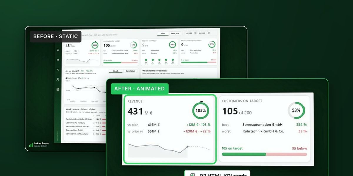
Dashboard motion design treats a finished report as footage rather than as software. You export each page as a high-resolution still image, and then you move a virtual camera across those images: pushing in on a KPI, sliding between pages, lifting several dashboards into view at once. Finally you render the whole thing to an MP4. The result looks like a product teaser for your own report, and because it is just a video file, anybody can watch it in a browser, a chat window or a slide deck.
The important detail is that nothing touches the report itself. Your PBIX or PBIP project is never opened by the animation process, so there is no performance cost, no custom visual to install, and no risk to the semantic model. In other words, this is a marketing and communication layer that sits entirely outside your Power BI work. That separation is what makes it safe to try on a real client report.
Dashboard motion design is a short, silent, rendered video of a finished dashboard. Rather than recording a screen, the report is captured as still images and animated in code (camera moves, reveals and transitions), then exported as an MP4 for portfolio, pitch or social use.
Here is one I published this week. It runs about thirteen seconds, it has no narration, and it never explains a single number. That is deliberate, because the job of this video is not to teach anybody anything. Its only job is to make somebody stop scrolling and think that whoever built this knows what they are doing.
It is not the same as animating a report
Whenever I mention dashboard motion design, somebody assumes I mean Play Axis or an animated dashboard visual from the marketplace. Those are a different thing entirely, even though people search for both as animated dashboards. An animated dashboard built with Play Axis moves your data inside a live report so that a user can watch a trend develop, which is a feature your audience interacts with. Motion design moves the presentation of a report that is already finished, and produces a file you send. One lives inside Power BI; the other never goes near it. Dashboard animation in the sense I mean here is closer to a product video than to a visual.
The other common assumption is that I am talking about a screen recording. I am not, although a recording is a perfectly reasonable option and I still use one when somebody needs a walkthrough. The difference is control. A recording captures whatever happened, including the cursor drifting while a visual loads, whereas a rendered video contains only frames I chose to exist. Consequently a recording documents the work, while a rendered video argues for it.
| Approach | Touches the report? | Live data | What it is for |
|---|---|---|---|
| Play Axis / animated dashboard visuals | Yes | Yes | Exploring change over time |
| Screen recording | No | Yes | Walking somebody through it |
| Dashboard motion design | No | No, stills only | Making somebody look |
Why a screenshot is not enough
A screenshot flattens every decision you made. The hover states are gone, the drill path is gone, the slide-out filter panel that took an afternoon is gone, and the visual hierarchy you built deliberately now reads as decoration. Anybody who has spent real time on layout and design decisions knows this feeling. The thing that made the report good is exactly the thing a static image cannot show.
The obvious fix is to share the real report, except that immediately runs into a licence. To open a Power BI link somebody needs Service access and usually a Pro licence, and the people I most want to impress rarely have either. A hiring manager does not. A prospective client does not. The finance director who signs off the next phase of the project almost certainly does not. So the honest situation is that the best version of my work is locked behind a door that most of my audience cannot walk through.
The third option is to book a call and share your screen, which does work and which I still do often. However, it converts interest into admin. Somebody sees your post on a Tuesday, is mildly curious, and by the time a calendar invite has been accepted for the following week that curiosity is gone. A video removes all three problems at once: no licence, no meeting, and nothing flattened.
A screenshot proves the work exists. Motion is what makes somebody actually look at it.
How to present a dashboard: the options I compared
Before settling on this, I went through every other way to present a dashboard. There are five realistic ways to present a dashboard, and three questions separate them: does the viewer need a licence, do you have to be in the room, and does it need to be interactive? Live in the Service and Power BI presentation mode both win when somebody is going to ask questions, but both require you to be present. Exporting to PowerPoint is fine for a board deck, although the live embedded version still prompts for a sign-in, which defeats the purpose more often than people expect.
A screen recording is the closest competitor and it is genuinely good for a walkthrough or a Power BI demo video where somebody needs to understand how a feature works. Motion design wins in a narrower but important case: when you need somebody who has no obligation to care about your work to care about it anyway. That is the portfolio case, the pitch case and the social media case. Rather than being better in general, it is much better in that one situation.
| Method | Viewer needs a licence | You must be present | Interactive | Best for |
|---|---|---|---|---|
| Live in Power BI Service | Yes | Yes | Yes | Working sessions |
| Power BI presentation mode | Yours only | Yes | Yes | Meetings you run |
| Export to PowerPoint | No, if static | No | Partly | Board decks |
| Screen recording | No | No | No | Walkthroughs |
| Dashboard motion design | No | No | No | Portfolio, pitch, social |
What animation actually does for a report
Animation does three separate jobs, and it took me a while to see them as separate. The first is highlighting. When you want somebody to look at one number, moving the camera towards that number works, while drawing a glowing box around it does not. That turned out to be the single most useful thing I learned: a static highlight reads as decoration and the eye slides past it, whereas a camera move reads as intent and the eye follows. Every early attempt I made ignored this and every one of them felt flat.
The second job is telling the story in order. A dashboard presents everything at once, which is correct for somebody using it and wrong for somebody meeting it for the first time. Motion lets you present a dashboard in a chosen sequence, so you show the headline number, then the trend behind it, then the breakdown that explains the trend. In effect you are doing what you would do verbally in a meeting, except the video does it without you and does it identically every time.
The third job is marketing, and this is the one most Power BI people never think about. A report is a product, and products get trailers. When you put thirteen seconds of motion next to a competitor’s static PNG, the difference in perceived quality is out of proportion to the actual effort involved. Furthermore, the same file works everywhere, from a LinkedIn post to a proposal PDF, a landing page or a paid ad, without any rework at all.
If you highlight something, the camera has to move to it. A static highlight is decoration; a camera move is attention.
Who this is actually useful for
If you are building a portfolio, dashboard motion design is the clearest win. Every Power BI portfolio looks the same, because everybody screenshots their best page and writes a paragraph about DAX underneath. A short video signals that you thought about the person looking at it, which is exactly the thing an employer or a client is trying to work out about you. The layout work you did only counts if somebody notices it, and motion is how they notice.
If you work inside a company, the use case is selling the project rather than selling yourself. Internal BI work dies quietly all the time, not because it is bad, but because the people holding the budget never see it and have no reason to open a report. A fifteen-second clip travels through Teams, drops into a steering committee deck, and reaches a decision-maker without anybody scheduling anything. I have watched good internal dashboards get cancelled purely because nobody upstairs ever saw them working.
If you are a freelancer or an agency, it changes what a proposal feels like. Attaching a rendered clip to a pitch demonstrates capability instead of asserting it, and a prospect who cannot evaluate your data model can still evaluate whether your work looks considered. Similarly, on LinkedIn and YouTube, vertical video simply outperforms static images, so the same asset earns attention organically and can be put behind ad spend later without touching it again.
How I make them: Claude Code and Remotion
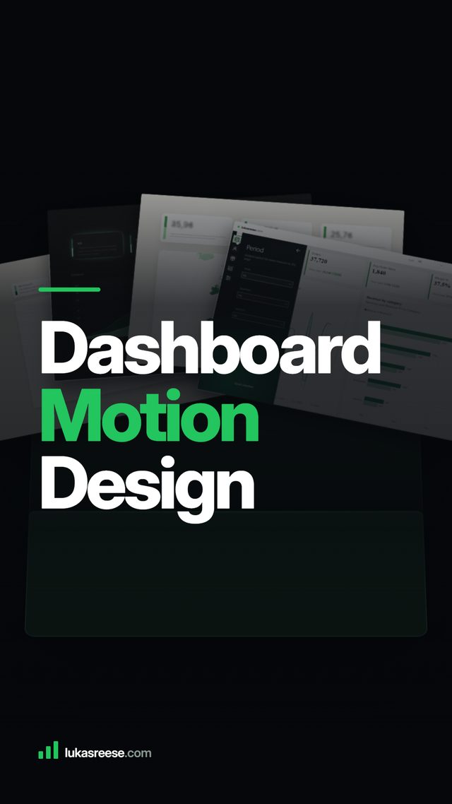
I use two things and neither costs anything. Remotion is an open-source framework that renders video from React code, so every frame of the animation is written as a component rather than dragged around a timeline. Claude Code writes that code. Because the video is code and not a binary project file, an AI agent can read it, change it and re-render it, which is the same loop I already use for automating repetitive report work and for the Desktop Bridge. No After Effects, no licence, no subscription.
The process is simple to describe. I export each report page as a wide, high-resolution image, crop them all to identical dimensions so nothing jumps between shots, write the beats out in plain English, and let Claude Code build the composition. Then I render it and cut it shorter than feels comfortable. Mine went from twenty seconds to thirteen, and every cut improved them. Matching your canvas size upfront makes the cropping almost disappear.
What I want to be honest about is that this is not push-button, and anybody telling you otherwise is selling something. Dashboard motion graphics need taste more than they need software, and you have to teach the tool yours, which means collecting references (good product videos, title sequences, motion studies) and feeding them in as concrete examples rather than adjectives. Asking for something “modern and dynamic” produces nothing useful, whereas pointing at a specific fifteen-second clip and saying “this camera move, at this pace” produces something you can work with. Beyond that it is trial and error. My first dashboard motion design video took an afternoon, and most of that afternoon produced material I deleted. The second took twenty minutes.
How I make a dashboard video, in six steps
People keep asking for the exact sequence behind an animated dashboard video, so here it is. Nothing in it needs a paid tool, and steps one to three are where most of the quality comes from.
- Export every report page as a wide image. I capture each page at 2,500 pixels wide or more from Power BI Desktop, because the camera will push into a single KPI card and a small export turns to mush at that point. Matching the canvas size upfront keeps the crops identical.
- Collect three to five references. Short clips of product videos, title sequences or motion studies that have the pace and the camera moves I want. Additionally, I keep them in one folder with a line each on what I like about them, because that folder is what I show the tool later.
- Write the beats and the rules in plain English. One line per beat (“the folder opens, the pages rise onto a ring, the revenue page comes forward”), plus my brand colours, my fonts and a handful of rules such as “never magnify the screenshot” and “one move at a time, hold between moves”.
- Let Claude Code build the Remotion composition. A Remotion dashboard video is a small React project: it writes the components, one per move, from the beats, the rules and the references. Consequently the video is code, and every later change is a sentence rather than a timeline edit.
- Approve a storyboard before rendering. I ask for one still per beat first, as a contact sheet. A wrong crop costs a minute to fix at this stage and an hour after a full render.
- Render, cut, export for the platform. I render at 1080p, cut shorter than feels comfortable, and export H.264 with the settings LinkedIn and YouTube accept without re-encoding. The full settings are in the guide above.
“The video is code. That is the whole trick: a change to a dashboard video is a sentence to Claude, not an afternoon in a timeline.”
The full process, tool by tool, is in the free guide above.
What it does not do
Dashboard motion design cannot answer a question. There are no slicers, no drill-through and no way for a viewer to check the thing they actually care about, so this opens a conversation rather than finishing one. In practice that means a motion dashboard sits in front of a live session instead of replacing it. If somebody watches the clip and asks to see the real report, the format has done its job perfectly.
It also goes stale. Because the frames are stills, redesigning the report makes the video wrong, so it is better to think of each render as a marketing asset with a shelf life than as documentation. And it is worth being clear that motion will not rescue a weak dashboard. Animation draws attention to whatever is on screen, which is excellent when the design is good and merciless when it is not. Get the design right first, then make it move.
A few of the moves, so you can see what I mean
Five moves cover most of the dashboard animation I make. The table is the short version; the tiles below show each one moving.
| Move | What it does | When I use it |
|---|---|---|
| Rotating carousel | Several pages turn on a ring at constant speed | Under a headline, or to say “there is more than one page” |
| Vertical scroll loop | One column of pages moves straight up | Vertical formats, because the frame is tall and so is the content |
| Pieces flying apart | A page splits into its visuals, drifts, snaps back | Once per video, in the first five seconds |
| Shutter reveal | Vertical slats rise in a quick stagger | Switching pages without a fade |
| Arriving inside a frame | The page drops into a bezel with a small overshoot | An opening beat only |
Descriptions of motion never land the way the motion itself does, so here are five small examples built directly into this page. They use plain placeholder cards rather than a real report, because the point here is the mechanic, not the data. Two run on their own; hover over the other three to trigger them.
None of these is the finished product. My actual videos combine several of these ideas with real report captures, proper pacing, and a lot of trial and error on top. Think of this section as a small taste of the vocabulary rather than the recipe.
Hover to see each move
Constant speed, no easing, no stopping. Because it never settles, you can put a headline on top of it and it will not fight for attention.
One straight line, moving up. It is the most natural motion there is for a vertical video, because the frame is tall and so is the content.
A page splits into its parts and drifts, then comes back together. It works because it proves the whole was built from pieces. Used more than once in a video, it stops meaning anything.
Vertical slats rise in a quick stagger instead of a fade. It reads as something being constructed rather than a slide transition, and it takes well under a second.
The dashboard drops into a monitor bezel with a small overshoot, so it settles rather than stopping dead. I use this for an opening beat only, then let the frame fall away.
Frequently asked questions
What is dashboard motion design?
How do I present a dashboard to somebody without a Power BI licence?
Can I turn a Power BI dashboard into a video?
Is a screen recording good enough instead?
How long should a Power BI demo video be?
Does this change the underlying report?
Do I need to know React or motion design already?
What tools do I need for dashboard motion design?
Where I have got to so far
I am going to keep experimenting with this, mostly because the reaction has been noticeably different from anything else I post. This is early work rather than a finished method, and I expect the way I do it in three months will look different from the way I do it today. But the underlying idea seems solid: we spend enormous effort building dashboards and almost none on how we present a dashboard once it is done, and that gap is worth closing. A motion dashboard is the cheapest way I have found to close it.
If you want to try it yourself, start with the design rather than the animation. My guide to dashboard design best practices covers the layout work that is worth animating in the first place, and the piece on jobs I no longer do manually explains the agent workflow this borrows from.
If this is interesting for you, or you have a dashboard that deserves better than a screenshot, whether that is a portfolio piece, a product, or a project you need to sell internally, send me an email and tell me what it is.
[email protected]Written by Lukas Reese, a freelance Power BI consultant working with clients in Germany and the US on data modelling, DAX and dashboard design. Last updated 24 August 2026.